? How to tell the difference between a React component and a design pattern
[Robin:] The odd thing about design systems and front-end development is that not everything in a system can be turned into a component or a variable or a design token. Ethan Marcotte mentioned this just the other day:
A design I change, a pattern I build: they’re not just artifacts, but threads in a larger web. The results of my work—of our work—ripple throughout the rest of the system, and a systems worker strives to understand that.
Jina Anne described this in detail when she wrote about how a design system is much more than just the deliverables:
So in the design systems work we do, you often think of a style guide. Or a component library. Or a Sketch UI Kit. And there are arguments on whether either of those things can be called a design system if it doesn’t include this other thing or that other thing. We even talk about whether design systems are products or are more of a service. My take? The word “design” and “system” used in combination together literally just means to systemize your design (and in my world view that is more about the overall experience). And so if for you that means a Sketch UI Library, then you do you! My point is I think there is too much focus on the deliverables in the first place.
This leads into an area of design systems work that’s taken me years to figure out: there’s an enormous difference between a React component and a design pattern. Also, feel free to replace “React” with any other framework here — that’s just what I’m most familiar with today.
Many problems in my design systems career have been caused by mistaking a pattern for a component, and vice versa — so let’s begin with The Tale of IconLink: Once upon a time, we had a component called Icon that looked like this:
<Icon name="pencil">Edit</Icon>This would render a pencil icon next to some text that said “Edit.” In the mockups, however, designers would constantly place icons within links and so a new component was born: IconLink and it worked like this:
<IconLink linkSrc="http://gusto.com" iconName="pencil" linkText="Edit" /> This made sense at the time. We’re using this pattern everywhere, so let’s make it a component. But! Under the hood of this component it was effectively made up of the following two components that already existed:
<Link href="http://gusto.com">
  <Icon name="pencil">Edit</Icon>
</Link>
It took me a long time to realize that IconLink should never have existed in the first place and we should just use Links with Icons embedded within them because it was always confusing why we needed the linkText prop or the linkSrc prop. iconName is also pretty confusing if you’re familiar with the Icon component, too.
(This was when I realized every component API in your library should teach you how all the other components work, so if iconName is the prop for adding an icon to one component, then that should be the case for the lot of them.)
Now, the problem here is that not only is the API more confusing and named differently from other components, but that the API is now much larger. You have to remember that things are different for this one component, as it becomes one edge case. And not only that, but if we want to add a new prop to Icon, then we probably will forget to update IconLink in the process. This makes things generally much harder to maintain as time passes.
So the fewer relationships between components that need to be maintained in a library, the better. This also means that any components like this — that just passe props down to another component — is pretty much always a bad idea. Icons inside links is a design pattern (a common agreement between everyone in the org that this is okay) but it shouldn’t be a component for this very reason.
My point with all this is that it’s easy to see every problem or design as a new component or a mix of currently existing components. But instead, we should make components that can slot into each other neatly, rather just continue to make more components. Now, after about two weeks of refactoring, we’ve deprecated and deleted IconLink, making our library of components a little bit easier to understand.
Things are 1% less confusing today, and that’s enough for me.
In CSS news, Michelle Barker went ahead and recreated the logo for the television show His Dark Materials with the clip-path property and it happens to look something like this:
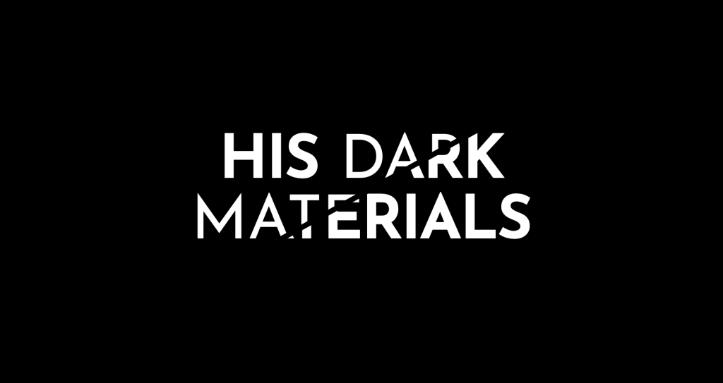
I really love this effect and, while I haven’t played around with the clip-path property myself, Michelle’s excellent demo is very good inspiration.
Harry Roberts has written all about how to make a performance budget pragmatically and, boy howdy, if every sentence of this article isn’t quote-worthy:
When faced with the task of setting a brand new budget, it can feel daunting—almost paralysing—trying to find a value that is both attainable but effective. Is it too ambitious? Is it not ambitious enough? Is it going to be really difficult to hit? Or do we risk making it so easy to achieve that it’s almost pointless? How do we know? How long will it take to find out?
Here’s the thing: most organisations aren’t ready for challenges, they’re in need of safety nets. Performance budgets should not be things to work toward, they should be things that stop us slipping past a certain point. They shouldn’t be aspirational, they should be preventative.
I’ve spent a lot of time at companies trying to create a culture around great web performance and, as Harry writes, it can be extremely tough to do. There is a lot of great thoughts Harry has here that can be applied in our orgs today that will get us all 1% closer to making our websites performant.
Stacking elements in CSS can quickly get pretty complicated but Sarah Drasner has written this post that walks us through it.

The difficulty is that there are so many methods to stack elements that things can be daunting. I think there are moments where I have a gadzooks moment and realize that my mental model of this stuff is less than stellar. Sarah’s post makes for a wonderful reference that I’m sure I’ll be coming back to time and again.

TinaCMS
TinaCMS is an open-source CMS that gives your Gatsby and Next.js sites real-time editing capabilities …a next-gen CMS for next-gen sites :)
Kathleen McMahon has this great piece about why we should use relative units in CSS when it comes to setting type and why that’s a big deal. (So instead of using pixels we should set type in rems or ems.)
Kathleen writes:
Remember, users really do change their settings under the hood, and we should be maintaining users’ control over their own browsing experience. If you use relative CSS units for your typography styles, you can maintain the fidelity of your layouts without negatively impacting the needs of your users.
This is such a well-researched post and it reminds me that I suddenly have a lot of refactoring to do!
Here’s a wonderful list of things you can do with a browser in 2020. There’s are so many APIs; the Web Share API, the Push API, the Payment Request API! It’s sort of bonkers that the web has improved so much in recent years and on so many fronts.
However, there’s not much word about HTML and I think we should all see that both as a warning and an opportunity.

Jetpack
Jetpack is sorta like a one-stop shop when it comes to supercharging a self-hosted WordPress site with the benefits that come with a hosted WordPress.com account. We’re talking a full CDN, downtime monitoring, analytics and… a whole bunch of blocks made for the Gutenberg editor, including a nifty slideshow.