Pagination is a ubiquitous design pattern on the web. Thanks in part, to huge sites like Google using it:

Pagination is a metaphor. It is a way to break up content onto multiple pages when putting it all on one would be to overwhelming or resource intensive. Google’s approach has defined how we think about pagination, and thus what we feel to be intuitive. But to what end?
I said that pagination is a metaphor, but what that metaphor is depends on what the pagination is doing. In Google’s case, it is an indicator of relevancy.

Your “friends list” in Facebook is paginated too, but it’s a completely different metaphor. This list is alphabetical, so the first page you see begins at “A” and as you paginate to the right, you go deeper into the alphabet.

The problem with paginating chronological content
An example of chronological content is a blog, where entries are posted in date order, with the most recent post shown first. For examples sake, let’s say a blog had 2,500 posts, and showed 5 posts per page, so that is 500 pages of pagination.
Left or right?
In both the Google and Facebook examples, going to the “next” page is metaphor by an arrow facing right. Neither of these examples is dealing with chronological content, but it still sets a fairly strong standard that the “next” page is directionally “right”. If you look a Google Blog Search, which is chronological, they use the next/right standard.
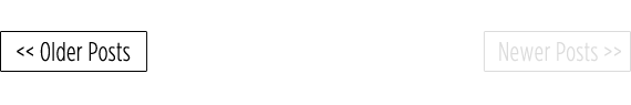
So in implementing pagination on a blog’s front page, the only pagination button that makes sense is “older posts”, because the newest is shown first. Do we use the next/right standard?

But doesn’t that just feel wrong / anti-intutive? We say “back in time”, and “back” feel like “left” to me, not right. So let’s break that standard.
Numbering problems
When you are looking at the homepage of a blog, there isn’t any numbered pagination going on at all. But it may be taken for granted that you are looking at “Page 1”, just like with Google. And we already know the only pagination choice is to click “Older Posts” which we have designated to move us backward in time and show older posts. What do we call that next page? Do we call it “Page 2”? That would result in a URL probably something like this:
http://fakeblog.com/page/2
or
http://fakeblog.com/?page=2
and perhaps something like this visually:

“Page 2” would be the most logical and intuitive choice, but I think there are serious concerns with that because of the nature of chronological content. Let’s say next week five more articles are published. That means what is on the home now will be gone, and will be at “Page 2” now instead. What was on “Page 2” is now on “Page 3” and like dominos the rest of the way down.
I’m thinking there are some significant concerns with this.
- Bookmarking – If someone were to bookmark their place in the site as they were going through the content, anytime new content is published this bookmark becomes more and more off it’s original target.
- Incoming links – If someone were to link to a particular paginated page, that link would be wrong as soon as more content was published (assuming it was to show off some specific content).
- SEO – Search engines are confused because the content on these pages is never the same as last time they looked. (pure speculation, I’m no SEO expert)
Flip flop
We already flip flopped the standard right/next for left/back, so why not flip flop the pagination as well. Rather than numbering pages forward, number them backwards. So when you click on “older posts”, you get “Page 320” (or whatever the highest number pagination you have is).

The benefits of this is that creating new content doesn’t shift the entire pagination structure. Next week after five more articles are published, the “Older Posts” button just goes to “321” instead of “320”. That means that all incoming links and bookmarks are preserved, and search engines will find the same content at the same URLs forever.
Thoughts?
This is all just musing. I’ve never implemented something like this, or even seen something like this live in us. It’s just rolling around in my head so I thought I’d write it down. What do you think? Is it smart? stupid? Smart but too anti-intuitive to be usable?

definitely something worth thinking about, and something that often confuses me, especially when sites use next/previous instead of older/newer, your page numbering idea is already the standard on forums where the older posts are displayed on the first page of the thread, I don’t see why it couldn’t work for websites even though it would probably confuse as many people as the normal method does…
This just got me even more confused, but it’s a great read. I’m glad to know I’m not the only one.
I subscribe to the belief that older entries should be to the right. When I think of a blog, I think of a book. I picture the new articles in the front of the book rather than at the end. When I want to read the next “older” page, I turn “the page” right to see the next page. I’m also a creature of habit and get annoyed by the sites that have older pages to the left, I always end up clicking back to the newer page.
Does that not mean that sometimes your first would not have 5 posts on, leaving it looking a little bare?
As an example there are 20 posts and the pages would be
4 – 5 posts (current front)
3 – 5 posts
2 – 5 posts
1 – 5 posts
Your next published article would then sit on its own on page 5, the new front page.
Do you treat the front page differently?
All in all I don’t think there’s a real issue with current techniques but it doesn’t mean to say we can’t improve on things!
Good point. I think you might just have to treat the homepage different somehow, and just make sure there are always five on it, despite those being potentially repeated on the next pagination over.
This would bring back the bookmarking issue. Article wouldn’t be always on the sane page…
The actual articles could be contained on their own individual pages, and the homepage could have a synopsis of the five most recent posts. When a person goes ‘back’ the synopsizes for the next 5 older posts will be displayed. Since people will not be linking to the synopsis it does not matter if these remain static. The content will be static, which is the most important for functioning links and search engines.
Of course if a person is only writing short posts then the synopsis very well could contain the entire post….
I hate it when email says ‘Previous’ and ‘Next’. I’m generally reading newer to older, but is that what previous and next mean in email? I don’t know. I suppose it comes from whatever the most likely reading order is.
This is a problem with blogs as well. Is the reading order aimed at someone new to the site, who reads the most recent post, then gradually works backward? Or someone who’s started at the beginning (with your first post) and is on a quest to read all your content?
I think this idea is just a musing trial. I don’t see the relevancy and importance to older and newer pagination. People interest can be expressed on label or category of the posting.
I think the pagination on a blog is pretty confusing and might be a headache to deal with the page in which you are. Specially if we flip the numbers and say the newest page is number 1. When yesterday there was something different on the page 1.
Hmmm… Reversing the page numbering to preserve links is a great concept, but I think the buttons are a usability problem. The “back=left, forward=right” paradigm is pretty well ingrained, but users aren’t thinking “back” as in “back in time,” they’re thinking “navigate back to stuff I already saw.” That’s a hard convention to break. I think users won’t even bother to read the buttons; they’ll recognize that it’s a pager and instinctively aim for the right-hand button to move to the next page of content, then be confused when it’s grayed out (on the front page) or takes them in the opposite direction they were expecting.
It also creates some visual confusion… If the newest page is 321 and clicking the Older button takes you to page 320, the “current page” indicator will move to the right even though you clicked the left button. It would make more sense to have the “Newer” button next to the newest page and the “Older” button next to the oldest page.
I agree with both this post and jonathon’s earlier, we shouldnt be scared of reversing chronology for the sake of usability. Everyone knows that blog sites have newer content at the ‘front’ with older content at the ‘back’, thus making the left to right order make sense.
I had this problem while designing a blog once (the left vs. right idea). However, if you think of paginated blogs as a journal, than the solution you came to seems logical. Granted the higher to lower numbering scheme doesn’t really translate well to a physical journal, in the sense that journals don’t have a series of line numbers. The right = newer & left = older idea filters well, you start on the first page of a journal, and keep flipping pages from the right to add new content.
Interesting read though!
Completely agree left = older, right = newer.
Personally I like the idea of paginating by something like month. Current month then going back.
i think your way of doing it is actually more intuitive, although people may find it strange at first. i definitely think it’s a better way of doing it.
my main is how would we go about making that change in wordpress? is it something you could do in a vid cast maybe. I think i would definitely want to implement it in blogs!
Perfect timing, I just implemented post pagination on a cartoons/nostalgia blog I run to try and keep visitors on the site longer. Since it’s on the single view, I just used “Last Post” and “Next Post.”
I use the standard Pagenavi on the homepage, although I’ve never really been happy with it.
I understand your point, and theoretically you are correct. If I were to think of a Blog as an Online Diary, going forward (to the right) should give me newer entries.
Still, usability and convention tells me that going down to the right should move me to older posts. In this arena, I think that wins out. I think it is important to name this link correctly (Older Entries rather than Next).
As for bookmarking and SEO, I want the individual posts to be bookmarked/indexed (with their respective Older / Newer links) rather than a page of posts.
You can’t control what people bookmark. I agree most people will bookmark individual articles, but you can’t absolutely know that.
One of the many things I loathe on most blog templates is the “left for older, right for newer” approach, for the following reason: In western layouts we read left-to-right and top-to-bottom, and that’s drilled into us from when we first learn to read so we can’t snap out of it. Look at the front page or archive of any blog and it’s (quite rightly) the newest post at the top and older as you move down. Now, to go to a horizontal sequence, you must transpose the top to the left and the bottom to the right (ie the reverse of most blog article pages) because otherwise you’ve flipped the ordering according to our deeply-ingrained convention. It makes no sense for the archives, RSS feeds, index page etc to be reverse chronological and then for the article page to be forward chronological.
As for paginating a chronological feed, why paginate by a certain number of posts? Find a date unit which the user finds manageable – a month for instance (displaying more than six posts per archive page is hardly going to tax the server) – and go with that. SQL may be easier to write with fixed-count pages, but humans don’t relate to that so well. Why make the user interface suit the database instead of the user?
I think date based pagination is smarter as well, but there is no reason you can’t have both.
There is something to be said for generic page-based pagination as well though, in that it’s more consistent than dates. If you paginate by week, and one week you publish ten articles and the week before you publish one, that leads to some awkward paging. Much nicer to show a consistent # on each page and just clearly indicate date by the titles.
But is consistency of number of posts on a page something that’s of value to the user? Personally I’m not sure that it is.
I agree with your well-made point that having a reasonable number of posts on a page is of value, but I think any problem there is caused by picking too small a time slice. Listings (archive) pages shouldn’t contain full articles (IMO) so I don’t think there’s a big problem in picking a month at the very least as a date unit. There’s no blog on the planet that has the performance implications that the first page of Google results has :)
I’ve always thought the pagination on blogs seemed odd, but it’s not standardized and I think that could be confusing to the user.. that’s why I prefer “Older/Newer Posts” because left & right don’t work…
An arrow is a weak icon to indicate time.
Don’t make me think!
Seeing some numbers at the bottom of a page, my spinal cord tells me there is something following the next/right standard.
My brain agrees that back=previous=left, but my brain has not much to say when it comes to using an intuitive webpage.
I love the “Don’t Make Me Think” attitude, but I also think almost any of these methods qualify. If you have a button that says “Older Posts” with an arrow at the bottom of a page, no matter where that is, there isn’t much thinking involved. It’s just a matter of making that placement and what happens after clicking it the best experience possible.
Gmail has older emails pointing to the right… although, now that I think about it, when I turn a page in a book to go further to the right, it takes me to pages I haven’t yet read.
I’d go with older to the right, you know, since google did.
Great initiative—love this discussion.
I think it’s highly illogical to place the next page (or “Older posts”) button to the left, because:
1) We read from left to right. If I’m on the frontpage and want to read more, the text should continue on the next page, which naturally follows the flow of the text (to the right).
2) We start counting at 1. Users don’t really care how many posts that have been published before they came there. They just started reading, and thus they should start on page 1, and continue to page 2. There’s a high risk of causing confusion when reversing the pagination count.
3) “Next page” is more relevant than “Older posts”. I, as a user, want to read more articles, and I don’t care if they’re older or newer—I just want more. I think the timeline metaphor isn’t apparent enough, and is best avoided all together by not labeling buttons as “Older” or “Newer”. Rather, label the pagination buttons as “More”, “Next, “Prev”, etc.
Good points, thanks for sharing, but I think a lot of folks would disagree on a number of points. I know personally I think “older” is a far better word in blog pagination than “next”. I get frustrated at blog articles than don’t show the publication date so I can’t tell how timely it is. Thus I really do care if I am traversing a site “back in time” or “forward in time”, thus I want my buttons named accordingly.
Don’t forget about the users. dont make me think
Good points — check out my reply to ilter below for some more thoughts on “time of publication” vs. “unread content”.
However, I think the main problem is that we’ve all grown up with these physical objects that we base our mental models on — and the models are apparently completely different, which shows when we apply it to a new medium.
The main challenge should be to supply a clear mental model for your pagination, whichever you as a designer decide to use. As someone suggested below, you could illustrate a timeline to suggest a time based mental model, which supports your article.
Maybe we shouldn’t focus on settling on the “best” way to think about this, but rather on helping the user apply the same mental model as the designer did, intuitively.
What about browser buttons?
When we want to go to the previous page, we don’t click the arrow which points right.
Exactly. In the case of browser buttons, “Back” or “Previous” indicates back as in “sites you’ve visited previously”, and has nothing to do with when they were published. It’s about you having accessed that content before.
As someone pointed out further down — unread content is almost always displayed to the right. Be it movies, books or newspapers. If you have not read it or seen it yet, access it by forwarding or turning to the next page. This should go for blogs as well. Start at the index page, read more by turning to the next page.
This would probably be true for most visitors (they are either first time visitors, or visitors that haven’t read every single post on your blog — and thus, they can access unread content by turning to the next page).
nice concept and something i wouldn’t mind testing.
would the homepage still be xxx.com/ or would you be forced to see xxx.com/page/nnn (nnn being the newest page) so that the user knows that they’re actually looking at the newest content and the site’s pagination is not like conventional pagination. either way, a well established convention has been broken.
for me, a page’s content changing might be useful for search engines to know that there is always fresh content available, but then maybe too much change can be a bad thing.
i would actually like to give this a go, as i think it’s actually a good idea.
You’d definitely want to keep the homepage as xxx.com/ — whatever gets decided on for pagination, even if it’s a little weird, you should definitely never mess with that convention.
Infinite Scroll is a great plugin for WordPress that loads more posts when you reach the bottom of the page. My blog is an example:
http://automaticlifestyledispenser.com/blog
Here is the plugin site link:
http://www.infinite-scroll.com/
Interesting plugin, sure it has its uses somewhere but for me the cons out weigh the pros – ‘Disadvantages:
* The “footer” of the page will be typically impossible to reach.
* Currently there is no way to cancel or opt-out of the behavior.
* There is no permalink to a given state of the page.
* Dynamically adding more content to the page increases the memory footprint of the browser. Depending on the browser, this could account for around 50megs of RAM.
* Analytics will not immediately capture the event, so custom configuration is required.’
Reminds me of a plugin abduzeedo used to use which loaded images for post only when that part of the page became visible. – called LazyLoad I think but I’m not sure it works with the current version of JQuery.
I generally don’t like lazy loading because it completely removes the reliability of the action of scrolling – when I go to a page and my loading indicator shows that the page has finished loading, I expect that it actually has finished loading (at least until I click something to make it load more content), and the bottom of the page is where my scrollbar says it is.
That said, I love the Twitter-style “more” button at the bottom of the page.
To prevent ridiculously long pages for a blog though, I would perhaps restrict it to showing 5 posts at a time.
When you click “more”, the latest 5 posts slide up and out of existence, the next 5 load in, and the url changes to
blog.com#p=2
Granted there are still the issues with bookmarking, search engines and non-JS users, but for the majority of users out there (including me) I think this is a much more usable and intuitive solution.
I really think the bookmarking thing is a bit of a non-issue. We are talking about a list of blog posts here, not a single post itself. If someone bookmarks your list of blog posts rather than a single post, they’re probably pretty aware that it is going to update.
Another really interesting article. I always wondered why the “older posts” was on the right, because to me it also felt really awkward, because as you said “going back feels like left, and not right”. But i had never thought about it this far into it. But i do agree that “older” and “newer” are better then “next” and “back”. I think its pretty important to know if youre navigating back in time or forward when it comes to blogs. i guess the older/right button is something ill just have to get used to even tho it does not feel natural.
I think the the reserved page numbers make a lot of sense.
Except for one thing… They are counting down to the right.
I think the highest (most recent) pagenumber should be on the right, since “right” is also “newer posts”-button’s location.
For the rest, it makes perfect sense.
In response to an earlier comment, one could say that I consider a blog also a book, but a history book. It’s starts early and ends in the present time. So the latest page is the most recent.
And on the front-page it might be confusing, but when browsing an archive, it’ll make perfect sense to go “right” to the “newer posts”, just like in a book.
Agreed the numbers in reverse kind of counteract your flipping the old / newer buttons. rather than flipping the numbers, shouldn’t you keep them in order but just have the last / highest page always the last number in the list on the right. then when going back in time / left the numbers would correspond to that movement.
Great article. I’ve been thinking about this myself. However, to me, “Older posts” to the right is intuitive.
A blog to me is like a big pile of pages, or sheets of paper, which are face-up, and to which you add when you update your blog: when it’s time for a new page it’s a bit like adding a new sheet of paper to the pile (it’s not a great analogy because of the way that a blog is updated, post-by-post, but it’s how I think about it).
Faced with such a pile of pages I would turn them over by thumbing their right edges, just like a book. So I guess the metaphor is a continually updated, never-finished book. To read more – whether or not you’re going back in time – you take the pages from the right.
I hope i’m understanding this right.
I think it depends on the content you want to display.
For example if you just want to do the posts on your blog i would use back arrow to the older posts just you would go back in your browser to try and keep this in a standard way.
As for search items you could reverse because now you filtering the content based on relevance so you want the new stuff 1st page the the rest would be like you reading a book.
So the bottom line in my option is how you filter your content and relevance everything else you will be confusion visitors people want see what they want now they dont want to see the other 300 pages.
I doubt anyone goes behond 10 pages on google search.
Just my opinion.
Honestly, I find both “older” and “newer” labels for pagination confusing. On my own blog I simply placed one link at the bottom called “Continue reading”. I think for chronological formats, people always “continue” reading, hardly ever the other way around.
Twitter does it too. If you are on a user’s account with their messages list, the bottom link is one link only, being a huge button called ´more´.
Of course, the above is not true for content that really needs to be navigated both ways.
I believe back to most people makes them think of left simply because most people are right handed. When i think of going back i think of my left hand going back, not my right
For cassettes, videotapes, DVDs, etc, “chronologically forward” (fast forward) was always “right” and “chrono. backward” (rewind) was always “left”.
For books (English books, anyway; manga comics, for example, are read rightmost-page-to-leftmost), unread content has always been on the page to the right. For stories, this was also “chronologically forward”. So the “right means newer” philosophy works with this mindset.
Of course, physical media like that has always been consumed from beginning to end, from oldest content to newest. Blogs and other digital media, not so much. Instead, we consume blogs either from newest content to older content (scrolling down the front page), older content to newer content (subscribing or checking the front page regularly), or from an interesting piece of content to other, also-interesting pieces of content (we were dropped into the middle of the blog through google).
I’m wondering if pagination is one of those carry-overs from physical media (book page numbers, DVD “chapters”) that need to be done away with and replaced by other methods that are more appropriate to digital media, blogs in particular. I’m just not sure what methods those are, exactly. Infinite scroll, as has been mentioned, is certainly one method.
What about a more non-linear approach, like a “subject map”, where posts are laid out in a kind of mind-map fashion, with related posts connected to each other? For sites like css-tricks and digwp, where the content is not quickly outdated, I would say that “interesting/related” content is more important than “chronologically nearby” content.
The question is, how do we “group” “related content” in a usable, relevant, and displayable fashion? Categories/tags and “related posts” plugins are a start, but I’m sure posts can and should be related to each other through attributes other than the categories we assign them to.
In the meantime, what about up/down navigation for blogs? Older posts are pretty much always spatially below newer posts. Also, this way you wouldn’t have to figure out “which way to tilt your head” (a problem with associating right/left navigation with up/down content — like an email inbox).
What happened today, that I blogged about today, is more relevant in general than what happened the last time I blogged over a month ago.
Page 1 = somewhat most relevant, most timely, most recent. Page 27 = old crap from 2 years ago.
Now if the visitor does a a “search” via the form instead of just “browsing” the archives then they get a paginated list of articles ordered by which contain words/phrases that most closely match their search terms.
That’s great..!
Thanks..!
In my experience the best method is to show a button “more” and load additional X number of contents. Users know exactly what you mean by it and are not confused. From the SEO side there is also no problem with this method as you should have a sitemap linking to all the contents of a site.
Like most people, I agree: “older” should be on the left. But instead of page numbers, why not a “slider” approach? The same thing that you see when playing a video:
[older] [——-o–] [newer]
As for bookmarking, use “flexible” date-based indexing (taking the hard work of calculating stuff onto the server). You’d “automagically” create a new page once there were enough posts to fill one instead of arbitrarily using weeks or months. The page “number” is a date-based address, based on the date of the first post in it. The only caveat is that you need a “buffer” page, i.e. the latest page.
For a 5-posts-per-page example:
The latest page, “/my/blog/latest” displays at least 5 posts, and at most 9. When one more post is created the server creates a new archive page, indexed by the date of the 10th-latest post (say, “/my/blog/20091210/”), and shifts posts 6-10 into that page. The “latest” page now contains 5 posts.
Like on a video control, you can show the position (i.e. page) when dragging the slider.
Maybe not an ideal solution, but it doesn’t “make the user think”…
I completely agree with left=older posts. I’ve tested it on my blog and it just works. “Previous post” is one of the most clickable item on my home page, so readers do understand the logic. However, the numbering is a bit confusing, it got me thinking for a while.
Really interesting article and comments. It’s nice to see people disagree in a constructive way. :-)
Anyhow, I think some people that propagates for the back=right theory by comparing with books is on the right track, but draw the wrong conclusions. As someone said, the newest content in a book is (in the western world) accessed by paging right.
Consider it a narrative. The left -> right structure is quite valid. The difference between a traditional book and a blog is that a blog is more like a diary, a log book or a guestbook that is left open on the last written page. Thus, you have to flip pages left to get to older entries.
One thing I got kind of confused with was the flipping of the page numbers, though. If I understand it correctly, the first entry ever written would be #1, whiler the last entry in the illustrated example would be #231. I concur with that.
BUT: in that case, the numbering itself should be flipped, so that #1 is far left (as on google) and #321 is far right. You start out far right, though. That way, the stepping through the numbered axis is synchronized with the older=left, newer=right metaphor.
That being said, I actually would prefer other, thematic ways of navigating a blog, using keywords, calendars etc.
Nice thought but the problem is that everyone is used to “normal” navigation, so changing it will make confusion. It’s to late to change it.
Although I partly agree with you, I find it very non-constructive to stick to that kind of ‘it’s too late’ mentality.
People IS getting used to ‘normal’ navigation, but what is the norm today might be the laughing stock of tomorrow. In this regard, there are no ultimate truths. To some extent, it’s more like fashion.
The Infinite Scroll that a previous poster mentioned is something quite new, for example. On devices with touch screens, it make perfect sense to work that way. As we’re getting more and more touch enabled devices – such as Tablets, eReaders etc. – the traditional pagination as we know it might disappear altogether.
In the end, I think that the design itself can be able to remove much of the confusion that might arise from using patterns in different ways.
BTW:
A related information is bank statements. Let’s say you have a page with a table of transactions, the newest transaction being on top. The table always show 20 transactions. When flipping through the paginated table, which way should point towards older transactions?
Left, right – or perhaps down?
I’d love to hear your view on this. :-)
I’ve always thought a slider interface might work well for pagination. This would most likely work best when you have A LOT of pages. Typical pagination jumps 10 items per page, but what if you have a couple hundred pages? List your page numbers on top of a slider that shows where you are. As you slide the slider, the page #s scroll with it. When you mouseup from the slider (release the click), you go to whatever page you slid to.
Formatting of the following will probably get jacked up here.
1 2 3 4 5 6 7 8 9 10 11 12 13 14 15 16 etc…
———————————–*——————————————–
I also think it is far more intuitive to move left to access older content – but I think the idea as it relates to WP/blogs in general should be considered in terms of posts rather than pages.
The pages are containers for your posts which stack up from 1 to XXX and it would be crazy for every post have to shuffle up a number every time a new post is made.
Would it not make sense for the pages to be populated dynamically based on the number of current posts from last to first (much as they are now in fact) but for the page numbers to accurately describe the chronology??
I usually place the next page button to the left. Based on my own observations, more people tend to look to the right (actual center, Quadrant I/top right). To keep the trend that most people will land on the home page, I place the older post button to the right to be in easy reach. Fewer people, in my tests, used the newer posts button than the older posts button.
“Newer” “Older”May be better than “Next” “Right”, they may easily lead to ambiguity. The discussion need some UE experts to join;-p
Technically, it’s “UX”, but I agree :)
I really don’t think that’s a good way to present the pagination. Personally, I feel that the “Older” link may well be placed on the right – there’s nothing really unnatural about that IMO, and lots of sites are using it (Gmail, WordPress, and literally all forum software that display posts in chronological order).
The idea of older/newer makes a lot of sense to me. I’ve never cared for the next/previous links. I’m not convinced about having older be on the left along with the highest pagination number.
The nature of a blog is such that your newest post is going to be at the top of the main blog page, which is going to have to be page 1 (even if we don’t use the page/1/ in the URL), since the second page (page 2) only gets created when page 1 is full. The numbering has to become greater on older pages.
Going to the left to go back is intuitive, but even more intuitive is having the lower number to the left. It seems counter-intuitive to see the pagination have the highest number on the left. When someone enters the blog on the main page you naturally want to show 1 in the pagination and it would have to be the right. Something feels confusing about that.
I really don’t have a problem seeing older posts to the right, though I do agree it’s more natural to see older on the left. I think as long as it’s clear which way gets you to older posts and which gets you back to the newest post people will be fine.
I generally don’t do blogs, but that is an excellent point you’ve got there.
I think that it’s a bit problematic to name your home page “Page 320”, isn’t it?
You might want to consider dropping paging all together.
What I like to see more is this: http://blog.wekeroad.com/2009/11/27/paging-records-sucks–use-jquery-to-scroll-just-in-time
For what it’s worth, take a look at how Blogspot does it. It doesn’t have page numbers. Instead, it just has “Older posts” and “newer posts” links. The links add a “updated-max” parameter to the URL. So, it’s timestamp based, not page number based.
I am a strong advocate for the left is older and right is newer approach. Simply because this is more intuitive (We read from let to right).
For me the numbering is no problem. Simply because when you write a book, you start writing at page 1 and the next (newer) article would be on page 2. And this is also the way you read the book.
In the “real” world, the only reason to do this the other way round is for archiving purposes or revisional purposes. And this stems mainly from the fact of physical limitations.
Paper stuff was usually archived or bundled in ordners. When a new paper was to be added, you could either remove all the papers already in there and then put the new one in the back and put the rest back, or you could simply put it on top. Which is a lot less work.
I think your idea to have old=left and new=right to be perfectly intuitive. It also makes sense that the oldest post on your site would be on page 1.
The only thing I would change in your example is the numbering order. you have:
[«Older Posts] [321] [320] [319] [318] [Newer Posts»]
If I click on the link to the LEFT to see older posts, but the number highlighted moves to the RIGHT then that is counter-intuitive.
However if you go:
[«Older Posts] [318] [319] [320] [321] [Newer Posts»]
Then your numbering sequence follows the same convention that you are establishing with your left and right = old and new.
I saw someone earlier mention forums and it’s true that this is how they would do their pagination, but in those cases the first page you start out on is the oldest page in the thread.
I think that instead if you look to Web Comics you’ll find that they have been paginated like this for years. If you go to questionablecontent.com the first comic you see is the newest one with links below it for [First][Previous]…[Next][Last] with the 2 on the right ‘grayed’ out. A setup like that makes perfect sense for things that are presented in a chronological fashion where you want your visitors to see the newest stuff first.
Hi
Nice article. But is it not more correct to change it so that numbers that are more to left (older articles) in right order than the other way.
Like this:
[older] [316][317][318][319][320][321] [newer]
page 321 is newer so it must be closer to right and 316 is older and closer to older button.
Reversing page numbers is something I considered doing (for SEO purposes) but general feedback suggested that users expect page numbers to start from one – or at least they do on screen.
Great discussion about a topic I haven’t really ever thought about in any great detail.
I actually find myself disagreeing with the majority here. People are comparing the flow of a blog to the flow of a book. But to me, this is just not the case. With a book, you always start with the oldest content – the beginning. However with a blog, it is the opposite: you’re always presented with the newest content. You’re essentially reading the book backwards.
Also, I consider going left to be things you have already seen (i.e. the pages you’ve already read in a book, and the webpages you’ve already visited in your history. Now despite the fact that any further blog posts you read will be older, they should be considered unseen. Therefore, you should navigate to the right to see more of the blog (the older posts). Just like you would read left-to-right to read more of the book.
I hope this makes sense.
I left that out on my previous reply, but one thing I personally think should change regarding this subject is the way the “latest post” is regarded. I think the latest post is to be simply hotlinked to a general frontpage. The frontpage has nothing to do with the content order or numbering. It is -if you wish- the cover of the book which changes everytime a new article is posted.
What about a combination…
As far as I can tell there seems to be two issues here – that the UI needs to be intuitive, and that the URL needs to be bookmarkable (and readable).
In my mind the UI really should start at page 1, and increase with an older or next button to the right. This is so ingrained into our interface subconscious that it takes a lot of brainpower to overcome that hurdle (an older to the left just makes my brain hurt).
The URL on the other hand should be reversely proportional to the page number – page 1 contains the posts with the highest id, and page 250 should be the lowest.
Could you use a start post number in the URL for this? For example, page 150 would be http://www.xx.com/startpost/5 (if you are viewing 5 posts/page), and page 1 would be /startpost/750, where the posts on the page count backwards from the startpost (showing posts 750, 749…745)
You could also include the number of posts to show per page in the URL eg. /startpost/750/showing/5. The issue as mentioned by another poster is that page 1 would have less posts that the other pages (eg if the latest post was 748), which would be weird in my mind. You could do a special case for page 1, and have startpost be 748 (but this would perhaps confuse matters even more).
NB. (this is all a stream of consciousness, presumably many overlooked issues)
A very interesting problem, and one I dont think has been satisfactorily solved yet… but in a year or two we will probably be using a system that is just plain obvious and we will look back and laugh.
I agree with people supporting “infinite scroll” and its variations as the optimal approach. It’s rare that I use page jumping, with “next” and “previous” (and its variations) being the main way of navigating. Even when I jump pages, it’s just a “fast forward” to get me to later or earlier in the chronology.
If we’re talking about a blog, and chronology is the important thing, I think that infinite scroll, combined with a “jump to date” widget of some sort gives you the best of all possible worlds. The date widget would approximate the “page jumping”, and the infinite scroll does the “previous”/”next” thing.
And of course, content-driven blogs are usually more easily navigated with category/tag/search anyhow. I’m on Chris’s blog and I want to learn more about jQuery, I’m going to just search for jQuery articles (ironically, bringing me to a Google search) or even better, use his sidebar “jQuery tutorials” tab.
Paginated posts are kinda broken if you ask me.
Forgot to address the bookmarkable thing…
Click the article of interest. Bookmark whatever that software’s equivalent of a “permalink” is. I’m going to bookmark Chris’s “musings-on-paginating-chronological-content” page, not “page 1” that currently happens to contain that article.
I don’t really know how bookmarking the pagenumber would be practical at all. It’s specific articles within those pages that you want. Not the page you were on when you found the article.
There is a way around all this. Let’s call it the pile model:
TOP=Newest
—
UP = Newer
DOWN = Older
—
BOTTOM = Oldest
It is recursive with the reverse-chrono model we know from the blog’s list-view, and therefore reinforces the mental map in the user’s mind. Go team.
The pagination links could be defined as linking to the first item on the next page. The rest can be calculated from there and the correct page selected for that item.
This is difficult. I say we ditch numbers for pagination of content and keep them for search results.
We seem sometimes to forget that we (users and designers) are dealing with the HT on HTML (HyperText).
The numbers are just offset from where we are now.
The deal is that we should offer a way to get back to said results page and have its content show consistency through time (often Google links to lists will make them show newer content instead).
I say we leave numbering 1 2 3 4 … for search results and not let Google list those pages, then have a chronological or numerical archive of posts that’s readily accessible to the audience as well, that does make more sense in the “printed media” sort of way but that also gets listed by Google and retains its contents through time (like all posts from May 2008 or all post from 150 to 159 under link page 15).
That way at least, should one decide to produce a book from the site’s contents, there would be less work to do :)
Thanks Chris for this post. I am building kind of CMS platform for sport news website and the client wants on their front page to have all the news in a div block somewhere on the middle of the page ordered by the date created and it needs to have AJAX pagination. For example when you come to the website for the first time it shows the first 10 news and pagination links should be on the bottom, so my problem is, what if i have 50 pages each with 10 news (the last one can have less than 10 of course) and i just can’t use 1 to 50 numbers (considering the space), so how i can put links like:
First – 1 – 2 – 3 … 48 – 49 – 50 – Last
When you click on the 3 then pagination links go forward by visibility and this is where i get stuck, i don’t know how to do this with jQuery, so if number 3 is clicked then pagination will look like:
First – 3 – 4 – 5 … 48 – 49 – 50 – Last. I know that i have to do something with what links are visible and what are not depending on which link is clicked.
I hope i didn’t sound too confusing to you, but any suggestions would be highly appreciated and in mean time if i get it to work i would like to share it with you.
Thanks for your time
Zoran
I thought about this “problem” some more. Basically, numbers on the web mean nothing in themselves. To humans, a sequence of numbers is just that, something to indicate a sequence going from 1 to X.
When a visitor comes to a paginated page, he/she might enter at “page 50” and is then presented with a “older/previous” link and a “newer/next” link, with a load of numbers in between.
Again, these numbers mean nothing, but they can be confusing in the way Chris pointed out in this article.
Another way around them would be to not have these numbers represent page numbers, but page-jumps. The lay-out would then be:
oldest – … – 3 – 2 – older | newer – 2 – 3 – … – newest
Reversing this would then still make sense.
Another advantage of this is, when you put the second but last nuber there as well like so:
oldest – 13 – … – 3 – 2 – older | newer – 2 – 3 – … – 24 – newest
You can actually see how many articles there are in total and between the current article and the newest/oldest one.
I’m sure I’m not the only person here who reads XKCD… thats what I thought of while reading this article.
Previous on the left, next on the right, and each new comic is one number higher than the last. Its never caused any confusion there that I know of.
XKCD.com to check it out (and for anyone who doesn’t read it, it’s worth a look).
I’m not a big fan of the idea to flip flop paging. even if it is for chronologic reasons.
i suggest you don’t build your url’s as domain.com/page=2
but as
domain.com/2009/10/9
use the date of the last viewed post
or slug or whatever.
that can be rewritten (url rewriting is not that hard) so you can list that post with the 4 next posts… that url will always yield those 5 posts then. even if a new one is published
however i do not change anything to the actual paging, so people who “remember” they stopped browsing at page 10
will see a totally different page 10, if they come back 1 month from now (that is if/when you published new articles in that month)
but it does tackle the links to your site, or bookmarks by people. (and the SEO issue if it even was an issue (no SEO expert either))
I just don’t get how bookmarking “page 10” is useful in the first place. Bookmark the article of interest, not the article it’s found on.
*the page it’s found on
I think I agree with ET. Why does the paging necessarily have to be left and right? Wouldn’t it be more logical if the paging would follow the way the articles are places on one page? In a blog, this is usually most recent at the top and older posts at the bottom. Perhaps it would be interesting to try for a little column on the side like this:
/\ newer posts
3
4
5
6
\/ older posts
I think this would feel a lot more logical to the user, since the posts on one page already have this chronological order. Maybe I’ll try it for my new blog :-)
Musing are often interesting. How posts/pages are paginated is something to think about when building themes. Don’t think I’ve come across any other article dealing with it. Glad you put your thoughts down.
I’m using the John Godley’s Guangzhou theme where the first page shows a summary of posts. It uses an “Older Entries” metaphor which, when hovered over, shows “Page 2.” I think that’s absolutely correct, in the sense that the summary page IS the first page. If you click on Older Entries and go to Page 2, it is *still* a summary, formatted the same way. However, if you click on one of the article titles (whether on the original first page or page 2), the pagination scheme changes. You’ll get the /ArticleName/ and if it has pages within it, you’ll have the /ArticleName/2/.
I fully agree with Chris idea. I’ve always complain about the pagination of blogs.
I just add a small thing, having all the same post always on the same pages will we creating static content, and is not necesary to cache the pages as when a page get the full numer of posts could become a plan html.
i never thougth about a vertical navigation, i like that idea as well.
Greate article!
Chronology and pagination really don’t mix well. How about considering another well-established metaphor for older vs newer – namely, the archaeological metaphor!
In fact, many blogs already do this, by placing links to previous blogs on the right of the screen, with the newest items on top – just like stratigraphy at an archaeological site! It makes better sense than left-right pagination in either direction.