Without even realizing it, our perceptions are cross-referenced with our memories. Our brains conjure up an emotional reaction when our eyes see familiar shapes, colors, and textures. This fun exercise uses various styles of couches to help you make decisions about the emotional response that best represents the personality of your company (or how you would like your company to be perceived).
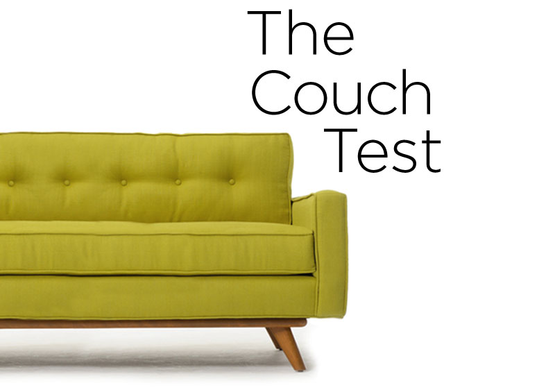
So, which couch feels most like your company? Parallel your choice with your company’s brand personality attributes. Insights on effective color and hand-picked typography choices (with links to free fonts) are included and will help codify your communication style. See if your choice aligns with your company’s mission and vision.
Is your brand…
Stylish?
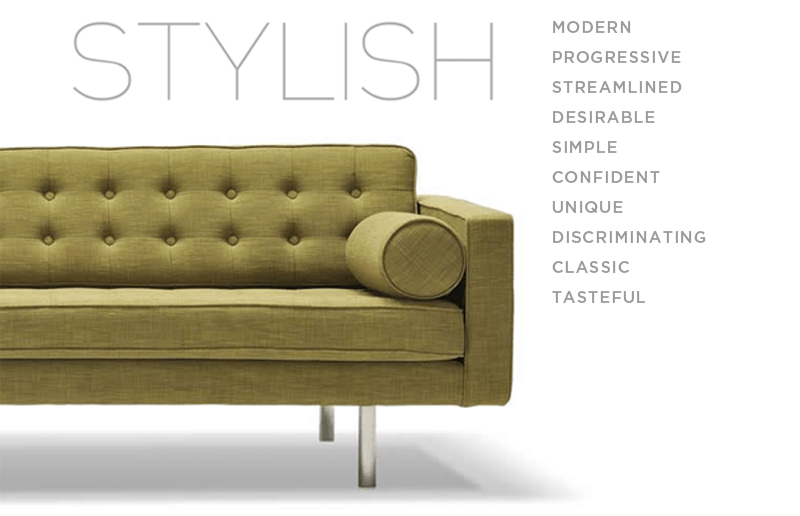
Clean lines, modern, current. That’s a stylish company. Being confident and deliberate in your decision-making shows in everything you do. This company may associate themselves with a Mid-Century modern look.
Recommendations:
For color — go fruity for the main color, use: orange, plum, lime, blueberry, etc. ground it with a gray or charcoal. A geometric sans-serif font like Raleway will feel contemporary yet timeless; look cutting-edge yet approachable —all staying in line with that sharp stylish image.
Case in Point:
Agile?
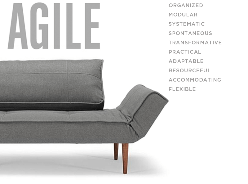
Pragmatic in its approach, this company can accommodate almost anything that is thrown its way. The agile company appeals to people who want to get things done no matter what road blocks they come against. Energetic and flexible, this company is always on its toes.
Recommendations:
A fun muted tone with sage greens and slate blues will keep the look grounded. The typography should be super clean while the layout is geometric and modular. A condensed font face like Alpin Gothic will make an excellent evergreen typeface solution for your logotype.
Case in Point:

Collaborative?
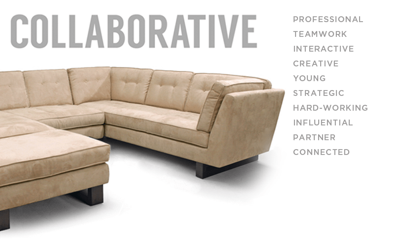
Communication is key. Relationships are important to your organization both internal and external. Decisions are not made in a vacuum but are a result of the collaboration of many minds. Your company culture is perceived as young, thoughtful, and deliberate.
Recommendations:
The color family is a pop of color grounded in neutrals. Pick one strong color. Don’t clash hues. Balance a dominant color with lots of white. For a logotype, stay friendly and timeless with a sans-serif font such as, Langdon.
Case in Point:

Rustic?
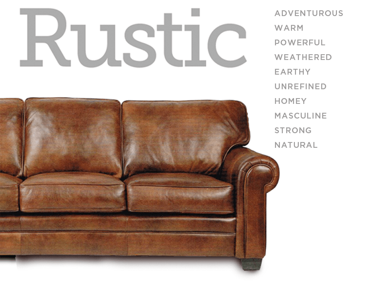
Solid furniture, wood, and leather — heirlooms that evoke a rugged, organic tone. You take your work seriously. You are a meat and potatoes kind of company.
Recommendations:
Stay earthy or let your corporate identity color palette go beyond greens and chestnut browns with inspiration drawn from the colors of autumn leaves, baked clays, and terracotta. Keep the font strong, legible, and simple by using a san-serif or get bold with a slab font like Museo Slab. A showy, novelty font will dilute your message.
Case in Point:

Playful?
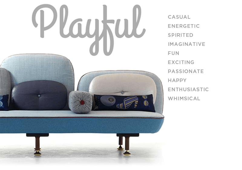
Happy and productive corporate or retail culture. This is a place where ideas become realized and enthusiasm is valued. The employees feel appreciated and are proud to be associated with the company.
Recommendations:
Let go a little with this color palette. Explore colors such as vintage teal, pink, or robin’s egg blue. Conversely, use a neutral as a secondary color to counter the fun color and ensure a professional feel. Play with a bold, retro script like, Grand Hotel for a logotype. Steer clear of novelty fonts. Over-designed fonts make you look like you are screaming for attention and may come off as amateurish. Downplay to stay above the pack.
Case in Point:
Accomplished?

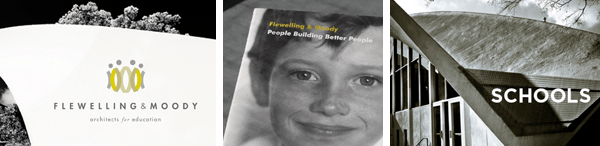
A bookshelf laden with books from every generation and a smart looking desk lamp define this category. Rich in tradition and high on integrity, you’re a company built on a solid reputation that has garnered great respect from years of experience and deep knowledge of your industry.
Recommendations:
Consider darker colors to convey depth and couple it with several shades of an earthy tone: a mid-tone khaki or charcoal gray. Using a classic typeface with contrasting thick and thin strokes will be easily readable. A serif typeface will represent stability and credibility, along the lines of Crimson in upper and lower case.
Case in Point:
Karen Barranco is originally from New Orleans and now in Los Angeles. In 2000 she founded Special Modern Design and her work has been been published internationally in books, print magazines, and online, including being featured on lynda.com and being hand-picked by Shepard Fairey to represent the “Revitalization of the Los Angeles River by 2020” initiative. Logos With Soul is a spin-off company for designers.
