You love HTML emails, don’t you?
As a developer, probably not… but subscribers absolutely do. They devour them, consume them on every device known to man, and drive a hell of a lot of revenue for companies that take their email marketing seriously.
But most web developers tasked with building HTML emails merely want to get them out the door as quickly as possible and move on to more interesting assignments. Despite email’s perennial value for subscribers, tight timelines, and a general loathing of the work result in things falling by the wayside; and, just like in the web world, one of the first things to be set aside in email is accessibility.
I think we all agree that accessibility is a vital topic. Unfortunately, it’s one that’s ignored in the email marketing world even more than on the web.
Accessibility in email doesn’t have to consume a lot of time, though. There are a few simple practices you can build into your own campaigns that will make your emails more accessible and your subscribers even happier.
Accessible Tables?
One of the main reasons that web developers hate building emails is that we’re still stuck using tables for layout in email. Although there are a few different ways to get around using HTML tables, most emails still rely on them to ensure that emails look good in Microsoft Outlook, which doesn’t support more traditional CSS positioning, let alone newer CSS layout techniques like Grid (although that’s possible in email, too).
But HTML tables present a hurdle for users relying on screen readers for consuming their emails. This is made clear when you hear the output of a screen reader working through the typical HTML email campaign. Mark Robbins of Rebel posted an excellent example of this behavior a while back.
The screen reader is doing it’s job: it sees a table, assumes that it contains tabular data, and reads it appropriately.
However, since we’re using tables purely for structural purposes, we need screen readers to ignore those tables. This is where ARIA roles can help us out. By applying the role="presentation" attribute to a table, we can instruct the screen reader to skip over those elements and move straight into the content.
See the Pen Accessible Emails – Tables ARIA Presentation by Jason Rodriguez (@rodriguezcommaj) on CodePen.
With that one simple addition, our emails are much more accessible. It should be noted that nested tables don’t inherit this behavior, so you will have to apply role="presentation" individually to every table in your campaign. Creating a snippet or building this into your email boilerplate is a good way to ensure accessibility without having to even think about it.
Out of the Image and Into the Code
A common practice in email marketing is to use images for everything in the email: graphics, illustrations, copy, links, and buttons. Although this can be efficient (slice, dice, and send it on its way), it’s another huge problem for subscribers relying on screen readers. The typical image-based email has a lot of information that can’t be parsed by a machine. What’s more is that a lot of email clients disable images by default, too. Ever see something like this?

We want to avoid or improve situations where content can’t be seen by users or content can’t be read by a screen reader. There are two ways to do this.
The first is to rely less on images and more on HTML to convey your message. Pull copy out of your images and put it into your email as real, live text.

HTML text isn’t susceptible to image blocking in email clients, so it will always be shown. Further, most copy that’s typically found within an email can be converted to HTML text. You can style that text however you want, even using web fonts, and your content can be seen by users and understood by screen readers.
This is especially important when it comes to links and buttons in emails. A lot of designers will rely on images for buttons since they can style those buttons however they want. However, those image-based buttons are victims of the same image-blocking behavior as any other image. Using HTML, CSS, and, in some cases, Microsoft’s proprietary VML language, you can create code-based buttons that display everywhere and still fit in with your design.
See the Pen Accessible Emails – Bulletproof Buttons by Jason Rodriguez (@rodriguezcommaj) on CodePen.
The second is to rely on alternative text for images. By adding the alt attribute, we can describe the content of images for screen readers so that users get some context and a better understanding of the email.
The same rules apply in email as on the web:
- All images should have an
altattribute - Alternative text should present the content and function of an image
- Alternative text should never be redundant
- Alternative text relies heavily on the context provided by the content surrounding an image
- Decorative images should use an empty
altattribute
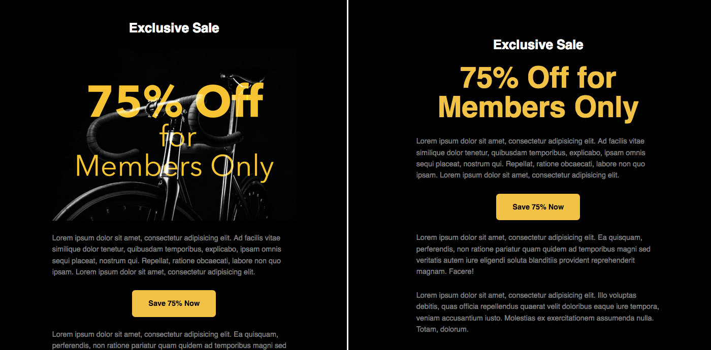
A simple example of alternative text in an email would be for something like a retail sale.
See the Pen Accessible Emails – Styled ALT Text by Jason Rodriguez (@rodriguezcommaj) on CodePen.
On top of making our emails more accessible, we can actually style that alternative text so that it better fits in with the rest of our email design when images are disabled. Using things like color, font-family, font-size, font-weight, and line-height allows you to style alternative text in largely the same way you would any other text in the email. Combined with something like background-color on the image, these styles make it possible to have highly-optimized—and accessible—emails for when images are disabled.
It’s All Semantics
Despite what some email marketers and developers will tell you, semantics in email do matter. Not only do they provide accessible hooks for navigating an email, they can provide fallback styles that help maintain the hierarchy of emails in the unfortunate event CSS isn’t loaded or supported.
It used to be that all text styling was done on table cells within a campaign, with any copy being a direct descendant of that table cell.
See the Pen Accessible Emails – Old Text Approach by Jason Rodriguez (@rodriguezcommaj) on CodePen.
Email developers would avoid using semantic elements like headings and paragraphs because email clients (correctly) displayed their own default styling of those elements, which sometimes resulted in broken layouts or unintended designs. I don’t know if it was sheer laziness or something else, but very few developers would use semantic elements with simple overrides to keep their designs accessible and consistent across clients.
Adding the margin property on block-level semantic elements—and relying on style inheritance from the table cell—can create more accessible emails that display properly nearly everywhere.
See the Pen Accessible Emails – Semantic Text Approach by Jason Rodriguez (@rodriguezcommaj) on CodePen.
You don’t have to stop at simple headings or paragraphs, either. You can use sectioning elements like main, header, footer, article and more to provide extra semantic value to your emails. I would caution you to use them on top of your existing table-based structure, though. Not all email clients support styles being applied to those elements, so something like this is a good approach:
See the Pen Accessible Emails – Semantic Article by Jason Rodriguez (@rodriguezcommaj) on CodePen.
Designing for Subscribers
The last technique I want to discuss—although not the last technique available to us—is adhering to tried-and-true design principles within our campaigns to keep them accessible.
Accessibility isn’t all about screen readers. Subscribers can have visual impairments as well as physical or cognitive disabilities that make consuming emails difficult, especially when an email’s design hasn’t been updated in years. By relying on design principles like hierarchy, space, pattern, proximity, type size, and contrast, we can ensure that a broad spectrum of subscribers can understand and enjoy our email campaigns.
This is especially apparent when it comes to viewing emails on mobile devices. If you’re not taking the mobile view into account from the outset, or using responsive email design, then your desktop-first email campaigns can be a pain to use when scaled down on most mobile email clients.

Simply revisiting your designs with mobile and disabled users in mind can go a long way to keeping your emails accessible. Using larger type that’s legible for a wide variety of users, combined with proper heading styles and a hierarchy that is easy to scan is a great baseline. Adding in repeatable patterns within your emails that further aid scanning and understanding, along with plenty of white space and properly contrasting colors take your emails even further.
I encourage you to use tools like Chrome Lighthouse and Accessible-Colors.com to check the accessibility of your HTML email designs. It’s all HTML and CSS, so the same tools that work on the web work on email as well. Use them!
Have Your Own Tips?
Although a lot of email development is stuck in the past, that doesn’t mean we can’t modernize our campaigns right along with our websites. Many of these tips can be baked right into your email boilerplate or code snippets, allowing you to create more accessible HTML emails without too much thought.
At the same time, don’t let that stop you from putting that extra thought into your emails. This article merely scrapes the surface of what’s possible in HTML email development. I’d love to hear about your tips for building accessible emails in the comments below.
Great article! I hate making newsletters, but absolutely love reading them.
Because of this, and on a semi-related note (apologies if this is off-topic/not allowed), I am in the process of creating a newsletter directory, allowing users to browse and find newsletters to sign up for. A beta can be found here: https://lettrs.email/
Thanks again for the article! Always good to see new articles, opinions and views on existing technologies and problems!
At the very start you affirm:
– subscribers devour html emails
– html emails are stuck with tables
Some people disagree. “Studies” about html emails are often sponsored by mailchimp (soon to be acquired by Oracle…).
Please have a look at (in same order)
– https://www.gkogan.co/blog/dont-design-emails/
– https://litmus.com/blog/a-bulletproof-guide-to-using-html5-and-css3-in-email
It’s 2017, man !
In-line SVG
Thanks for this post, it’s a good topic to discuss regarding CSS. A lot of email providers have specific limits to the styles they will allow or strip out. And Gmail will remove SVG images entirely. (last I checked)
My one point I will make is why bother with tables at all? I see no value in using a table. If it’s a mobile email, you don’t need columns. If it’s not, you have other layout styles you can use to get columns. And columns are the only thing that tables helped with.
Margin: 0 auto; with a max-width will get you a centered column in your layout. Happy coding, looking forward to the comments that will show up here.
Hi Vanderson,
The Outlook desktop app on Windows and Windows Mail 10 both use Microsoft Word to render HTML (I know, crazy right) and unfortunately that doesn’t support
margin: 0 auto; with a max-widthso we’re forced to use tables to do things like; constrain the width, use multiple columns or apply a background.Currently those clients have about 8% market share, so it’s still enough to worry about although check your own analytics to see if it’s relevant to you.
Jason linked to his article about using MSO conditional “ghost” tables
https://www.rodriguezcommaj.com/blog/nearly-table-free-emails
And my article on a work in progress project that makes MS Word convert a
<div>to a<table>http://blog.gorebel.com/get-off-the-table/
Regarding VML buttons: you must set
o:PixelsPerInchor the button will be mangled on high-DPI displays. See https://stackoverflow.com/questions/31860828/prevent-images-in-html-email-scaling-up-with-dpi-scaling-outlook-2013/31864815#31864815; you’ll want something like this:Describing VML as “Microsoft’s proprietary VML language” is not at all accurate; see its history on Wikipedia: VML was a precursor to SVG and supported by a number of companies at the time. It’s completely dead on the normal web, now; it’s only because Microsoft regressed to using the Word HTML renderer/editor (which is worse than IE 5) in Outlook 2007 that VML is still alive at all. And we all wish that they’d fix that foolish decision that has cost so many people such vast sums of money.
Also don’t forget to add support for a plain text version of your email.
Some tips about plain text emails: https://litmus.com/blog/best-practices-for-plain-text-emails-a-look-at-why-theyre-important
A plain text email will make the content of your email even more accessible.
Another problem that can arise is what happens with those mail clients that have HTML blocked, which also happens!
Been a while since I did emails, but when I did I used Mailchimp’s own builder, Zurb Ink, or build from scratch. Firstly I never understood how guides would say if your audience is using X, you can never truly know what the email will be opened in so you need either to design for the lowest denominator or provide fallbacks. And in my experience you have a budget and time constraints, the clock is ticking. You will think you have cracked it and then at the final moment in testing find the emails fails, normally in Outlook. So I know it is highly unimaginative in terms of technology, but by reducing the tech palette it does push the creativity. So in the end I just stuck with single column, couple of images, text. The end results performed as well as the more complex multi column designs, the client was happy, it worked and took much less time, every time to develop. Particularly once you have a template, change the images, change the text, done, send, invoice.
Great stuff. As someone who deals with HTML emails every day now (for a contract), I appreciate the article and everyone’s comments.
My two cents’ worth would be: Put all the -mso styles into conditional comments, like <!–[if mso]> (of your liking, with version numbers if you think yiou must). Separate from the rest of your declarations.
Why? That way, your CSS will still validate and won’t get automatically disregarded & discarded by those pesky email clients who do stuff like that (here’s looking at you Gmail on certain browsers and on certain OSs). What happens? If you have invalid CSS (as determined by certain email clients), they will get rid of your section. No problem, you say, “I use inline CSS styles in the copy anyway.” That’s cool, but if you can produce valid(ating) CSS, why wouldn’t you?
For what it’s worth.