- This topic is empty.
-
AuthorPosts
-
December 19, 2013 at 10:13 am #158768
paulob
ParticipantHi Michael,
I can see the image but currently your design doesn’t show that black border which is what is confusing me because there is nothing to elongate in the current example.
As I mentioned its not possible to put that border under the background because it is sitting on top of it already. It is different from the logo and header because they are separate elements that are not nested in the element that is overlapping them.
When you have nested elements you can never put an element on top and under the background at the same time. It’s either one or the other.
If the little gap at the side was a whole separate element then yes you could slide something under it but you have nested elements and not separate elements.
What you would need to do instead is stick something else on top to overlay the border and rub it out where needed while matching the background gradient.
e.g.
#main:before {
content:"";
position:absolute;
right:2px;
width:10px;
top:0;
bottom:9px;
background:url(http://www.wslmf.org/images_2/right_column_bkg.png) no-repeat 0 0;
z-index:4;
}
You would need to create an image similar to the one I have used in that example but one that matches the design you want (with black borders). If you just use the code I posted for now you can see the effect that it will give and then you can remake the image to suit better and tweak the positioning if required.
This is the only way you will erase part of that red border.
You are still thinking in terms of design and not flow. Pages must flow naturally and you have to make compromises I’m afraid. You could for example absolutely place everything into position and would initially look like you wanted but just wouldn’t work on the web because you can’t control what size text your visitors are using or indeed what devices they are viewing with; all of which will affect the way the layout behaves.
Usability and maintainability must come first and then you make it look the best you can. People go to a site for the content and the design second. If your visitor has to wait a bit longer for your nice graphic to load then chances are they will be off somewhere else long before its loaded. It’s always a compromise. Make it look the best you can but not at the detriment of usability. (Keep it as simple as you can but that doesn’t mean make it ugly :)).
December 19, 2013 at 12:20 pm #158781Anonymous
InactiveGreetings Paul,
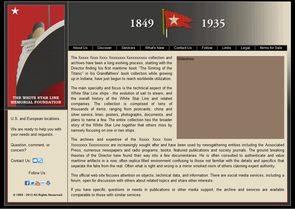
Great!! The code above got me close to what I want as you can see here. I did have to change the with to 11px to shift the new column background to the left so the line would align a. The only problem now is that the column_bkg.png which creates the lines and background for the page is showing all the way to the top of the right side instead of the right column background being shown with the gradient along the edge. I’ve grabbed an image of it and indicated the issue with a red line here. I assume there is a code and z-index to get the column_bkg.png to be under the right column background image. This will bring the look to exactly what I envisioned.
I agree with your points regarding flow and usability, but a page has to look good too. I know it seems a lot of to do over a silly line for shading, but it really does make the edges more defined and gives a depth. Believe me, it would have been much easier if I left them out of the logo. I originally drew the logo without these lines and it had no depth and was quite flat in appearance. The fact I had to put them in to provide a bit of depth has only caused delay, but the end product will justify it.
Best Regards.
December 19, 2013 at 3:19 pm #158799ParticipantHI Michael,
You seemed to have removed the image from #inner as shown in my example:
If you add this then it will create the gradient effect.
#inner {
    background: url("http://www.pmob.co.uk/temp/images/xright_column_image.gif") no-repeat scroll 100% 0 ;
}
Unless I’m looking at the wrong thing again of course :)
Here’s a screenshot of your page with the image added live.
December 20, 2013 at 12:49 am #158843InactiveGreetings Paul,
Perfect! It is as I wanted it! Thank you very much!!
Yes, I did remove the image from the #inner because I’m confused as to why it is in both the #inner as well as the #main:before? Is it because in order for the z-index to function on the image the element has to have an absolute position and the #inner is relative?
*Oops! I just noticed after submitting this that the main border isn’t covered by the right column image in IE. Is there an easy fix for this?
Best Regards.
December 20, 2013 at 1:15 am #158844ParticipantHi Michael,
Do you have a link to the current page as I’m still seeing the one with the red border going to the top?
Also which version of IE are you referring to?
December 20, 2013 at 1:28 am #158845InactiveGreetings Paul,
Here’s the updated page. Sorry for the oversight.
I’m still using IE8 as I’m not an IE fan/user. If this is working on current releases, then it’s not an issue other than a learning curiosity of how it could be fixed. I’ve come to realize my earlier obsessions with older IE versions was unfounded given that the current is 11.
Best Regards.
December 20, 2013 at 1:42 am #158846ParticipantHi Michael,
Its fine on IE9+.
I’m out today so can’t look until the hood until later but I’m guessing it’s IE8s buggy handling of z-index on pseudo elements. There may not be a solution for IE8 other than adding an empty div into the html to hold that image and then position it in the same way.
IE8 is still a buggy browser (not half as buggy as earlier versions though) and as the design looks fine otherwise in IE8 I would be loathe to add extra html just for IE8.
December 20, 2013 at 2:48 am #158847InactiveGreetings Paul,
Thank you for letting me know. Its fine then as it’s working in the newer IE versions. No point in adding more elements for a browser version that few will be using. I should update I guess.
When you return would you please enlighten me as to why the right column background image url is in both the #inner as well as the #main:before? Is it because in order for the z-index to function on the image the element has to have an absolute position and the #inner is relative?
Best Regards.
December 20, 2013 at 1:47 pm #158875ParticipantHi,
You could probably use one image but it would need to be on #main:before {} but I think the image would need to be a little wider I think as it needs to rub out the left border now and the right repeating border/image.
In #inner we position the image at 100% 0 but in main:before its at 0 0 so that we can rub both left and right borders out. I think it would work if you made a wider image but as it works the way it is with existing images then there’s no point. There’s no harm in using the same image twice as it only gets loaded once.
December 21, 2013 at 5:23 am #158916InactiveGreetings Paul,
Just out of curiosity and trying to understand more about how this works, I played around with the #inner {} and #main:before {} elements a bit and unless I’m not seeing something, the following works: I deleted the background image from the #inner and in the #main:before changed right:2px to right:0, width:11px to width13px, and changed the background from no-repeat 0 0; to no-repeat 100% 0;
Would you confirm that this works please?
Best Regards.
December 21, 2013 at 6:08 am #158918ParticipantHi Michael,
Yes that seems to be working and is what I would have expected to happen.
I didn’t actually check the width of the image when I made my last comment but as long as the image fits across that gap it should work.
The reason it was on #inner originally is because it was likely that the background should go under the content section.
December 21, 2013 at 7:12 am #158921InactiveGreetings Paul,
Thank you for checking it and for the info. I do believe that I’m beginning to understand bits of this. There are things however that appear to be simple but are giving me a time.
Have a great weekend!
*This can be marked as solved.
-
AuthorPosts
- The forum ‘CSS’ is closed to new topics and replies.