- This topic is empty.
-
AuthorPosts
-
October 4, 2016 at 4:12 pm #246159
bigmikee
ParticipantOK, This is really challenging and no one has solved it so far.
To sum up my problem, i am trying to achieve a design goal. I have an image of a Macbook Pro, which I have resized to the correct aspect ratio of a youtube video frame, I also have a video on youtube I am using.
The Goal: is to have the youtube video play on top of the image of the MacBook, so it looks as though the video is paying in the MacBook. (see image1.jpg http://mwebsatwork.com/image1.jpg )I have manage to achieve this by using a wordpress theme called Bateaux Blueprint. By adjusting the paddings, I have got the video to play perfectly inside the MacBook pro.
The Problem: When you resize the browser window, the youtube video as well as everything on the website resizes but not the MacBook pro background resulting in the video getting smaller and then out of place. See image2.jpg http://mwebsatwork.com/image2.jpg
Attempted Solution: I have found a way to create a background style using CSS that will resize when the browsers is resized. This can then be added to a table <td>, so effectively I would have created a section that has a background that will resize. But the issue I face is There is no way to then insert a youtube video in the table without using iFrame. iFrame does not resize and so I am back to the same issue i began with.
Any help?
October 4, 2016 at 6:46 pm #246164I.m.learning
ParticipantJust a thought, possibly use the macbook image as a border. We can change the border color, width, style…why not an image?
I used an image of a torn page as the border for a page body. Maybe try that. I’m on mobile so I can’t experiment, but know it works for many HTML tags.
Another option could be media queries for predetermined sizes.
October 4, 2016 at 8:34 pm #246165Shikkediel
ParticipantIf you’d make a demo with Codepen or similar application, we could experiment with it. I think we’d need to see some code to try and help out…
October 4, 2016 at 11:59 pm #246175ParticipantI can not use an image because you can not put an object like a youtube video on top of an image. When you say use the image an a border. What do you mean. As in slice the image and use it as a boarder around the video?
October 5, 2016 at 12:29 am #246176Naresh
ParticipantWell, I’m not sure, but what about positioning both, image and the video to absolute, setting max-width and assigning z-index property to the video?
October 5, 2016 at 12:31 am #246177ParticipantOk, This is more or less a rough version. i have pasted into Pencode.
I am trying to get the video to sit over the image. I then added these code to the style. But it just full screens the image and resizes it but does not hit the intended objective.See the Pen <aCodePen.href=”http://codepen.io/bigmikee/pen/ALxWbg/”>ALxWbg by michael ( @bigmikee) on CodePen.
<script async src=”//assets.codepen.io/assets/embed/ei.js”></script>
October 5, 2016 at 12:33 am #246178Participant<!DOCTYPE html>
<html>
<head>
<style>
table#t01 {
background: url(http://mwebsatwork.com/macBookBG700x410.jpg) no-repeat center center fixed;}
table#t01 {
width: 100%;
background-color: #f1f1c1;
}
</style>
</head>
<body><table id=”t01″>
<tr>
<td style=”text-align:center;”><object width=”400″ height=”400″
data=”http://www.youtube.com/embed/XGSy3_Czz8k”>
</object></td>
</tr>
</table></body>
</html>October 5, 2016 at 3:00 am #246179ParticipantHere’s an approach with the padding-bottom trick:
The compromise is a width that’s slightly cut off. To reduce this, you could add what’s at the bottom of the image separately.
October 5, 2016 at 7:38 am #246193Beverleyh
ParticipantAn extra wrapper on Shikkediel’s demo seems to do the job http://codepen.io/anon/pen/Egomyk
Set the width of the outermost wrapper if you need to resize.
October 5, 2016 at 8:39 am #246195ParticipantHihi, I was looking at it meanwhile and made one that has an extra wrapper as well – and a border image as I.m.learning suggested.
Edit – still fiddling with it by the way…
October 6, 2016 at 12:37 am #246215Participanta border image
That was a good excuse to read up on the property, which was quite a bit more complicated than I anticipated. But since background-size has better support and it isn’t really necessary to use a border, I forked a version that uses a regular background as well. Also made the style as lean as possible.
http://codepen.io/Shikkediel/pen/rrpozo?editors=1100
Removing the white background from the image and making it a png would be a bit more usable for different background colours (so I may have a go at that when I reinstall PSP).
Just change the
padding-bottomvalue of#containerto define the aspect ratio. The padding values of the outer element (that determine the inner container size) may have to be adapted when the width is changed so it is positioned correctly.October 6, 2016 at 1:57 am #246216ParticipantI see you’ve opted for a nice bit of Rick there, Shikkediel. Gotta love that 80s swinging hip action! Hee, hee
October 6, 2016 at 2:53 am #246217ParticipantYep, and no semi-rickrolling intended there because I once bought the whole (cd) album. :-)
I also thought the original video sounded a bit out of tune, lol. A song from some vinyl I also own by the way.I noticed the transform centering probably isn’t even needed anymore now, so I’ll likely strike a bit more style rules.
October 6, 2016 at 2:57 am #246218ParticipantYou my friend, are a true magician. That worked perfectly. Even better responsive than the solution I got from the theme developers. Their method works utilising their frame work, but this will work anywhere.
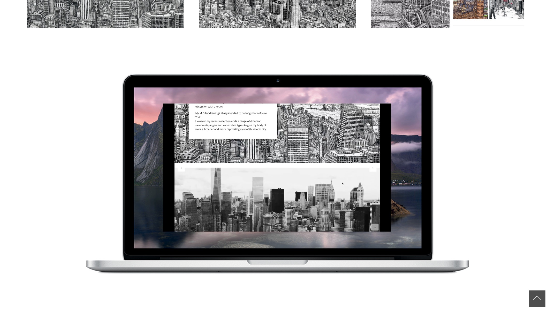
here is the finished version:http://mwebsatwork.com/portfolio/emmadooley
But I will keep this and maybe in future use your coding. it’s clean.
October 6, 2016 at 3:17 am #246219ParticipantOeh, that does look quite nice! Cheers.
A song from some vinyl I also own by the way.
That would be the G n’ R version of course. I think Dylan wrote it but that was before my time even.
-
AuthorPosts
- The forum ‘CSS’ is closed to new topics and replies.