- This topic is empty.
-
AuthorPosts
-
December 11, 2013 at 2:45 am #158144
isuru
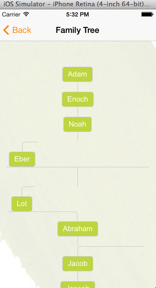
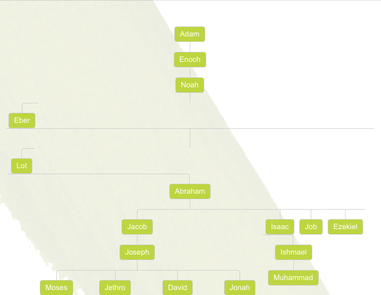
ParticipantI have created a css family tree by going through this tutorial. In desktop browsers it looks perfect. Here is how it looks.
Now I’m trying to make it display the same in iPhone and iPad screens. But when viewing it in those screens, it messes up the layout. Like so.
http://i.stack.imgur.com/W5Feg.png
http://i.stack.imgur.com/7K3I3.png
Note that some of the lines connecting the nodes are missing.
I have tried to resize the page using the html meta tags. Tried all the 3 lines below.
<meta name="viewport" content="width=device-width">

<meta name="viewport" content="initial-scale=1.0">

<meta name="viewport" content="initial-scale=2.3, user-scalable=no">
But no avail. I simply need to shrink the page to fit the iPhone and iPad screens. Can anyone please tell me how I can accomplish this?
I have also created a pen here to demonstrate the problem (resize the browser window).
Thanks.
December 11, 2013 at 5:43 am #158155Merri
ParticipantI made it more compact and replaced floats with inline-blocks.
http://codepen.io/Merri/pen/bBsdA
If you wonder why there are font-sizes and margins with both px and rem… px are fallback for browsers that don’t support rem. Default font-size on all modern browsers is 16px, so 1rem = 16px. rem = html element font-size.
rem is being used because I used the zero font-size trick to remove white space between the inline-blocks. I also used
white-space: nowrap;to make it impossible for the tree to break into pieces (like it does with floats).Also, don’t use viewport meta tag in this case unless you see the trouble to add media queries to resize the tree appropriately for all the target screen sizes. If you do see that trouble then you can use meta tag with device-width and initial-scale of 1, which is the only meta tag you should use on responsive sites.
December 11, 2013 at 5:44 am #158156Paulie_D
MemberI think it’s an inherent issue relating to how many pixels are required to display the whole tree.
You’re using padding (I think) to separate the branches etc and that’s all adding up.
Media queries to reduce the padding values are different viewport sizes would be appropriate (or use %).
December 19, 2013 at 11:47 pm #158838ParticipantSorry about the late reply.
@Merri: Thank you for modifying the code. I’m still a little lost on making the tree responsive. As in what CSS rules should I change and all? Can you please shed some light on this?
@Paulie_D: The padding are used for top and bottom as far as I can see. Can you please point out which CSS properties I should be looking in to? Maybe I’m missing something.
Thanks both of you for the response.
-
AuthorPosts
- The forum ‘CSS’ is closed to new topics and replies.