- This topic is empty.
-
AuthorPosts
-
July 24, 2014 at 3:55 pm #176370
Filmguy2013
ParticipantHello. My website Truck Driving Schools Info is a wordpress.org website that uses a custom theme from FThemes called Indicate. It is a responsive theme. Here is the problem. My laptop that I used to do some CSS customization on is a 17″ widescreen format laptop.
I have the width of the “container” set at 100%. I have two “sidebars” on either side of the “content”. I believe my website is 1600px wide and it loads correctly on my 17″ widescreen laptop. The problem is, when I bring up my website on a 4:3 aspect ratio computer monitor or even a widescreen monitor that is smaller than my 17″ laptop screen, the website is all jumbled up and the right sidebar is pushed down and all the way to the left side of the screen and appears underneath the left sidebar! I can’t run a professional website if it loads incorrectly on different sized devices and causes it to look amateur!
Here are two screenshots taken of my website from my friends laptop which has a 15″ widescreen monitor; the first screenshot shows the upper part of my website. The right sidebar should appear under the social profile icons that are on the menu bar, but the second screenshot shows where the right sidebar actually appears… at the bottom of the webpage, below the left sidebar:
- Screenshot #1: http://www.truckdrivingschoolsinfo.com/wp-content/upLoads/2014/07/Truck-Driving-Schools-Info-screenshot-2.jpg
- Screenshot#2: http://www.truckdrivingschoolsinfo.com/wp-content/upLoads/2014/07/Truck-Driving-Schools-Info-screenshot.jpg
In the second screenshot, that dark blue horizontal line at the bottom is the top of the fat footer on my website.
The administrators at the FThemes support forum have told me that the problem is that the “container” width is set at a percentage value, while the “content” and “sidebar” widths are set at pixel values and that this is what’s causing the problem but, they won’t give me the CSS code I would need to insert into the CSS editor of my website to fix this problem. They only tell me to set the container width back to the default 960px. This is unacceptable. Is there any kind of CSS code I can insert that will force the website to load at the correct width whether it is viewed on a large widescreen laptop, a 4:3 aspect ratio computer monitor, or a small smartphone screen, since it is a responsive website? Can someone please help me resolve this situation? Thank you. Here is the CSS as seen in the CSS editor. Where it says “LAYOUT” is where you will find the “container”, “content:, and “sidebar” that I am describing:
[Mod edit]: code dump removed.
July 24, 2014 at 4:41 pm #176374__
ParticipantPlease, do not “dump” code on the forums. It makes it very difficult to read/ navigate the discussion. Small amounts of code necessary to demonstrate a problem are fine, but always use code blocks so it is formatted correctly. If you need to share large amounts of code, use codepen or make a gist on github.
I have the width of the “container” set at 100%. I have two “sidebars” on either side of the “content”. I believe my website is 1600px wide …
No, as you pointed out, your website is 100% wide.
Just FYI, your site doesn’t seem to lay out properly on larger screens, either: likely the same problem.
The administrators at the FThemes support forum have told me that the problem is that the “container” width is set at a percentage value …but, they won’t give me the CSS code I would need
Well, it’s a free theme that was not custom made for your site. You should either use it as was intended, or find a theme that does (or have one built). Given the fact that you are not using the theme as intended, there is really no fault in their refusal to provide a “fix.”
When working with website layouts, you need to consider different screen sizes. You can’t design for one window size on one monitor and assume it will work everywhere.
~ ~ ~ ~ ~ ~ ~ ~ ~ ~
As for your specific problem, the reason things are moving out of place is that you have a container with a width that does not match the total width of its contents: sometimes things will wrap unexpectedly (because there is not enough space), sometimes things will not wrap when you expect them to (too much space).
Try setting the
#containerwidth to match the total width of its children (the1600pxyou mentioned). This might solve things (though it makes the theme decidedly un-responsive), or might cause other problems, but it’s a place to start.July 25, 2014 at 8:53 am #176462ParticipantThanks for the suggestions, guys. Un-traq-ed, it is a free theme unless you upgrade to the premium version, which is what I did so, I actually gave these guys my money for a “responsive” theme.
The problem is, the support team tells me I need to keep the container width set to the default 940px if I want the website to load correctly on all devices. That is fine and good but, when I set the container width to 940px, my website content is very slim with big blocks of solid color on either side (which is actually the background color behind the content and sidebars).
That is why I enlarged the container, so that my website didn’t look so “plain” and ugly.
What I don’t understand is, if you take a look at http://www.truckingtruth.com, which is obviously a responsive website, no matter what size you make the web browser, his website centers itself perfectly. I’m just trying to figure out how to get my “responsive” website to do the same thing without having to have the content area so small at the default 940px.
If the website is truly responsive, wouldn’t I be able to set the container, content, and sidebar size values to percentages and then they would load at whatever size the percentage is set to on MOST devices?
Or am I asking for too much?
July 25, 2014 at 8:58 am #176463Paulie_D
MemberNo, you’re not asking too much, but you’re asking the wrong people.
If they claim the template is responsive but still requires a fixed width container…they are lying.
Even so, just swapping out px for % on the container is not a magic bullet…you will still have work to do adjusting all the othe fixed widths (if there are any) and adding media queries (although I would have expected these to be included in a ‘responsive’ template)
You need to go back to the vendor and either get your money back or proper explaination as to how, exactly, they can call it responsive when it clearly isn’t.
July 25, 2014 at 9:49 am #176465janet4now
ParticipantI agree with paulieD. The theme is not responsive and you should request a refund. It is “adaptive”, but that is NOT responsive and they shouldn’t be advertising it as such.
July 25, 2014 at 6:12 pm #176495Participantit is a free theme unless you upgrade to the premium version, which is what I did so, I actually gave these guys my money for a “responsive” theme.
Well, there you go, then.
no matter what size you make the web browser, his website centers itself perfectly
That’s not being “responsive,” it’s being “centered.” If you give your
#containera static width that matches the width of its contents, it centers itself nicely also.I’d agree with the recommendation of getting either a refund, or an exchange for a theme which better meets your needs.
July 25, 2014 at 7:30 pm #176496ParticipantThanks, guys! I will confront them about the theme not being truly responsive now that I have some confirmation from people in the know like you folks. One more question. Does anyone know where I can go to get my website made into a responsive website? I am guessing I will probably have to shell out some dough and hire a web developer to do it?
Also, Paulie, there are at least media queries in the CSS. Would I have to mess with the media queries to make my website responsive? The media queries are:
        /* =RESPONSIVE
-------------------------------------------------------------- */

.menu-primary-responsive-container, .menu-secondary-responsive-container  {
    display: none;
    margin: 10px;
}

.menu-primary-responsive, .menu-secondary-responsive  {
    width: 100%;
    padding: 5px;
    border: 1px solid #ddd;
}

/* Tablets ----------- */

@media only screen and (max-width: 768px) {

     #container, #footer-container {
        width: 100%;
    }

    #main,
    #main-fullwidth,
    #header,
    #footer-widgets,
    #footer {
        padding-left: 10px;
        padding-right: 10px;
    }

    #main, #main-fullwidth {
        background-image: none;
    }

    #header {
        height: 100%;
        padding-top: 10px;
        padding-bottom: 10px;
    }

    .logo, .header-right {
        float: none;
        text-align: center;
        padding-left: 0;
        padding-right: 0;
        margin-left: 0;
        margin-right: 0;
    }

    .header-right {
        padding-top: 10px;
    }

    #topsearch {
        float: none;
        width: 96%;
        margin: 10px 2%;
    }

    #header #topsearch {
        margin-left: 0;
        margin-right: 0;
        width: 100%;
    }

    #top-social-profiles {
        float: none;
        width: 100%;
        display: block;
        text-align: center;
    }

    #content, #sidebar-primary, #sidebar-secondary {
        width: 100%;
        float: none;
        padding: 0;
        margin: 0;
        display: block;
    }

    .menu-primary-container, .menu-secondary-container {
        float: none;
        margin-left: 0;
        margin-right: 0;
        display: block;
    }

    .fp-slider, #fb-root {
        display: none;
    }

    .post-box {
        width: 100%;
        height: 100%;
        float: none;
        overflow: hidden;
        margin: 0;
        padding: 0;
    }

    #footer-widgets-container #footer-widgets {
        width: inherit;
    }

    .footer-widget-box {
        width: 100%;
        float: none;
        margin: 0;
        padding: 0;
    }
    #copyrights, #credits {
        display: block;
        float: none;
        text-align: center;
    }

    #footer-container #copyrights, #footer-container #credits {
        padding: 5px 0;
    }

    #footer-container #footer {
        width: auto;
        padding-left: 100px;
        padding-right: 10px;
    }

}

/* Mobile Phones ----------- */

@media only screen and (max-width: 480px) {

    .menu-primary-responsive-container, .menu-secondary-responsive-container {
        display: block;
    }

    .menu-primary-container, .menu-secondary-container {
        display: none;
    }

    #header .menu-primary-responsive-container, #header .menu-primary-responsive-container {
        margin-left: 0;
        margin-right: 0;
        width: 100%;
    }
}
July 26, 2014 at 1:26 am #176508MemberFirstly, please don’t dump code like that, it’s hard to read, takes up waaay too much space on the thread and is, usually, not useful.
That said, if there are media queries it sounds to me as though this template IS responsive and somewhere along the line you have either gotten bad information or have misunderstood what you have been told.
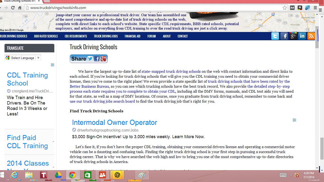
July 26, 2014 at 11:00 am #176539ParticipantHey Paulie, sorry about the code dumping. I still don’t understand how to go about showing you guys the CSS code without “dumping” it. Anyway, I messed around with the CSS and finally got the website to look and behave the way I wanted it to in the first place. Check it out: Truck Driving Schools Info.
The content isn’t centered but, that’s just a minor issue I can live with. I’m just glad that when I shrink and expand the browser window, the website loads properly and fluidly, without creating a horizontal scroll bar. For some reason though, it doesn’t load properly on Internet Explorer when I shrink the browser window. On Chrome and Firefox, though, it acts fluidly. Thanks everyone for your help.
July 26, 2014 at 8:14 pm #176563ParticipantFor some reason though, it doesn’t load properly on Internet Explorer when I shrink the browser window.
You’d need to describe what “doesn’t load correctly” actually means, and what version(s) of IE are affected.
I still don’t understand how to go about showing you guys the CSS code without “dumping” it.
well, …
Small amounts of code necessary to demonstrate a problem are fine, but always use code blocks so it is formatted correctly. If you need to share large amounts of code, use codepen or make a gist on github.
July 27, 2014 at 4:02 am #176569MemberThe content isn’t centered but, that’s just a minor issue I can live with.
The content IS centered as far as I can tell. Granted the menu isn’t but that should be a relatively easy fix.
You will have to work on the SVG map being responsive but the dimensions are inline so it might just be a matter of removing those from the HTML.
July 27, 2014 at 3:54 pm #176630ParticipantThanks, guys. Paulie, if you mean the blue interactive HTML5 map of the United States on the homepage, it is actually responsive but, for some reason, when I shrink the browser window, the map doesn’t shrink along with it BUT, if I shrink the browser window, and then reload the webpage, the map reloads at the correct “responsive” size. The developer of the map gave me a line of code to insert into the webpage HTML editor. Before he gave me the line of code, the map would not shrink to the correct size even AFTER reloading the webpage. So, the map should load correctly on different size devices, it just won’t respond fluidly when I shrink and enlarge the browser window. Here is the code that the developer gave me:
<script>jQuery(document).ready(function() {FSresizeMap();});</script>
Do you know of a way I can make the map respond fluidly?
Also, how would I go about centering the navigation menu? Thanks.
July 28, 2014 at 3:44 am #176661Gary Pickles
ParticipantHi Filmguy2013, had look at you site and as a quick fix to you problems was to add a Max-Width: 1024px; to the container, and edit the in-line style for the blue map to width 100% and height auto.
Not saying this will solve all your problems but i think it helps.
-
AuthorPosts
- The forum ‘CSS’ is closed to new topics and replies.
