- This topic is empty.
-
AuthorPosts
-
June 7, 2011 at 9:21 am #73951
andrewsellenrick
ParticipantDang, after reading all of the constructive comments I wish that I could see revisions you’ve gone through to reach your current version…
June 7, 2011 at 3:15 pm #73959treyrust
MemberAndrew, If you go to http://treyrust.com/ and click “portfolio” That is the first one I made, then the current one is the next one
And thanks, Chris! The background was the first thing I put into the website. So it just stuck around until now and, I think it looks amazing now: http://bit.ly/lGbdQt
It looks a lot better in a browser than in that pic though, Really sharp. And as you can see, I went back to using hyperlinks, the only reason my current site (that makes me want to puke when I look at) uses jQuery is I wanted a single page website, that slowly evolved into a 3 pager.
And on the code… Yeah, now that I have put a lot more work into the aesthetic of the site, I’ve really ignored code readability. I’ll work on that next… But thanks for the complement, I enjoy writing clean code, even if its outdated. :)
Trey.
June 7, 2011 at 7:39 pm #73969MemberAdded some text shadow http://bit.ly/jMwNyK
Trey.
June 7, 2011 at 8:03 pm #73978MemberAnd your talking about the one in the picture, right?
June 7, 2011 at 8:06 pm #73981MemberOh, then I agree with you 100%! It’s some of my worst work, look here: http://bit.ly/jMwNyK
I started over because I knew I wouldn’t get ANYBODY to work with me.
And I spent the the whole development cycle on the navigation…
Trey.
June 7, 2011 at 8:09 pm #73984MemberI’ve considered taking it down a few times, but the work that would go into a “under construction” page could be better spent polishing my new one…
But like I’ve said, I’m not working on that site anymore, I made it a month ago in a sorry attempt to get things done.
What is your opinion on the site that I’m working on now though?
Trey.
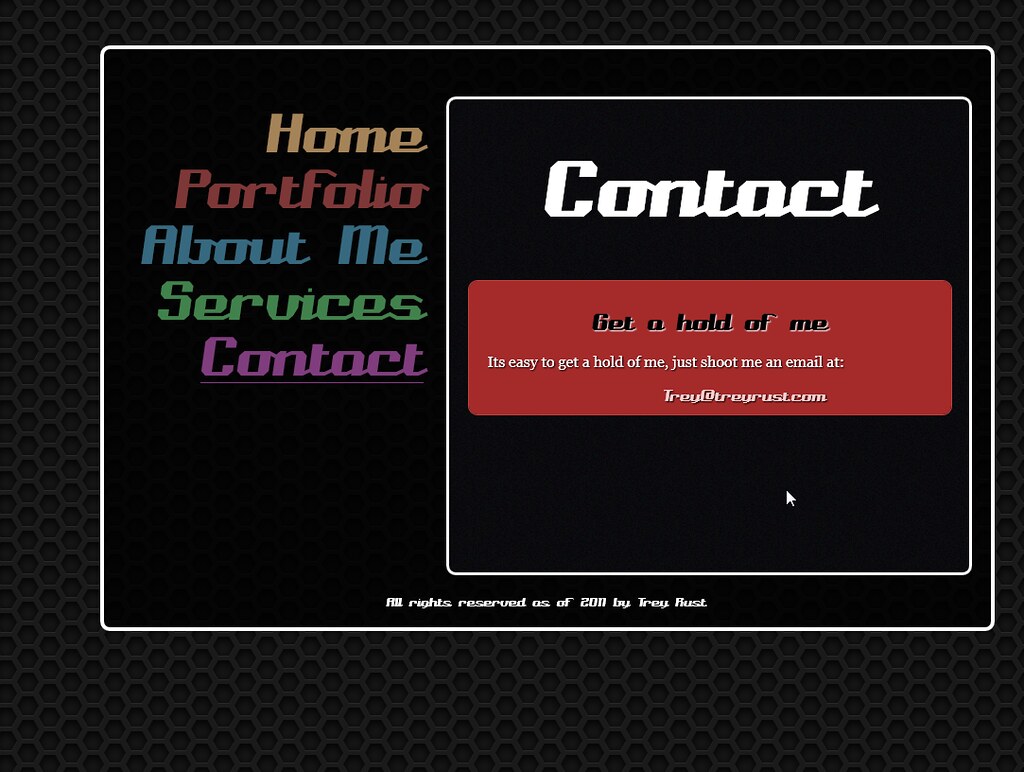
June 7, 2011 at 8:21 pm #73988MemberSo, you really think my new one is bad? http://farm3.static.flickr.com/2717/5810201186_1ddf46c091_b.jpg
June 7, 2011 at 8:24 pm #73989MemberIts a simple site though, why would I want a huge site like fords, if its a personal portfolio site? I WANT a simple site. I am going to put some bigger stuff in my portfolio.
And do you really think a major company like ford would even be looking at freelancers? They would rather blow thousands on a web development firm.
Trey.
June 7, 2011 at 8:28 pm #73991tannercampbell
ParticipantYou mean this http://bit.ly/jMwNyK ? It’s the same story. You’ve got to study some design, no one will hire you for your skills based on these sites. I know how hard freelancing is, and if you go out into the pool with a site like this, you’ll drown.
look at http://astuteo.com/ and http://www.nosleepforsheep.com/
You have to showcase what you’ve got, or people will think you’ve got nothin’.
June 7, 2011 at 8:31 pm #73992ParticipantMy point is you won’t get clients to put in your portfolio to impress prospective clients with a website that doesn’t showcase your ability. Forget Ford, what about Sam’s mechanic shop down the street, or the local storage facility around the corner, or your Aunt’s cookie business — you have to design something that shows people what you can do, otherwise no one will ask you to do anything. That’s all the help I can give, my two cents if you will. Good luck Trey.
June 7, 2011 at 8:52 pm #73995MemberI mean, this is chris’ website http://chriscoyier.net/ Does that really look like someone who could code a big site like this one? He made this website you know.
And why do you think everyone says to do work for free for the first couple of sites? I know I need some sort of portfolio. I’ve already picked out some people that I respect enough to do that.
My point is, you can’t showcase ALL your abilities in one website without it turning out to be a total cluster #$%&. I tried to use as much jQuery/CSS3/HTML5 as I could, but I really can’t cram everything in, its just a portfolio. I agree it needs to be good, but does good have to mean big?
And your comparing it to some good websites, I will admit it. But what your not doing is comparing it to other websites that have a similar design philosophy.
One of the unique things I was going for in my website, was it being almost 100% CSS3, rather than a ton of gradients, textures and illustrations. And that right there should be enough to prove I’m not completely incompetent.
Offering some constructive criticisms would be nice, rather than just telling me to restart the first grade. I am confident in my code, I don’t need to relearn HTML.
Trey.
June 7, 2011 at 9:08 pm #73996ParticipantAre we being punked?
June 7, 2011 at 9:40 pm #73999Member@andrewsellenrick Probably, I’m just gonna ignore the rest of his comments unless he says something constructive… and as well considering he has had TONS of questions, but never helped anybody, at least. Not enough to be able to find ANY, through all the topics he started.
Not to brag but, I’ve only made 1 topic on here asking for help. And it turned out to just be a stupid thing that the W3C wants us to live with.
Now, what do people with actual experience have to say? I’m interested in hearing from some of the others that critiqued my work before, and really helped.
And just in case anyone has trouble finding the current pic, here it is: http://farm3.static.flickr.com/2717/5810201186_1ddf46c091_b.jpg
Trey.
June 7, 2011 at 11:18 pm #74001Participant@treyrust, you are right. If I am going to make rude comments I should have at least made a few constructive ones first. Things I like about your design… The background image, the font choice, and the use of color. Things you might improve upon… The unique font is great for the menu, but is hard to read in smaller headlines, try using a san-serif instead. The use of white strokes is a harsh way to separate your content and creates boxes in boxes in boxes. Try using a vertical line, different bg color, or texture to create contrast instead… even a gray stroke would be easier on the eyes. Don’t be afraid to let some small design elements to break the boundaries of your content to create visual interest.
June 7, 2011 at 11:27 pm #74003scubasteve
ParticipantHey treyrust,
Here’s what I think, plain and simple, you decide how constructive it is…
Your code.
Its decent. It’s surprisingly readable, although i’d suggest some indentation for more readability. There’s some issues with paragraphs inside of list items or improper usage of header tags. In this regard i’d suggest looking at w3schools for what each tags purpose is. As well as work on your layouts. You also say on your site that you know html5, but there is no use of it. Same thing for css3, except in this case, just because you can do it doesn’t mean you should, use what you need.
Your Design.
It’s bad. I don’t want to say it’s terrible, it’s not, but there’s just so many things lacking that I’m not sure how to help you improve any of them. The only thing I applaud you for is wanting to be different. Funny thing about that is when you try to be different you end up with a design that is outside of the box, but also outside of good design. People are inside of the box for a reason, because it works. I suggest if you want to be different think on the edge of the box and only be a little different. Besides that you definitely need to improve your design skills. Try these sites:
- http://www.alistapart.com/
- http://www.smashingmagazine.com/ (the best)
- http://thinkvitamin.com/ (sign up for membership if possible)
- http://sixrevisions.com/
- http://www.onextrapixel.com/
- http://www.456bereastreet.com/
- http://simplebits.com/
- http://www.pearsonified.com/
- http://www.cssbeauty.com/
- http://snook.ca/
- http://www.andybudd.com/
- http://www.briangardner.com/
- http://fadtastic.net/
- http://www.colourlovers.com/blog/
- http://2010.designmeltdown.com/
- http://www.smileycat.com/index.php
- http://www.webdesignfromscratch.com/category/basics/ (START HERE)
- http://www.andyrutledge.com/
- http://chriscoyier.net/blog/ (Obviously)
- https://css-tricks.com/ (Again Obviously)
- http://www.inspiremonkey.com/ (for inspiration)
These are just some sites that I myself read. You may ask how I read them all? Two words… Feed aggregator. I have a mac so i use Reeder. It helps immensely in reading lots of blogs quickly.
One more quick tip on your designs in general, for your site at least. Your going for a portfolio site, so the one page, dynamically loaded content just doesn’t work well at all for that. Try not to push away the html conventions that are standard. And with that thought, standards compliance is also very important.
Okay! So now you know what I think, how about what I think you should do… again you choose if you want to follow these or not…
Steps to becoming an awesome designer in a few short months (perhaps less)…
- Read all of the links I listed as well as search for more. Do this for about a month. Reading all of these can be difficult, so get a feed aggregator to simplify it.
- With your new found knowledge, start practicing. Make sample sites to demonstrate what you’ve learned. Then show them to people. Not your family, they’ll tell you it’s great no matter if it’s totally awesome or a horse’s rear. Instead try friends first, then try online. This forum will work or any good web design forum.
- Once you and those other people are sure your skills have improved, try and do your site again. (I know you’ve done it over and over again, but if you really want to be a great web designer that’s what it takes. If that’s not what you want to do, maybe your on the wrong career path).
- When your done with the redesign show it off to those same people. If it’s not great, repeat the previous step again until it is. Once it is then your ready.
- Now your ready to do small sites. I know you want to do big awesome sites. But everyone starts out small. So go to local places and offer to redo their website for free. Yes free, with no true experience, they won’t pay you no matter how much skill you say you have. It’s about show not tell in this biz. So do at least five local sites, i’d suggest places that don’t even have sites or have very old sites. Elementary schools are a good example.
- After you start doing these sites, where hopefully they will at least be good looking and function as promised (Function on the web is more important than design), add them to your portfolio as images, the more the merrier.
- Finally once you’ve filled up your portfolio with ONLY the best of your designs. You can now start charging. But again, start small, choose small places at first and charge in small increments as your skills and design prowess increases.
* As a side note to this list, consider a niche market, no one is a master at everything and focusing your skills on one area will bank you more business as well as make you look more professional.
And just to cheer you up… a few years ago I knew absolutely nothing… about web design, of course.
Finally, be professional, if you want to make money in this business, you got to treat it like one.
GOOD LUCK! And BEST WISHES!
Scubasteve :)
Your friendly neighborhood helper!
-
AuthorPosts
- The forum ‘CSS’ is closed to new topics and replies.