- This topic is empty.
-
AuthorPosts
-
December 22, 2015 at 8:16 am #236095
grimski
ParticipantI have (what I consider) quite a complicated ‘table’ layout. As the website is responsive and will need an alternative layout on mobile, I thought creating the table with divs/lists might be the way to go – especially seeing as I design for mobile first, then up.
I’ve managed to create the basic table structure here:
http://codepen.io/moy/pen/eJzjpE
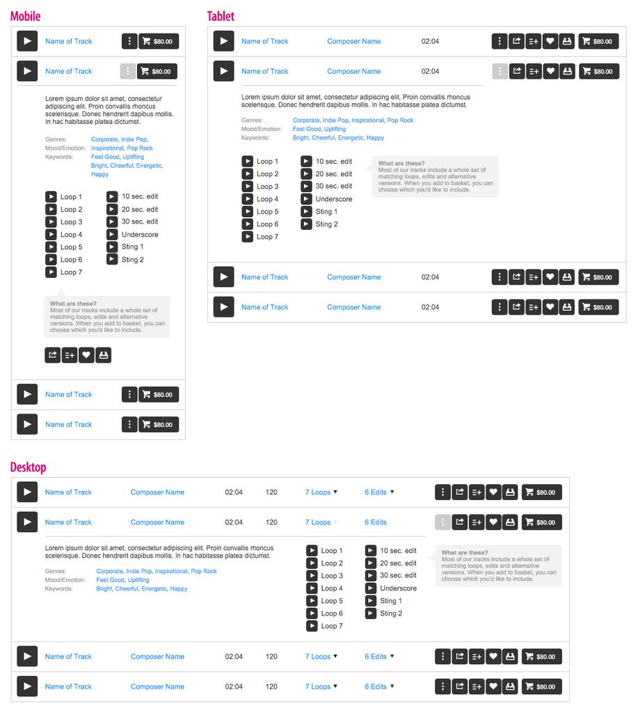
It works pretty well, the issue is once a row is clicked, the panel expands showing more extra information – this is a pain. Here’s a wireframe:
http://postimg.org/image/48dlzkdon
For me the content should be nested as it is related to the row it is clicked on. However I’m really not sure if this is achievable but it would be preferred.
The next option would be to _simply put a hidden row with all the extra info below each ‘track’. Then show/hide it when required. Even this is a bit trick though – I don’t see away you can mimic
colspanin CSS?Anyone have any ideas on this, a bit stuck!
December 22, 2015 at 8:59 pm #236106Krish1980
ParticipantUsing divs or lists for table data is not semantic, and , from what I understand, bad for accessibility.
It is better to code using tables and use jquery solutions as a workaround.
December 23, 2015 at 2:08 am #236109ParticipantHi @Krish1980, thanks for the reply, I agree with what you’re saying. When content is laid out in a table, it should be a table, it’s what it is! Generally speaking I always stick to this principle.
The only reason I was swaying from this was the as I build from mobile upwards, I’d need to strip all the table
display:styles off every table, thead, tbody, tr, th, td. Instead setting them to block for example. Then in a media query, add them all again for 600px+.…but then again, with the dropdown/expandable row, it’s complex so it probably is best to got with a table.
A small issue I may have is, controlling the
colspan‘s. As they’ll change depending on whattable-cell‘s are hidden.January 6, 2016 at 7:16 am #236446ParticipantUnfortunately this isn’t going away, I need help!
I thought it might be more use if I uploaded the wireframes I’ve been provided with. Here’s the layouts for the 3 breakpoints required
http://i264.photobucket.com/albums/ii195/grimaldi360/Web%20design%20issues/wireframe-2.jpg
Really hope someone can help. I feel the expanded section should be nested in the above
<tr>as it’s related to that content, but I understand this mightn’t be possible.The only other way I can think of is just to have alternating rows, with the expanded (extra info)
<tr>coming directly after the<tr>which is on display. Then just hiding them until interacted with. The layout could be achieved usingcolspanbut what about the breakpoints, that’s going to cause an issue isn’t it, as there’s no way to control it via the CSS. Javascript required?January 6, 2016 at 7:46 am #236447Paulie_D
MemberGotta be honest here…I’m not seeing a table….or a list (as such).
Each row / track would have a wrapper containing a couple of direct children..
The first would be the primary, top line, information (your track rows).
The second would be the ‘content’ div that appears when furrther information is required. Jquery could do the slidetoggle with no problem
http://codepen.io/Paulie-D/pen/ZQexqW
Now you might use lists and tables inside those building blocks but on looking at the wireframe all the elements seem to lend themselves to distinct areas all of which can be done with floats / flexbox etc.
I think that you’ve gotten kind of wedded to the table first idea and are now trying to get it to work using tables when, IMO, it’s neither required or optimal.
January 6, 2016 at 8:25 am #236451ParticipantI think you’re right @Paulie_D, it started off with good intentions but along the way I got lost and was almost trying to reverse engineer it.
I really like that approach, and it seems simple when you put it that way!
The only issue I can see is aligning the expanded content with that above it. Not a problem with the text but the ‘loops’ and ‘edits’ should display below their headings – I guess that’s why I got so obsessed with the colspan idea.
I’m thinking there’s not really away around this though without setting percentage widths on each section?
As I need to support IE8+9, I suppose this would solve the issue of it working in those older browsers without needing a separate fallback? Though the pros for using
flex, the centring and the justify-content/space-between is pretty priceless!January 6, 2016 at 8:37 am #236452MemberIt’s just something I threw together and I use flexbox by default.
You can do the whole thing with floats and percentage widths…as long as the widths are the same in the upper primary bar and the lower content section it shouldn’t be a problem.
Oh you might have to use a dummy div here and there (for the empty ‘columns’) but it doesn’t look that hard.
In fact, and I hate to say it, but Bootstrap might be the way to go here. You can elimimate the empty divs then and pull-left or whatever.
Not sure how much traffic you’ll get for IE8/9 on phones/tablets though. :)
January 6, 2016 at 9:55 am #236459ParticipantHaha true! I suppose on IE8/9 on desktop I could switch it out for
display: tableand I think having the loops/edits not lining up in the expanding section is acceptable, as long as the content is still accessible, which it will be!So I guess it would look a bit like this (based off your example):
http://codepen.io/moy/pen/obZdoQ#0I tried using
flex-growbut that didn’t work, obviously because they’re not contained in the same div I guess.I suppose it will need to be percentage widths if the edits/loops lists are to line up with the edit/loop text above. I thought about nesting the content within each div and expanding them all – but that’s going to cause major issues for the layout on mobile/tablet.
…unless javascript was used to get the widths of the necessary divs and set it on the relevant content in the secondary div? I’m guessing that’ll be mighty heavy though, there could be 50+ tracks on a page!
January 6, 2016 at 10:14 am #236460MemberI suppose it will need to be percentage widths if the edits/loops lists are to line up with the edit/loop text above.
Yep, I’d say so…its probably the best option.
I mean flexbox can do some things depending on what elements will grow and which won’t….but I think % widths would be the optimal option here for the browser suppoprt you need.
You can always start with floats and enhance with flexbox.
January 6, 2016 at 10:34 am #236461ParticipantTried to give it a shot using
display: tableas a test.http://codepen.io/moy/pen/XXMYpo
Looks ok to begin with but when scaling the viewport all the columns go outta line. I suppose this would be less of an issue with floats. It’s a shame some columns and be restricted to fixed (or min/max) widths, but what can you do. It could to prevent the content from wrapping in certain columns.
January 7, 2016 at 8:51 am #236484ParticipantI’ve made some decent progress with this @Paulie_D:
http://codepen.io/moy/pen/XXRrwL
As you can see I’ve used floated divs, with percentage widths. I was thinking of using
flexboxto centre the content. I’m not too experienced with flex, I’ve triedalign-items,align-contentbut I can’t see to get it to work. Do I need to add another div within each cell and target that?I’ve also added in the break points and hide, what needs to be hidden at each breakpoint. So there’s a pretty decent overview of what each layout will be like and what spacing it needs.
I was going to add percentage widths of mobile and tablet as well but is this something
flexboxcould handle? Spacing the columns out evenly and is it possible to prevent certain ones from wrapping? The buttons at the end of each track won’t really change with the occasionally exception of the price being a few digits higher. I’m not sure if it’s possible to prevent the items within.track__actionsfrom wrapping onto the next line. If not, maybe I could do what I’ve down with the play icon – pulling it out of the content so it’s width doesn’t interfere with the rest.January 7, 2016 at 9:01 am #236486MemberI was going to add percentage widths of mobile and tablet as well but is this something flexbox could handle?
Yes, absolutely…no need to change anything there.
I was thinking of using flexbox to centre the content. I’m not too experienced with flex, I’ve tried align-items, align-content.
Depends on which way you want to center it, vertically or horizontally and whether you are using rows or columns.
Chris has a handy guide – https://css-tricks.com/snippets/css/a-guide-to-flexbox/
January 7, 2016 at 9:08 am #236487ParticipantIt would be to center the content vertically. Horizontally I’d probably just use
text-align: center;.The only thing I found on mobile/tablet was it effected the play button. It centred everything. Ideally the play button would have a fixed width so the ‘track name’ wasn’t too far away from it.
EDIT:
http://codepen.io/moy/pen/obWNeW
I think I solved it by setting
display: flexon the ‘cells’ and thenalign-self: center;– sound about right? Shame the buttons aren’t centred but I imagine it’s a case of applying the same to each button or is there another command?It works better on mobile/tablet now too. I believe
justify-content: center;was breaking it. Is there a command to stop.track__actionsshrinking below the width of it’s content or do you need to know the width?Thanks again for all your help, great stuff!
-
AuthorPosts
- The forum ‘CSS’ is closed to new topics and replies.