- This topic is empty.
-
AuthorPosts
-
July 5, 2017 at 9:07 pm #256541
b2995
ParticipantHi Everyone!
I need some help with CSS. I would like to place an image to the left of my search box (col-full) and under my secondary menu and have it lay on top of everything else (site-navigation). I’d like it to disappear on tablet/mobile size.
Here’s a link to my development site: DiscountSalsaShoes.com/dev/
I know more than a beginner but not this much to do this, and appreciate help in working this out.
Theme: Storefront Pro & Page Builder
Wordpress: 4.8July 25, 2017 at 4:24 am #257023webinuse
ParticipantHi, it would be much easier if you give us more details. First what image? Do you want to change backgorund, or to place any image? And what do you mean by “lay on top of everything else”? Do you mean like above everything, or in front of everything?
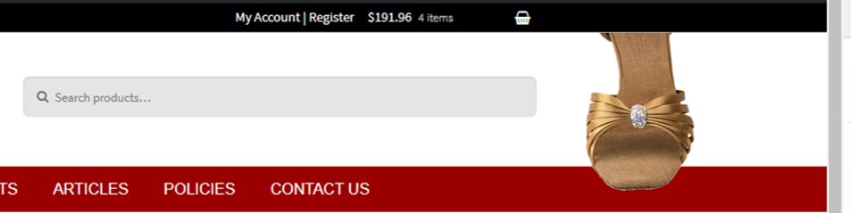
July 25, 2017 at 8:17 am #257032ParticipantHi Korovjov123 –
I want to place the image called shoe.png…
- to the right of “widget woocommerce widget_product_search”,
- under the “secondary-navigation”
- I also want it to lay on top of the header and the navigation
- But I want it to hide on mobile.
Here’s a link to an image of what I’m trying to accomplish: http://discountsalsashoes.com/shoe_example.jpg
Thank you!
July 25, 2017 at 12:36 pm #257034Atelierbram
ParticipantI would try to absolute position a pseudo-element in relation to the search widget, and use that as a wrapper for a background-image. Something like:
.site-header .widget_product_search {
  position: relative; /* to position the pseudo-element against */
}

/* pseudo-element: */
.site-header .widget_product_search:after {
  content: "";
  position: absolute;
  z-index: 2;
  right: -400px /* edit this value */;
  top: -100px/* edit this value */;
  width: 400px /* whatever the width of your background-image */;
  height: 200px /* whatever the height of your background-image */;
  background-image: url(path/to/background-image.jpg);
  background-repeat: no-repeat;
  background-position: center center;
}
July 25, 2017 at 11:48 pm #257068ParticipantAtelierbram is right, this is the best and the easiest way to accomplish what you want. And if you want to remove it on mobile, all you have to do is make your media querie, or if you have breaking points already which I assume you do, use one of them:
@media only screen and (max-width: 767px) {
.site-header .widget_product_search:after {
background image: none;}}July 26, 2017 at 6:17 pm #257107ParticipantAhhh! Perfect! I’m so easily entertained…LOL!
Thanks guys! Works perfectly ;)
-
AuthorPosts
- The forum ‘CSS’ is closed to new topics and replies.
