Every website that’s made me oooo and aaahhh lately has been of a special kind; they’re written and designed like essays. There’s an argument, a playfulness in the way that they’re not so much selling me something as they are trying to convince me of the thing. They use words and type and color in a way that makes me sit up and listen.
And I think that framing our work in this way lets us web designers explore exciting new possibilities. Instead of throwing a big carousel on the page and being done with it, thinking about making a website like an essay encourages us to focus on the tough questions. We need an introduction, we need to provide evidence for our statements, we need a conclusion, etc. This way we don’t have to get so caught up in the same old patterns that we’ve tried again and again in our work.
And by treating web design like an essay, we can be weird with the design. We can establish a distinct voice and make it sound like an honest-to-goodness human being wrote it, too.
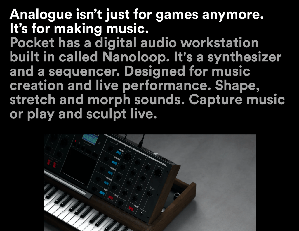
One example of a website-as-an-essay is the Analogue Pocket site which uses real paragraphs to market their fancy new device.
Another example is the new email app Hey in which the website is nothing but paragraphs — no screenshots, no fancy product information. It feels like a political manifesto hammered onto a giant wooden door.

Apple’s marketing sites are little essays, too. Take this one section from the iPad Pro all about the LiDAR Scanner. It’s not so much trying to sell you an iPad at this point so much as it is trying to argue the case for LiDAR. And as with all good essays it answers the who, what, why, when, and how.

Another example is Stripe’s recent beautiful redesign. What I love more than the outrageously gorgeous animated gradients is the argument that the website is making. What is Stripe? How can I trust them? How easy is it to get set up? Who, what, why, when, how.

To be my own devil’s advocate for a bit though, we’re all familiar with this line of reasoning: Why care about the writing so much when people don’t read? Folks skim through a website. They don’t persevere with the text, they don’t engage with the writing, and you only have half a millisecond to hit them with something flashy before they leave. They can’t handle complex words or sentences. They can’t grasp complex ideas. So keep those paragraphs short! Remove all text from the page!
The implication here is that users are dumb. They can’t focus and they don’t care. You have to shout at them. And I kinda sorta hate that.
Instead, I think the opposite is true. They’ve seen the same boring websites for years. Everyone is tired of lifeless, humorless copywriting. They’ve seen all the animations, witnessed all the cool fonts, and in the face of all that stuff, they yawn. They yawn because it supports a bad argument, or more precisely, a bad essay; one that doesn’t charm the reader, or give them a reason to care.
So what if we made our websites more like essays and less like billboards that dot the freeways? What would that look like?

Webpages are text markup. The core raison d’etre of any webpage is in its text, even if it’s just a form. I don’t design a single UI element until the words are finished. If the copy is tight the rest is easy.