There was just a bug late last year where system fonts (at least on Mac, I don’t know what the story was on other platforms) in Chrome appeared too thin and tracked-in at small sizes and too thick and tracked-out at larger sizes. That one was fixed, thankfully. But while it was a problem, it was the reason I gave up on system fonts for now and switched something else. A performance loss but aesthetic gain.
Now there is a new much worse bug, where the system font can’t be bolded. It’s not great, as a ton of sites roll with the system font stack as it has two major benefits: 1) it can help your site look like the operating system 2) it has great performance as the site doesn’t need to download/display and custom fonts.
Jon Henshaw wrote it up:
… the bug caught the attention of Adam Argyle, maker of VisBug and Chrome CSS Developer Advocate at Google. Argyle created a Chromium bug report, but the Chromium development team ultimately decided it wasn’t a blocker for releasing version 81. That resulted in sites like Coywolf not being able to use bold text for fonts that are larger than 16px (e.g., every heading).
The bug won’t be fixed in version 82 because the Chromium team announced that they’re skipping it, and will be releasing version 83 in mid-May instead. Argyle assured everyone on the original GitHub bug report that it would be fixed in version 83.
So we’re looking at 4 weeks or so. Šime Vidas proposed a temporary fix of going Helvetica for now:
body {
  font-family: -apple-system, Helvetica;
}
I guess with -apple-system in there, older versions of Chrome/macOS still might be able to benefit from system fonts? Not sure.
That brings up a source of confusion for me. When I first heard of using system font stacks, there was -apple-system and BlinkMacSystemFont and you were supposed to use them in that order in the font stack. Then came along -system-ui, and that seemed to work well all by itself and that was nice as it was obviously less Mac-specific. But there is also system-ui (no starting dash), and that seems to do the same thing and I’m not sure which is correct. Now it looks like the plan is ui-sans-serif and friends (like ui-serif and ui-monospace). I like the idea, but I’d love to hear clarity from browser vendors on what the recommended use is. Are we in a spot like this?
/* Just a guess... */
body {
font-family:
ui-sans-serif,
system-ui,
-system-ui,
-apple-system,
BlinkMacSystemFont,
Roboto, Helvetica, Arial,
sans-serif,
"Apple Color Emoji";
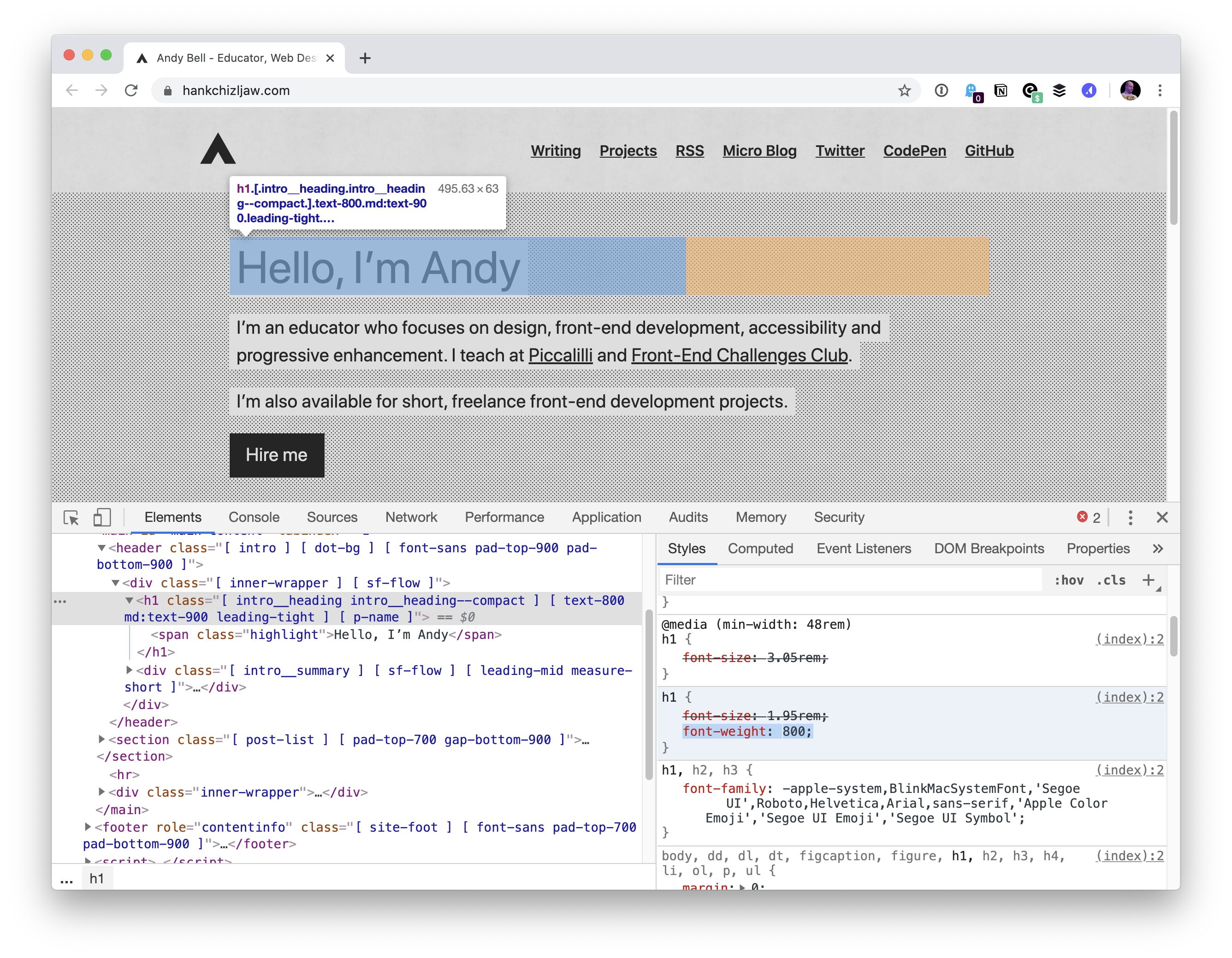
}Another observation from me… as I was trying to replicate this on Chrome 81, at first I was like “weird, works for me”, because I was trying out the bolding on default 16px text. I noticed that it was when the font was 20px or bigger the problem kicked in:

Bramus has an alternative fix idea: use Inter.
The value
system-uiwas implemented as-apple-systemfor a while, but-system-ui, I come to believe after doing some research, never was a thing.