I finished up a brand new series in The Lodge! It’s all about building a website from scratch. My friend Jeff, the ceramic artist’s website, to be specific.
It is a 40-video series that goes from a blank canvas to done. It covers every decision made, every line of code written, every pixel plotted, and every toggle toggled.
We start out how all non-personal redesigns start, with the clients desires for a new site. What drives it? What goals do they have? Can we discover any deeper themes? Can we organize and put a point on it all?
Then we look at Jeff’s work and the recent changes in aesthetics to it, specifically in how he photographs it. We take queues from that in designing the new site.
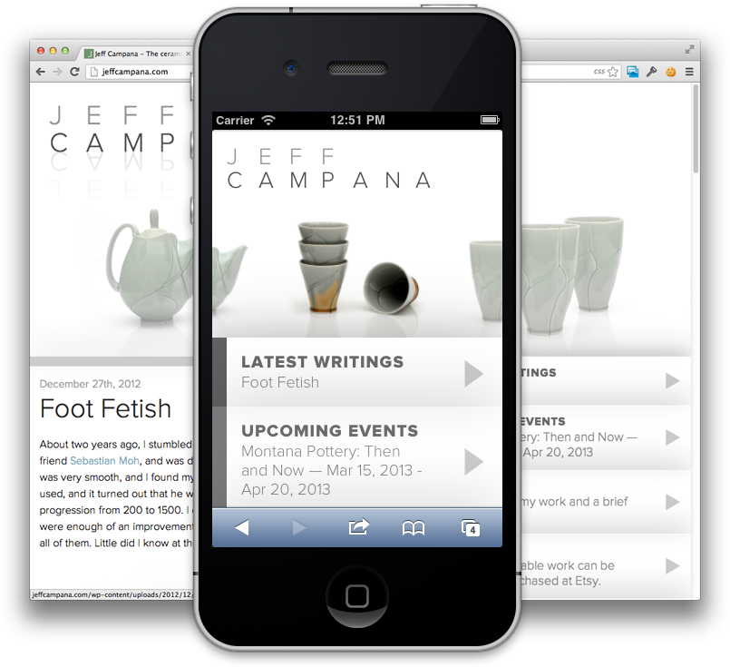
Jeff is sold on the idea of a mobile-first philosophy. Not through us explaining it to him, but by merely suggesting “Hey what do you think about designing site on the phone first?” and letting him figure out the obvious advantages there.
Then we design and build build build!
We want to give Jeff as much control as we can, so we leverage the abilities of WordPress to be a truly customized CMS to give him that control. The slider on the homepage is controlled by “custom post types” that Jeff can add, remove, edit , and even re-order easily all through the WordPress admin area. Events are handled the same way. Not through just categorized posts or pages, but entry screens we create just for this type of content.
We finish off by making sure the site looks good on larger screens as well, even adding in additional content because we have the space to support it.
Interested? Sign up for The Lodge to watch them. If you do, you’ll also have access to the 150+ video series detailing the redesign of CSS-Tricks (v10) as well!

Beautiful site! But it fails gracelessly in IE8. I know IE8 is a pain, but shouldn’t sites still sort-of-almost-kinda-work in IE8 for another year or so? Or is it safe to simply ignore it?
My opinion is thus:
Screw IE<9. The only way to get past such terrible browsers is to force their users to upgrade. Maybe turn off all styling, but if you’re still using IE8, you’re probably used to sites not working.
Ok, maybe too aggressive an attitude, but it’s what I do whenever possible.
As ever, it’s a site-by-site call with loads of factors involved. When I get some time I’d definitely like to go back and and least make it simple and navigable in IE 8.
Of course, like every rational person, I’d rather design “future first” as well (SVG images will still be valuable five years from now, but IE8 compatibility is a very perishable commodity). And, now that I’ve the blessing of The Chris Coyier to make IE8 even more of an afterthought, I’ll test pushing the envelope a little further…
Its all tricks to update their versions, like while you use google in browser other than chrome it shows that get a faster browser i.e. chrome, and when you use bing in browser other than ie, it shows get a faster browser i.e. IE. they are all tricks of forced promotions.
Screw <IE9?
You’re lucky, guys… We still work for IE7 in Italy…
Interesting place for a menu.
I have watched the first 6 videos…fantastic series so far…I hope you do more…These small bread and butter sites are I bet some of the most common sites that a lot of web designers work on..So a practical series such as this is very helpful…
Please keep making more of these lodge tutorial series…
Thank you Michael! Thanks very encouraging.
Since IE8 is the latest browser you can get on Windows XP, I think it should be supported since there are, unfortunately, a lot of people still using it. It’s not terribly difficult to do. Anyway, I glanced at the ceramic site briefly and it looks really clean. Good job!
Top slider looks messed up in Chrome on Mac, I can scroll to to right and entire page content moves off screen. In Safari gestures prevent me from scrolling back, so once content is gone I can only refresh page to get it back. Other than that looks impressive on 27″ screen.
Middle click is troublesome on desktop at the moment. I can scroll the page horizontally and I can slide through the images using it while all the images open into new tabs in the background. I’d also like to see some kind of “it is a slider!” indicator on desktop, or even better use arrows to click through as mouse isn’t a convenient tool for touch based controls. Disabling outlines (when not in :hover) would be nice too as now I get huge focus rectangles far outside the active link blocks. Alternative :focus style could be a way to go.
Great to see another series go up. The snout to tail approach is really valuable for a web designer who is fresh off the boat. It would be great to have a bit more transparency on the video “titles” if only so we can decide if the series covers elements that would interest us i.e. a contents page. Also @chris there is a typo in the last paragraph of your Lodge sign up page. Its says 19 videos and not 190 – confused me slightly when I saw it. Great work, keep it up. Loving ShopTalk too.
A table of contents is a swell idea! Done:
Lovely design Chris, you did an amazing job. Especially regarding the top slider and the changing left borders on the navigation. It feels great. :)
Chris, this is a very delightful site. Simple and still elegant. This is enough for me to sign up for the lodge right now.
Love the site, Chris. White space is excellent, typography works well, and the controls are intuitive. What I don’t get, however, is why oh why are you hiding content on the homepage on the tablet / mobile version ( “.home-article ” : < 713px)?
As a responsive web developer, I like the idea of being able to tell someone, “hey check out the homepage article at xyz.com” and be able to expect the same content experience on any device, but have the viewing experience optimized for any device.
Was it a technical constraint, or a design decision?
Hey Jonathan,
This is a “mobile first” series, so rather than thinking of it as “hiding content” on the small screen version, think of exposing additional content on the large screen version when there is room for it. That’s the way it is thought about and approached in the series. The article doesn’t even load by default, it is Ajaxed in if the conditions are right.
You do have a point about the “hey check out the homepage article at xyz.com” thing though. That’s social behavior that a designer doesn’t have control over. However, I think it would be OK. The very first link in the very large promenant navigation on the homepage is “LATEST WRITING” and the title of the article. Surely anybody could figure that out. The fact that the article is displayed in full is kind of a bonus.
Thanks for the explanation, Chris. I missed the Ajax load since I initially loaded the site at a higher resolution, then scaled down.
I deal with a lot of clients that want to hide content on lower resolutions, so it’s kind of a sensitive subject for me. However, you make a solid argument about having the article immediately linked to so that the content is still accessible, and I love that it’s being Ajaxed in on higher resolution devices.
Thanks for putting the series together. Will definitely check it out.