The following is a guest post by Fabrice Weinberg. Fabrice is a regular contributor around here. He’s always looking forward to the latest technologies and possibilities. Here on the outset of iOS7, he looks into recreating a particular effect that you might not guess is even possible on the web. It’s tricky, uses bleeding edge features, but doable!
Let’s start with the backstory. @simurai asked a while ago if it where possible to do a blur effect on arbitrary DOM nodes to simulate the iOS7 Translucent Effect on the Control Center (you can find his Pen here).
I won’t explain exactly how to build this effect for the Control Center but rather focus on how to build something similar to the blurred header effect you can find in iMessage and many other apps in iOS7. But the tricks you will learn will make it possible to build the Control Center effect too.

Used technologies
This solution makes heavy use of CSS Regions which is still a working draft but thanks to Adobe it is implemented in WebKit/Blink today.
With the release of iOS7, Mobile Safari is the first browser to enable this feature by default (still -webkit- prefixed). In Google Chrome 29 you just need to enableexperimental-webkit-features. in Google Chrome 30+ it is experimental-web-platform-features under about:flags.
CSS Regions
Quick introduction to CSS Regions: it is all about splitting the structure of the page from the content. There are two new CSS properties flow-into: named-region; and flow-from: named-region; these two are used to defined a so called named-region. You can think of it as a variable which will hold arbitrary content.
The element with flow-into on it is like a reservoir of content. That content “flows” into other elements with flow-onto on them.
A simple example:
See the Pen %= penName %> by Fabrice Weinberg (@FWeinb) on CodePen
Assuming your browser supports regions, you’ll be able to see the structure is separated from the content. Using flow-into: content the content from the div with the class .main-content is flowed though both divs with the class .region using flow-from: content;
For a more in depth look at CSS Regions read the great article by Arno Gourdol CSS3 regions: Rich page layout with HTML and CSS3
Getting Started
Let’s begin by defining the HTML structure. It is quite simple. We need some sort of a header and a container for the messages. Because of the use of CSS Regions, another container is needed to hold the content which will flow though the header and message container.
See the Pen # by Fabrice Weinberg (@FWeinb) on CodePen
There is CSS here to blur the .header.
Like in the first example, everything that doesn’t fit in the .header flows though the .content-container.
That is not the behavior we are looking for. We want to have the whole content in the .content-container and only blur content that is “hidden” by the .header. Let’s fix that.
Using CSS Regions to “beam” the DOM
This part is kinda hacky because the behavior of putting overflow-y: auto on an element that gets the CSS property flow-into: named-region; isn’t described in the spec and thus dependent on the implementation.
CSS regions allow us to define the flow of arbitrary DOM nodes and even let us add overflow-y: auto to make the content scrollable. Additionally, there is the need of a defined height.
Let’s use the sample from above, adding a fixed height and overflow-y: scroll to the .main-content:
See the Pen %= penName %> by Fabrice Weinberg (@FWeinb) on CodePen
That doesn’t look that good yet. Scrolling is working but the .header stays empty.
The fun part comes now, we are about to “beam” the content from .main-content to the .header element. This can be done with CSS3 and the ability to transform the whole content layer of the .main-content by using transform: translateY() to move the .main-content upwards by the amount of the .headers height.
See the Pen %= penName %> by Fabrice Weinberg (@FWeinb) on CodePen
That looks better! But still something looks wrong. There is always some content hidden by the .header now. To fix this we just have to add the height of the .header as padding-top to the .main-content to accommodate for the space taken.
See the Pen b8cc5b9a310ff94de8c707c24a3c99d0 by Fabrice Weinberg (@FWeinb) on CodePen
That’s it. This is the core technique used to achieve the iOS7 translucent/blurry effect. Based on this technique, I built this little playground where you can customize the header and even add a tint color.
See the Pen iOS7 Translucent CSS by Fabrice Weinberg (@FWeinb) on CodePen
Performance Matters
Let’s have a look at the render performance of this effect:

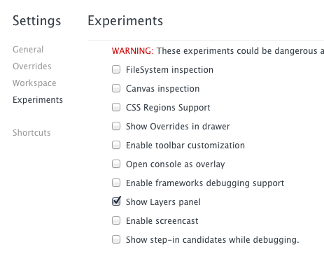
Above you see a timeline taken while scrolling up and down, you can see that nearly half the time we have per frame (16.66ms) is used for painting. Before we look into that I want to tell you about a great new feature in the Chrome DevTools called Layers. It’s a new tab in the DevTools where you can see what elements Chrome promotes to its own layer in a document. It is still experimental so you have to enable the devtools-experiments flag in about:flags. Be sure to restart Chrome afterwards. Then to activate the Layers experiment open the dev tools click on the wrench icon in the lower right corner (or just hit ?) to open the settings.
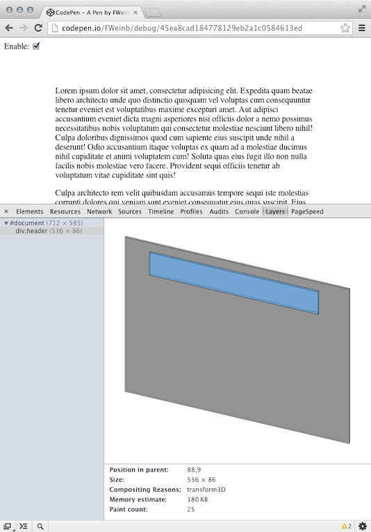
Using The Layers Tab

Above you see the Layers tab open. Chrome created just one layer for the whole document, that means that any change on the page will trigger a repaint of the whole document. That is expensive! You may have noticed the checkbox in the upper left corner. It is used to apply transform: translateZ(0) on the .header element. You can find the Pen here. The transform: translateZ(0) hack is used to promote an element to its own layer on the GPU.
As you can see there is an additional layer for the div.header now. Let’s do another timeline, now using the transform: translateZ(0) hack:

This looks so much better. Paint costs are only approximately 1/10th of the overall time per frame now. With the new layers tab it is now much easy to see where Chrome created layers and to see potential performance bottlenecks.
Wrapping It Up
It’s fun to see that this is possible today in WebKit/Blink. But (there is always is a but) this technique is not ready for production. Though it’s working quite well on the desktop it’s not working on iOS7 at the moment, it’s slow and scrolling is not working at all.
I created a GitHub Repository where you can find the source for the playground.
If anyone has any idea on how to archive scrolling on iOS7 (preferably without JavaScript) I would like to know! I hope you have learned one or two new tricks. Thanks for reading!
Layers Tab? How i can activate this? In my Chrome this tab doesn’t appear.
Like I explained you need the latest version of Chrome Canary. And enable it in about:flags.
Since version Chrome 30 i found it, in overrides
I dont want to create a controversy, but lets be honest -at least- This blur effect is not an iOS invention at all. In fact, is a pure copy of Windows Vista (2006), and this technology was called Windows Aero Glass (you can google it), so, this post should be titled: “Blurry Transparent Header Effect like Windows Aero Glass on CSS”
Yeah, okay, so Microsoft did it 6 years ago, but saying “from iOS 7” resonates better with today’s audience, don’t you think? ;)
Yeah…. because Microsoft invented translucency…
I understand your point, but it’s a bit pointless. Microsoft’s Aero glass was not a header with content flowing up under it, so if we are trying to create a header with translucency why would we not reference iOS7?
SVG is entirely capable of representing this with a
feGaussianBlurfilter using theBackgroundImagesource; tools like Inkscape support that well (could be good for mockups) but several years ago when I was playing with it no browsers supported it and I doubt that that has changed.I am working on a solution to the same problem that works in modern browsers. So far I have managed to take a snapshot of the DOM through js using html2canvas and blurring it with a Gaussian algorithm. Just need to have it clip properly and make it follow along with the scroll. This solution will be very js heavy but offer descent cross-browser compatibility. Will share with the CSS Tricks community once production ready.
I just read this whole post on my iPhone running iOS 7 and it all worked fine for me. Blur effect, scrolling, everything. Nice!
A couple of weeks ago I tried the same thing for a prototype but the performance on the phone was really bad. I came up with a variation using canvas. Here’s a demo that performs really well on phones
http://fsasso.com/labs/blur/
IOS needs some adjustments because of the lack of scroll events. But it is working
I have to say your version of the blur effects works much than compared to these examples. i like my shit to work out of the box, and this stuff doesnt work – no blurr on any of the examples. I think using canvas is more appropriate.
Cool effect! Worked fine for me on iOS 7!
What apple are doing is something a little bit more than just transparency, so please stop this Vista BS.
It is an interface which is chameleon like, as it adopts the color from the background, which in turn creates a unique design. Look at iTunes on the desktop, the interface and links change based on the album art, iOS 7 is a complete extension of this & will totally change the way we design.
I have been trying to create designs which utilize this approach in the past, let the graphical background elements influence the aesthetic of the page, and have a UI which is transparent and adopt the colour.
I can’t wait for some in-browser techniques where this will be possible. color: duotone-background-inherit;
Not sure what to call it, but will be great.
Hum, opening the fullpage example on iPhone iOS7, the page scroll is smooth as silk.
I was expecting at least a low FPS rate, but I was (gladly) disappointed. So, where’s exactly the performance problem? Maybe on lower Android devices?
Which iPhone are you using? It is a little slow on my old 4S. I fixed the scrolling in this commit.
Nice.
ThrillOn.com does this on their menus, but they use canvas and css filters.
Great stuff!
It’s not working for me. The chat bubbles are show up underneath the phone and not inside it? I think something is wrong with the demo/examples.
In Google Chrome 29 you need to enable
experimental-webkit-features, in Google Chrome 30+ it isexperimental-web-platform-featuresunder about:flagsPersonally, I know both myself and a ton of clients I work with still chose WordPress (For various reasons, many covered by Chris in this post).
It’s always been robust, open and updated.
Bring on more WordPress, I says!
You are the best, Fabrice! You rule the interwebs.
Excellent solution.
I found another way to do this (FX only) using the -moz-element feature to duplicate the content scrolling behind in a new blurred element.
Fiddle here: http://jsfiddle.net/RgBzH/
Unfortunately that’s FX only at the moment.
you’re a genius. I loved it!