Media queries are great for changing values in sudden snaps at different screen sizes. But, combining the power of calc() and viewport units like vw and vh , we can get an awful lot of fluidity across our layouts. For this we’ll use a technique called linear interpolation.
Linear interpolation is a formula used to find a value between two points on a line. In our case those two points are CSS values, like font-sizes, margins or widths, that we want to interpolate between over a set of viewport widths.
The reason we might want to interpolate between values over a set of viewport widths is to avoid having to create multiple breakpoints to control the flow of our content when the viewport changes. Instead, we let the user’s browser calculate, according to our instructions, what values it gets. Let me explain.
The following snippet is a Sass function based on linear interpolation that we, at Aranja, have been calling between.
/**
 * Computes a CSS calc function that betweens a value from
 * A to B over viewport-width A to viewport-width B.
 * Requires a media query to cap the value at B.
 */

@function between($from, $to, $fromWidth, $toWidth) {
  $slope: ($to - $from) / ($toWidth - $fromWidth);
  $base: $from - $slope * $fromWidth;

  @return calc(#{$base} + #{100vw * $slope});
}
The function is used like so:
$small: 400px;
$large: 1000px;

.Container {
  /* The base (smallest) value. */
  padding: 20px;

  /* In $small it should be 20px and in $large it should be 100px,  */
  /* In viewports between that its padding should be calculated */
  @media (min-width: $small) {
    padding: between(20px, 100px, $small, $large);
  }

/* In $large we cap the value at 100px */
  @media (min-width: $large) {
    padding: 100px;
  }
}
The code example above shows how we can between a container’s padding from being 20px in “mobile”-size to being 100px in “desktop”-size. Any size between that would get a calculated amount of padding ranging between 20 and 100 pixels. To prevent the padding from exceeding the maximum value we cap it with a breakpoint.
Try resizing the following demo to see the example in action:
The between function excels in solving spacing problems. Problems that previously we would have solved by hand using different media queries.
Example layout
The talented Carly Sylvester lent me the following wireframe she designed for a volunteer firefighter website so I get to demonstrate this technique on a real-world layout.
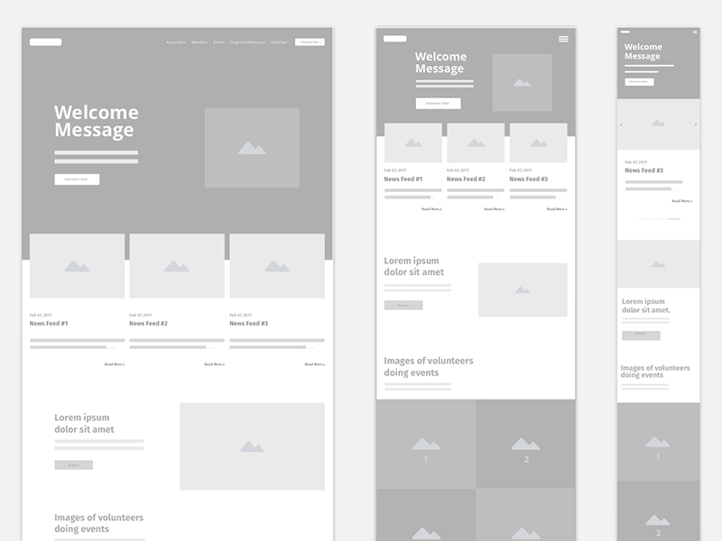
The design document consists of a desktop, tablet and mobile versions of the website, at 1440px, 720px and 324px respectively.
In reality, the lines between these different devices are not so clear-cut, so we’ll use the given values as target points and interpolate between them using our function.
Notice how the layout of the desktop and tablet versions are similar except for the use of white-space and font-sizes–which we’ll be able to interpolate between smoothly. When we get to our smallest target point we snap the layout into a classic full-width mobile layout.
For comparison, let’s see the implementation done the usual way, where the 3 main breakpoints are used to snap the layout their new values.
Videos of Demos
betweenbetweenTry browsing the demos in different screen sizes and the benefits of our function should be clear. To make the “regular” version of the website better we’d need to add more breakpoints in addition to the original three from the design document, resulting in more jumps.
Combined with the power of rem
A powerful technique we can do with the function is to between the root font-size and base our styles on rems:
The rem unit refers to the root font-size (the font size set on the :root or html element) to determine its value and the root font-size refers to the viewport width to determine its value. We set the root font-size to be 10px at the smallest and 18px at the largest and the result is a smooth transition between the two. The smallest the card in the demo ever gets is 245px, at our $small breakpoint, and it gradually grows until it reaches its peak, 440px, at our $large breakpoint.
Closing
I am convinced that by utilizing this technique we can make the web a better experience for users browsing on devices that don’t fit into the generalization of “mobile” or “tablet” sizes. For me, at least, it also makes the development process more enjoyable as there are fewer layout-related bugs on my table.
Regarding browser support–the fact that we only need calc() and vw for the technique to work puts it at around 97% in USA and Europe, and around 84% globally.
In the demos above, for example, unsupported browsers (Which are mainly Opera Mini and UC Browser) will either use our lowest (base) values or our highest (capped) values, depending on the viewport width.

Great article. Thanks for the useful tips, and the awesome SCSS function!
You’re welcome!
Love it. Will it work in email?
I’m lucky enough to have never written styles for emails. I’ll let others answer this question. Thanks for reading!
Nice. Like the way it degrades to the base or largest media-queried value if no calc.
I wrapped your function in a mixin so you can do something like
.selector { @include between(padding, 20px, 100px); }and it’ll add the media queries for you:
http://codepen.io/tobystokes/pen/NjGOde
Thanks for the mixin, Toby.
I decided to skip writing it to really drive home how the function works.
That’s the spirit! Really inspiring level of investigation here. Would be curious to know if there was a particular design issue that provoked this research, or if it’s mostly just a very convenient way to develop.
It’s a very nice way to develop, indeed.
I have been lerping for years in game dev but never thought of using it like this. Thank you for the inspiration!
I’ve been doing something similar with a scss mixin that goes from smallest px I provide to largest and transitions between the two via a vw unit. I like yours a little more! Yours is more general purpose and syntax looks easier! Awesome article!
A great technique. Thanks for the mixin :)
This is the bomb! Awesome.
Great article! Thanks for sharing this :)
This is so great, thanks for sharing David. It’s amazing how clunky mobile/tablet/desktop classes are feeling and this is so much better than trying to wrangle %-based solutions. And thanks Toby for the mixin!
Total eye-opener! I’ve been grappling with problems which are now solved – thx for sharing this!
Glad to have helped
It so good to know that! Simple solution, but so powerful!
great article, just that the font-size example with rem toward the end doesn’t really show any fonts resizing, which is a shame because I have a problem with the use of rems for font sizing and was hoping to see a good example. Great snippet nonetheless!.
Great and interesting content as always on CSS Trick dot com.
But I wonder what % of ppl resizes windows on desktop… not to mention tablets / smartphones.
I’m not entirely sure on that, would be an interesting statistic to gather!
But I think your point here might be this is only useful if users resize, which I don’t think is what this is going for. Even if a user never resizes, whatever size they come in at still may benefit from this type of responsive size thinking.
Chris is on the money, Serialspeaker.
One example from my experience: for years I’ve pulled in & extended parts of Bootstrap 3’s grid system, but I have never used their “locked width” containers model. I’d rather everything be fluid (up to a certain upper width) and make sure the layout is taking advantage of the user’s window or device size.
David Bachmann’s function here is one method for achieving a truly fluid layout. (Great article and snippet! Thanks for posting, CSS Tricks!) That said, I’m not sure where I stand on the idea that browser window/device width should always proportionately determine the vertical spacing as well. It seems each time I have seen a non-developer’s browser open in the past few weeks, it’s not at the full height of their monitor, which makes the huge vertical white space not-so-helpful. I wonder if a variation on this function could work taking viewport height in to consideration for situations like these…
I usually use this on
bodyfont-sizeand then use values that I want to scale withemunit. Great tool!Thanks for all the great advice!
This article really explains media queries in a good, simple way that even a graphic design student (like me) can understand.
Can somebody help me write the function in less?
I’ve got a less function here: http://codepen.io/MadeByMike/pen/RWJyML, also stylus, sass an postCSS and other examples can be found here: https://madebymike.com.au/writing/fluid-type-calc-examples/
From Luca Rosaldi, after comments closed: