For those who have missed the big news, Firefox now supports conic gradients!
Starting with Firefox 75, released on the April 7, we can go to about:config, look for the layout.css.conic-gradient.enabled flag and set its value to true (it’s false by default and all it takes to switch is double-clicking it).

With that enabled, now we can test our CSS including conic gradients in Firefox as well.
While some of the demos in this article work just fine when using a polyfill, some use CSS variables inside the conic gradient and therefore require native support for this feature.
One thing I particularly like about conic gradients is just how much they can simplify background patterns. So let’s take a few linear-gradient() patterns from the gallery created by Lea Verou about a decade ago and see how we can now simplify them with conic-gradient!
Pyramid

The pattern above uses four linear gradients:
background:
  linear-gradient(315deg, transparent 75%, #d45d55 0) -10px 0,
  linear-gradient(45deg, transparent 75%, #d45d55 0) -10px 0,
  linear-gradient(135deg, #a7332b 50%, transparent 0) 0 0,
  linear-gradient(45deg, #6a201b 50%, #561a16 0) 0 0 #561a16;
background-size: 20px 20px;
That’s quite a bit of CSS and perhaps even a bit intimidating. It’s not easy to just look at this and understand how it all adds up to give us the pyramid pattern. I certainly couldn’t do it. It took me a while to get it, even though gradients are one of the CSS features I’m most comfortable with. So don’t worry if you don’t understand how those gradients manage to create the pyramid pattern because, one, it is complicated and, two, you don’t even need to understand that!
Using conic-gradient(), we can now get the same result in a much simpler manner, with a single background layer instead of four!
What I like to do when coding repeating patterns is draw equidistant vertical and horizontal lines delimiting the rectangular boxes defined by the background-size. In this case, it’s pretty obvious we have square boxes and where their limits are, but it’s a really useful technique for more complex patterns.

By default, conic gradients start from 12 o’clock and go clockwise. However, in our case, we want to offset the start of the gradient by 45° in the clockwise direction and afterwards make every one of the four shades occupy a quarter (25%) of the available space around the midpoint of our square box.

25% starting from 45° w.r.t. the vertical axis (live).This means our pyramid pattern can be reduced to:
$s: 20px;
background:
  conic-gradient(from 45deg,
    #561a16 25%,
    #6a201b 0% 50%,
    #a7332b 0% 75%,
    #d45d55 0%)
    50%/ #{$s $s};
Not only does the code look simpler, but we’ve also gone from 260 bytes to 103 bytes, reducing the code needed to get this pattern by more than half.
We’re using the double position syntax as that’s also well supported these days.
We can see it in action in the Pen below:
Checkerboard

This pattern above is created with two linear gradients:
background-color: #eee;
background-image:
  linear-gradient(45deg, black 25%, transparent 25%,
    transparent 75%, black 75%, black),
  linear-gradient(45deg, black 25%, transparent 25%,
    transparent 75%, black 75%, black);
background-size: 60px 60px;
background-position: 0 0, 30px 30px;
Let’s see how we can simplify this CSS when replacing these linear gradients with a conic one!
Just like in the previous case, we draw vertical and horizontal lines in order to better see the rectangles defined by the background-size.

Looking at the square highlighted in deeppink in the illustration above, we see that, in this case, our conic gradient starts from the default position at 12 o’clock. A quarter of it is black, the next quarter is dirty white and then we have repetition (the same black and then dirty white quarter slices once more).

This repetition in the second half of the [0%, 100%] interval means we can use a repeating-conic-gradient(), which gives us the following code (bringing the compiled CSS from 263 bytes down to only 73 bytes – that’s reducing it by over 70%):
$s: 60px;
background:
  repeating-conic-gradient(#000 0% 25%, #eee 0% 50%)
    50%/ #{$s $s};
The Pen below shows it in action:
Diagonal checkerboard

Again, we have a pattern created with two linear gradients:
background-color: #eee;
background-image:
  linear-gradient(45deg, black 25%, transparent 25%,
    transparent 75%, black 75%, black),
  linear-gradient(-45deg, black 25%, transparent 25%,
    transparent 75%, black 75%, black);
background-size: 60px 60px;
We draw horizontal and vertical lines to split this pattern into identical rectangles:

What we now have is pretty much the same checkerbox pattern as before, with the sole difference that we don’t start from the default position at 12 o’clock, but from 45° in the clockwise direction.
If you’re having trouble visualising how simply changing the start angle can make us go from the previous pattern to this one, you can play with it in the interactive demo below:
Note that this demo does not work in browsers that have no native support for conic gradients.
This means our code looks as follows:
$s: 60px;
background:
  repeating-conic-gradient(from 45deg,
    #000 0% 25%, #eee 0% 50%)
  50%/ #{$s $s};
We can see it in action below:
Again, not only is the code simpler to understand, but we’ve also gone from 229 bytes to only 83 bytes in the compiled CSS, reducing it by almost two-thirds!
Half-Rombes

This pattern was created with four linear gradients:
background: #36c;
background:
  linear-gradient(115deg, transparent 75%, rgba(255,255,255,.8) 75%) 0 0,
  linear-gradient(245deg, transparent 75%, rgba(255,255,255,.8) 75%) 0 0,
  linear-gradient(115deg, transparent 75%, rgba(255,255,255,.8) 75%) 7px -15px,
  linear-gradient(245deg, transparent 75%, rgba(255,255,255,.8) 75%) 7px -15px,
  #36c;
background-size: 15px 30px;
Just like in the previous cases, we draw equidistant vertical and horizontal lines in order to better see the repeating unit:
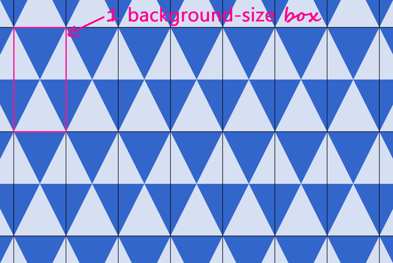
What we have here is a pattern that’s made up of congruent isosceles triangles (the angled edges are equal and the dark blue triangles are a reflection of the light blue ones) formed by the intersection of equidistant parallel lines that are either horizontal, angled clockwise, or the other way. Each of these three types of parallel lines is highlighted in the illustration below:

Every pattern cell contains a full triangle and two adjacent triangle halves in the upper part, then a reflection of this upper part in the lower part. This means we can identify a bunch of congruent right triangles that will help us get the angles we need for our conic-gradient():

This illustration shows us that the gradient starts from an angle, β, away from the default conic gradient start point at 12 o’clock. The first conic slice (the top right half triangle) goes up to α, the second one (the bottom right dark triangle) up to 2·α, and the third one (the bottom light triangle) goes halfway around the circle from the start (that’s 180°, or 50%). The fourth one (the bottom left dark triangle) goes to 180° + α and the fifth one (the top left light triangle) goes to 180° + 2·α, while the sixth one covers the rest.

α and β (demo)From the highlighted right triangle we get that:
tan(α) = (.5·h)/(.5·w) = h/wKnowing the width (w) and height (h) of a pattern cell, we can get the angles α and β:
α = atan(h/w)
β = 90° - α
It results in the pattern that’s generated by the following code:
$w: 15px;
$h: 30px;
$a: atan($h/$w)*180deg/pi();
$b: 90deg - $a;
$c0: #36c;
$c1: #d6e0f5;

html {
  background:
    conic-gradient(from $b,
      $c1 0% $a,
      $c0 0% 2*$a,
      $c1 0% 50%,
      $c0 0% 180deg + $a,
      $c1 0% 180deg + 2*$a,
      $c0 0%)
    0 0/ #{$w $h};
}
This means going from 343 bytes to only 157 bytes in the compiled CSS. The result can be seen below:
You can tweak the pattern width ($w) and height ($h) in the Sass code in order to see how the pattern gets squished and stretched for different aspect ratios.
In the particular case where the angle between 2*$a and 50% (or 180deg) is also $a, it results that $a is 60deg, our isosceles triangles are equilateral, and our gradient can be reduced to a repeating one (and under 100 bytes in the compiled CSS):
$a: 60deg;
$b: 90deg - $a;
$w: 15px;
$h: $w*tan($a);
$c0: #36c;
$c1: #d6e0f5;

html {
  background:
    repeating-conic-gradient(from $b,
      $c1 0% $a, $c0 0% 2*$a)
    0 0/ #{$w $h}
}
The live result can be seen below:
Bonus: Intersecting line backgrounds!

While these are not repeating patterns, they’re examples of a situation where a single conic gradient achieves an effect that would have previously needed a bunch of linear ones.
What we have here is a conic-gradient() created starting from two straight lines intersecting within the rectangular box where we set the background.

The gradient goes around the point of coordinates, x,y, where the two straight lines intersect. It starts from an angle, β, which is the angle of the line segment that’s closest to the top-right corner, then has hard stops at α, 50% (or 180°) and 180° + α.
If we want to have multiple elements with similar such patterns created with the help of different intersecting lines and different palettes, we have the perfect use case for CSS variables:
.panel {
  background:
    conic-gradient(from var(--b) at var(--xy),
      var(--c0) var(--a), var(--c1) 0% 50%,
      var(--c2) 0% calc(180deg + var(--a)), var(--c3) 0%);
}
All we have to do is set the position (--xy), the start angle (--b), the first angle (--a) and the palette (--c0 through --c3).
.panel {
  /* same as before */

  &:nth-child(1) {
    --xy: 80% 65%;
    --b: 31deg;
    --a: 121deg;
    --c0: #be5128;
    --c1: #ce9248;
    --c2: #e4c060;
    --c3: #db9c4e
  }

  /* similarly for the other panels */
}
Instead of hardcoding, we could also generate these values randomly or extract them from a data object with the help of a CSS or HTML preprocessor. In this second case, we’d set these custom properties inline, which is precisely what I did in the Pen below:
Since we’re using custom properties inside the conic gradients, this demo does not work in browsers that don’t support them natively.
Well, that’s it! I hope you’ve enjoyed this article and that it gives you some ideas about how conic gradients can make your life easier.

Lovely work Ana.
The code is clever and the explanation extremely clear, the perfect combination!
Thank you!
Great article Ana!! As an SEO Expert AND web developer/occasional web designer, more specifically I’m intrigued by the amount of space/loading time you saved using conic gradients. Unfortunately, it doesn’t sound like this is a very viable solution at the moment as it sounds like compatibility is currently an issue.
Do you have a list of which browsers support and which browsers do not support conic gradients?? I would love to see that list and hopefully see all unimportant, crappy browsers on the list of the incompatibles and all of the browsers I care about on the compatible list.
Conic gradients have been supported in Chromium browsers (which now include Edge too) for about three years now (since June 2017).
In Safari for over a year (since March 2019).
In Firefox for a couple of months, though only behind a flag. However, I remember that for basic
clip-pathshapes, it only took two versions between the time the feature first landed behind a flag and the time it was available for everyone. So I expect it to work without needing to enable a flag later in the year.CanIUse have a full compatibility table.
Bottom line: pre-Chromium Edge/ IE and some mobile browsers don’t support this. However, browsers with limited capabilities are probably running on devices with limited capabilities as well. And the people using them will appreciate a better loading time, even if get a plain solid background instead of a pattern.
So I personally feel that once Firefox supports it without needing the flag, it becomes a viable solution. Just remember to set a solid background fallback for any browsers that may not support it.
As far as I’m concerned, supporting browser X means ensuring the page is easily usable, not replicating all the visual flourishes created with cutting edge techniques.
Thanks for a great article, Anna! I’d love to translate it for a Russian collaborative IT blog. Please let me know if I could publish the translation and link this article.