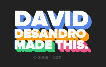
We can use multiple text-shadow and box-shadow values to create a three-dimensional look to blocks or text, like this screenshot of David DeSandro’s footer. However in that example, the “three dimesional” part is a solid color.
By alternating colors back and forth in the “stacking order” of our box or text shadow declaration, we can simulate a more three dimensional / lighted effect.
text-shadow:   1px 0px #eee, 0px 1px #ccc,
               2px 1px #eee, 1px 2px #ccc,
               3px 2px #eee, 2px 3px #ccc,
               4px 3px #eee, 3px 4px #ccc,
               5px 4px #eee, 4px 5px #ccc,
               6px 5px #eee, 5px 6px #ccc,
               7px 6px #eee, 6px 7px #ccc,
               8px 7px #eee, 7px 8px #ccc,
               8px 8px #eee;
Crazy people….
Nice effect, thank you =)!
awesome! and if you do this:
you smooth out the extrude so there’s no weird jagged lines.
Really nice fix. It’s a lot better than the version Chris posted. No offense, Chris >,
Experimented with this myself before sticking with the jaggy version. It bugged me that you lost all the crisp edges with the 1px blur. Maybe there’s a way to get both? Shadow contraction?
I can’t wrap my mind around this one, how does it work?
PS: I made a PHP function to automatically make it happen (very primitive and doesn’t check for errors) :)
I did something a bit more involved using {LESS}. You can check it out here:
http://dl.dropbox.com/u/442561/WoodEffect/textshadowtest.html
Much more complicated than the example above, but {LESS} makes it easier.
The examples are beautiful! Can you share?
If you play with transparency and some big numbers you can manipulate this to do some inner-glow style effects.
Be warned this appears to be a bit volatile so continue at your own risk – this appears to be a bit memory heavy so be ready to force quit youre web-browser… (also dont use your coding program’s preview mode as it may cause it to crash).
doesn’t seem to work the same across the browsers but I thought it was interesting enough to share…
Yours is really impressive !
It’s cool but didn’t work on Google chrome 21.0
Oops after several trial it just worked.
3d txt shadow:
text-shadow: 0px 1px 1px #ddd,
0px 2px 1px #d6d6d6,
0px 3px 1px #ccc,
0px 4px 1px #c5c5c5,
0px 5px 1px #c1c1c1,
0px 6px 1px #bbb,
0px 7px 1px #777,
0px 8px 3px rgba(100, 100, 100, 0.4),
0px 9px 5px rgba(100, 100, 100, 0.1),
0px 10px 7px rgba(100, 100, 100, 0.15),
0px 11px 9px rgba(100, 100, 100, 0.2),
0px 12px 11px rgba(100, 100, 100, 0.25),
0px 13px 15px rgba(100, 100, 100, 0.3);