I decided that in 2010, I was going to design more things. I didn’t do as much just straight up designing of things in 2009. So rather than wait around for opportunities to come to me, I am going to just pick random things to redesign. At the day job we just got done doing a whole ton of data entry for a client, that we do every year when they revise their catalog. We use Pinnacle Cart for this client’s store, which aside from having table-based templates, is a pretty decent eCommerce software. After spending so much time in there editing products, I decided that I would take a crack at resigning that particular screen see if I could address some issues.
The area I redesigned is just a part of the overall page, so don’t be distracted by the fact that there isn’t overall admin navigation and what-have-you.
Before
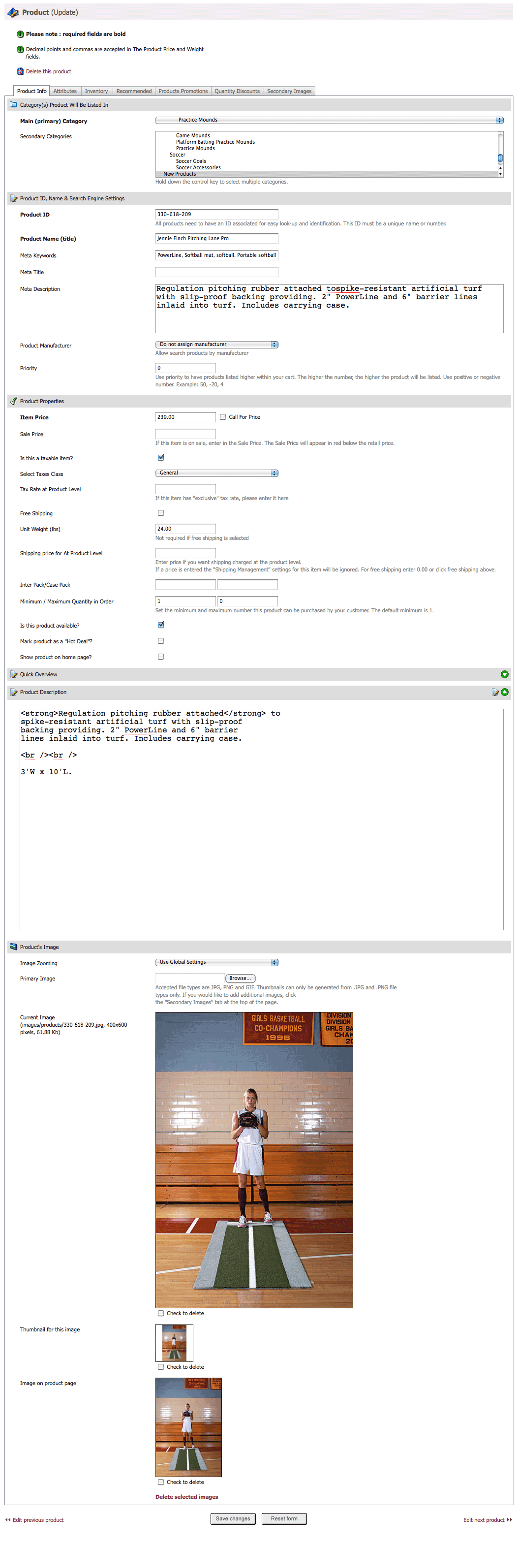
Problems:
- White space used ineffectively
- Tabs feel cramped
- Ordering of fields doesn’t make sense (e.g. Why is “Meta Description” and 5 other fields in between the product title and the price, the two most important fields)
- Page length is too long, why not break images into a separate tab
- Promotions and discounts tabs could be combined
- Next/Previous navigation at bottom of page is useless
- Reset form button is useless
- Shouldn’t have to scroll to save
- Meta keywords are useless
After
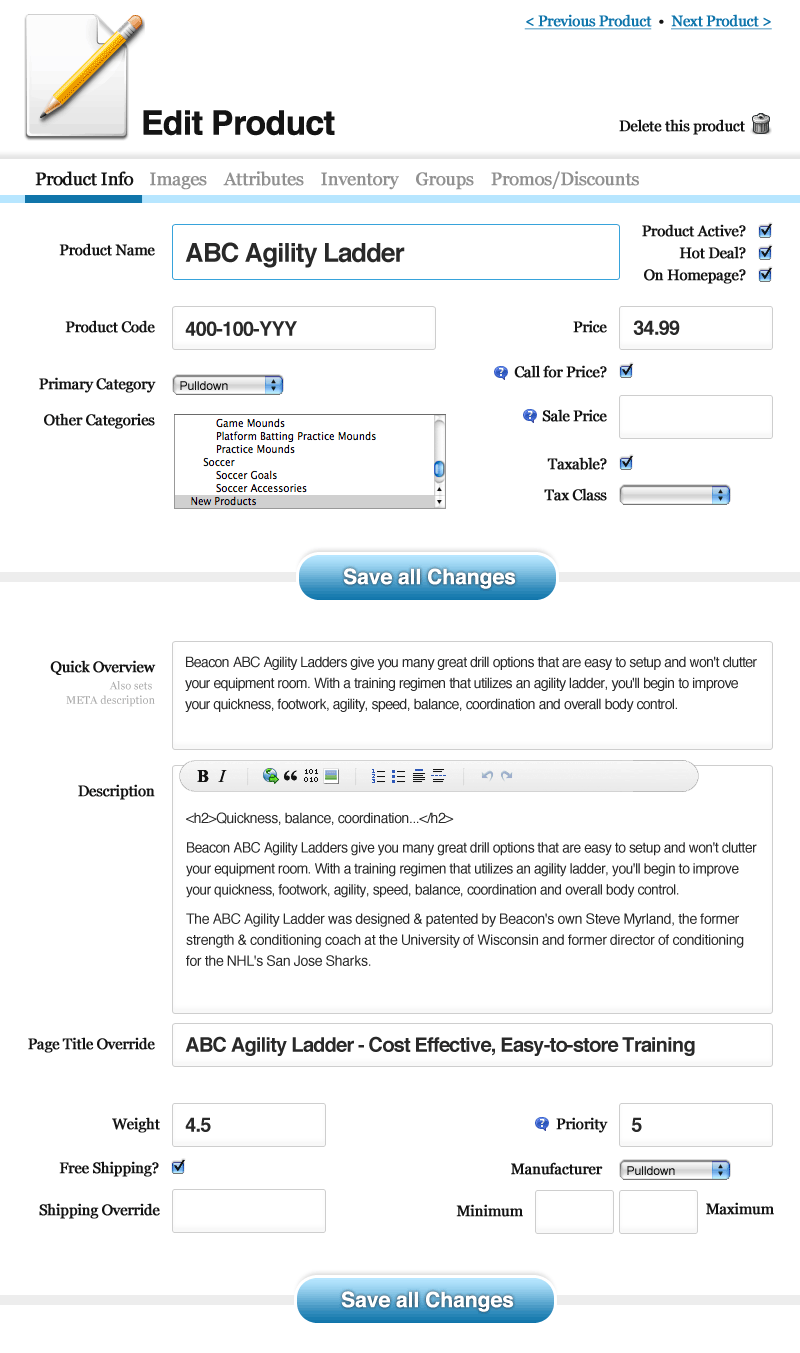
Improvements
- Tabs replaced by larger clickable links on top row
- Next/Previous navigation at top right corner. This way you can click-click-click and the link will always be in the same place.
- Fields grouped more logically
- Page length shortened by removing some things, and moving things around. At the same time the entry fields are actually much larger.
- Two save buttons present, so you never have to scroll to save, and is named “Save all changes” which should help with confusion over what the button actually saves (it saves everything not just the top or bottom half). The button also provides a break line to separate the basics from the deeper more specific stuff.
- Buttons for HTML tags in description area
This just feels better to me, but you don’t have to agree with me. If you have ideas for improvements or comments about where I went wrong, let me have it. I’ll also provide the PSD in case you want to shuffle things around yourself.

I don’t like the double buttons. Do you really need two on a page that small?
Surely that fits into most peoples browser-dimensions?
If not, I’d have probably used a fixed button at the bottom of the page, but still retaining the breaks in content.
I think there would definitely be page scroll on what I have mocked up. I was especially sensitive to that, just because of the sheer amount of action this page was seeing.
For example, with 1000 price changes, CLICK-TYPE-SAVE is way faster than CLICK-TYPE-SCROLL-SAVE.
The fixed button is a clever idea.
I suppose I’m forgetting the window-dressing associated here aswell, like the navigation and such.
But yeah, the page on it’s own would fit on most modern day monitors without scrolling I’d think.
Although, if you are doing 1000 saves, maybe an automated save with AJAX is a better choice?
Couldn’t they just hit the enter key, though? The only time I use the submit button instead of the enter key is when I’m typing in a textarea last, like now.
It’s an improvement for sure and I don’t really mind the two buttons but an even better solution, I think, would be to add a keyboard shortcut with some simple javascript!
@Vasili:
I gotta admit, I don’t even hit Sumbit in textarea’s. Im actualy that anti-mouse that I do shift-tab (ie. jump back to the last input-field, in which ‘Enter’ does work) – and press Enter.
Like now :-)
/me goes Shift-Tab -> Enter
I like the AJAX-save idea. As far as scrolling goes, it could also work if you have anchors such as “back to top” but I do like tabs better.
Finally, I don’t think most users are familiar with Shift+Enter or Tab+Enter to submit. If anything I would disable it just to be safe.
I would suggest slimming up that header to conserve realestate. Then not sure how hard it is but make another tab with all the pricing/shipping info in it. Keep each tab short and simple…
I like the idea of only keeping one “save all changes” button.
That original form is so ugly it’d be hard to image a way not to make it look better.
nice,
I like the improvement that Fields are now grouped more logically e. g. images
great job,
Thanks
Something about your Gravatar creates the optical illusion that it is rotated counter-clockwise a degree or two. Crazy.
Indeed O_O,
Weird.
I think it’s because the paper-crimp is on the bottom right, instead of the (more logical) top left.
Hm….
Wow looking at it makes my eyes go mad! Very cool illusion.
Anyways Chris you’re amazing to be able to redesign something like that, great job. I see no problems except maybe the save buttons should be a tad smaller, and like someone above suggested, fixed.
IMHO, the product image is desirable on the front page and not in its own tab. Maybe a thumbnail near the product name and then possibly a popup on hover.
I thought seeing all three of them was overkill, but a thumbnail I could see working maybe. I’m not sure then if the images tab should be maintained or removed then… it might be a challenge to make clear that the main image appears in both areas.
If you are looking for a location to identify the image as an ‘icon’, I’d use the thumbnail instead of the edit graphic at the top of the page (next to Edit Product).
I agree with John here. Having a visual help of what item you are editing can’t really hurt you, and would probably be very handy.
And you’ve got to love Benjamin’s fixed position ‘save button’ idea .. great approach!
Otherwise, great redesign ..
I think you did a good job recreating it.
Some stuff I would change:
– Sticky Save Button (as suggested before)
– Preview Image with Name and maybe ProductCode next to it (you always want some visual information on what you are editing…makes stuff much clearer)
– IMO you should align Inputs with numbers inside to the right (i.e. the price)..Stating out the currency wouldn’t be bad aswell!
– Sometimes it’s good to group things together and use the <legend> tag.
Just some ideas ~
I really like the save all feature, and having them spaced frequently is a great.
their version seems to be an “out-of-the-box cut-and-shut” effort and yours is a lot more intuitive.
i think the outcome you have produced is more inviting, and thus more useful. i would spend more time looking at what the things do and creating my page because of it.
Great redesign!
I like much more than the previous version, but I think you overdid it with button, input field size.
Still, much more userfriendly!
I agree with DesignLovr, its starting to look a little intimidating at that size, maybe a little smaller to be large yet subtle
Great job Chris, I happen to like the Magento product page where everything is nicely split and easy to work with. The only criticism I would have that it feels to compact in my opinion. For me I like to just work down the fields from top to bottom to get everything input but again great job!
It is much better the new design. How usable it would be having a fixed toolbar at the top of the page with the action buttons (save and delete)?
I like the idea of the fixed toolbar, but I’m not sure there is enough actions to justify it.
Save
Undo (A bit more intense and probably not essential whilst the refresh button is a few pixels/keystroke away) / Cancel – same situation
Add New
Delete
Next Item
Previous Item
Select Item/Search – With added space I think a dynamic search or drop box to move directly to the required item could be well utilized saving time wasted clicking through, allowing multiple updates to several varying items easier a filter box that doesnt search per se but generates a suggestion list to ump to item by code or name.
I think there are enough generic repetitive or nice to have at hand tasks to improve useability in a fixed bar.
The redesign is a great start but personaly I find the ‘Save All Changes’ buttons a little oversized and dominating.
I’m also against them being repeated, I appreciate your points for having them and they doo break the content up nicely- combined factors though for me decide the fixed bar would be worthy
I think your redesign looks way better, but it seems as though you did it for free.
I did but it’s just a little idea. I didn’t flesh out the rest of the page, do the subpages, or even code it. I’d be happy to do so, but that wouldn’t be free =)
Looks very nice and user friendly which Pinnacle Cart back end is not, in my opinion. Did you actually implement these changes or is it just a mockup?
Mockup.
I think the initial design seems to be very functional, maybe not as sexy as could be ;)
In my opinion the new tabs are not as intuitive and clear as the old ones. Also I disagree with your choice to right-align the labels for a form that is ‘non-standard’ (e.g. address or login), users cannot scan the labels easily. The headings in the original version seemed to be very clear and provide eye-catchers – ok the collapsible thingy should have been to the left and the edit or whatever icon it is to the right.
Your choice of fonts and colors is definitely more attractive, the size of the input fields maybe a little to big for my taste but then again, that seems to be very trendy, but does it take away important screen estate or will it actually help your users? What’s the target audience? Elderly people?
good job overall, cheers, Mike
I don’t know enough about the technical side of UX – I’m not even sure that’s the right acrynom – but I know what I like as they say. And I like this!
Nice, open, clear, inviting, crisp, organised. That’s what comes to mind when I look at it.
There is one thing I would suggest for all of us numpties out there – a thing I find of great help in an unfamiliar form are those little question marks that display explanatory messages about the part of the form you’re filling, so you can be at ease with what you are entering into any given field. They aren’t common enough, those little question marks.
This might be another topic but what WYSIWYG editor is that and what do you recommend that is lightweight and cross-browser?
http://wmd-editor.com/
Kevin from CTech says: Thanks for writing this article. This is just what I was looking for to improve my custom ecommerce store.
I realy like the redesign with it’s big input forms, change border on focus, better use of the available white space, the minimal wysiwyg. Pretty good man :) only want to know how you’re handling the images.
gr
Definitely a vast improvement!
I’m not a great fan of right-aligned labels in forms though. IMO it makes it look a little “messy”, as if inputs are just floating about. Maybe I have a mild form of OCD, but I like it when form inputs line up nicely – just seems to make it easier to read/follow :-)
In this page ,last 3 picture are not very good . In design,i like — this is i think so
~like this h1, h2,h3
Nice work Chris, it’s beautiful!
Much better :)
Good article :)