- This topic is empty.
-
AuthorPosts
-
April 6, 2014 at 11:13 am #167740
manojb05
ParticipantHi guys,
I am done a website, please share your valuable feedback
http://www.newtonclients.com/tg_web2/
Cheers!April 15, 2014 at 1:50 pm #168146lprintz
ParticipantOverall I like it!
As a quick overall view…here’s my 2 cents:
1) more contrast in the main nav – perhaps white text or, perhaps, tone down the background texture
2) I don’t feel the dropshadows are needed for the 4 callout box titles or ‘Cold Happiness for Warm Hearts!’…it looks a little muddle and will crisp up nicely without them
3) I advise against left/right justification (4 callout boxes)…causes weird word spacing and should only be used in newspapers in my opinion
4) I like what you’re trying to do with the quotes in the testimonials but I think it’ll be an improvement if you exaggerated the open quote as a HUGE graphic in the box (muted down with text on top) and simply close the quote in the textLen
April 16, 2014 at 5:18 am #168169Martin_Muzatko
ParticipantYou differ a lot in style on just one page.
Maybe its just me that I like more simple websites with a more clear structure.
I try to give you my as unbiased opinion as possible. :)Fonts
First thing that bugs me is the font variation.
I do love the font for the types of ice cream.
For the descriptions and default font, it looks like you are usingtimes new roman.
You really should use something more fitting.Another thing that makes it look randomly thrown together is the logo on the top.
Maybe your client has given it to you and you have your feedback from the client how he wants it to be. It is rather unwise to just throw it in as-is. Try to look if you can either remove the black background to make it transparent, and adapt the background accordingly to make it stand out a bit more. Maybe you can also integrate the logo in another way so it still matches with the style.Another thing that makes me twitch is the bar below the logo that says “Originale da Italia” in Papyrus. It doesn’t match the overall theme for an ice saloon.
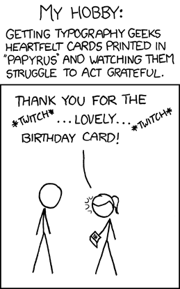
Well I can only share this one with you:
http://imgs.xkcd.com/comics/papyrus.png
I create my websites depending on what the worldview of my customer is. Also I make sure to visit the location (if possible) to grasp what kind of atmosphere the business puts up. You can already read from there if your customer cares a lot about look and theme. If it is a rather usual takeaway, he doesn’t need an all fancy website afterall. However, I can see that he/she offers different kind of ice cream . Classic, Sugar Free, Ltd.Edition etc.
Wow, I do not know many saloons/takeaways that offer this variation. It looks like they care and know what they are selling. The curly font already pictures that it is a rather luxury but affordable ice cream bar.Try to find your theme based on this. Try to get rid of the papyrus slogan. Unless your client wants it that way. If so – tell him the reasons why you want to get rid of it.
Suggestions for fonts:
Professionals buy fonts if the client is well paying and the project is worth it. However, there is a huge set of decent free fonts already.
http://fontsquirrel.com/
http://www.google.com/fontsAlso take a look how different fonts matches together.
Having 4 different fonts usually don’t fit together that well. Also look for the differen bold headings you already have there.
Usual setup is a font for headings and one for the rest of the bodycopy.
You can find some font pairings here:
http://www.creativebloq.com/typography/20-perfect-type-pairings-3132120
or especially this one: http://www.mrmcguire.com/10-useful-google-font-combinations-for-your-next-site/Depending on your customers worldview, try which combination looks as inviting as possible.
Theme/Colors/Minor Bugs
The website looks all together a bit too blurry in a few places. (reduce text-shadow)
The slider controls have some small errors (transparent between filling color and boxshadow)
The navigation items when hovered do not fill up to their full height (hover gradient)
there is a small transparent strip below. I suppose this is not intentional.Look at other ice cream companies and look why they choose their theme.
http://www.bortolotti.at/Imagine what colors, theme puts the customers of your customer in a mood so they want to go there and say “shut up and take my money!”.
Thats your job. Thats what your customer pays you for: to get him more paying customers.Usability
Remember “bortolotti” when I mentioned it earlier?
it has only 3 navigation points in the top.
Isn’t it rather weird that a huge popular caffee/takeaway has only 3 navigation points?
Smaller companies tend to have more menu points/content because they think more is better. The types of ice cream (supreme, sugar free) always repeat on each page, you should remove them, they become annoying very quickly. I first take a look and thought “sweet, there are different kinds of ice cream – thats nice” but then I see it on pages that do not relate to that content in any way, like Outlet, Partnership etc.Why is there a hover effect on the caption for the slider if it has no link/redirect/effect?
The Logo has no link to home. Unfortunately, it doesn’t scale for screen size.April 16, 2014 at 12:02 pm #168188Participantthanks len & martin for your valuable feedback. i will rectify the bus asap.
April 18, 2014 at 9:22 am #168275Ed
Participant@Martin_Muzatko’s feedback is probably the most thorough and considered pieces of feedback I’ve ever seen. Please listen to it.
Myself, the first thing that comes to mind is it’s really slow. I also don’t like the transition on the image slider/gallery. It feel like you want me to notice the pretty image transition (and it is pretty, good job) more than you want me to notice the actual images.
April 24, 2014 at 6:17 am #168584Sumit360
ParticipantYour website fonts are slightly small which are not clearly seen to open eye mainly your footer menu so try to make slightly big which can be easily seen with open eyes.
May 15, 2014 at 5:12 pm #170330ckubs
ParticipantI hope it’s not too late for a feedback( I’m pretty new here). Everything looks good minus the menu that makes me think of a poorly designed element with that almost sand look and doesn’t fit for an icecream website.
You should make it no texture at all glossy black or the same yellow tone as the glossy piece from the top as an extension. :)
May 28, 2014 at 3:16 pm #171293ChecMark
ParticipantAll I got was a “page not found” error.
-
AuthorPosts
- The forum ‘Design’ is closed to new topics and replies.
