- This topic is empty.
-
AuthorPosts
-
December 18, 2012 at 8:24 pm #118000
chrisburton
ParticipantTest
This is wrapped in a divThis is wrapped in a span
@andy_unleash are you inserting a space before the code begins and after the code ends as well as 4 spaces indenting the code? It works for me.
See here: http://cloud.chrisburton.me/LggH
December 18, 2012 at 8:33 pm #118001Andy Howells
Participant@chrisburton – Just tried it – no dice for me.
Might it be worth splitting this into an alternative thread?
December 18, 2012 at 10:08 pm #118015Philben
ParticipantGood work! Few issues – it breaks in IE8 and less ( not sure of your target users tho). You might want to consider appending your Html 5 elements to the DOM for wider support. It might be personal preference, but I find your portfolio list a bit too ‘in-your-face’ kind of, you may want to consider reducing it and increasing the gutters.
December 18, 2012 at 10:13 pm #118019Participant@philben – Cheers, haven’t done cross browser fixes (read, IE8+ support yet). To be honest, I’m not even going to bother firing up IE7, percentages are so low nationally and in our analytics.
When you say “appending your HTML5 elements to the DOM for wider support” – can you explain what you mean? I’m using HTML5 shiv and a block reset for HTML5 elements if that’s what you’re getting at?
December 18, 2012 at 10:31 pm #118026Participant@andy_unleash – Yes, Html5 shiv will do the same job, I should have clarified that. But currently it’s showing un-identified element in IE8, so you might want to debug that.
December 18, 2012 at 11:19 pm #118034ParticipantHmm cheers for the spot then. Which element is it in particular, or is it just all HTML5 elements?
December 19, 2012 at 8:14 am #118068Participant@joshuanhibbert – I like it, cheers dude.
December 19, 2012 at 10:33 pm #118200elmsoftware
MemberI will say that the menu didn’t ‘pop’ for me. The .7 opacity made it too dim in my opinion. Overall though…site looks great and well thought out and responsive. Also, really like the fixed menu when looking at it on phone.
December 20, 2012 at 12:41 am #118215ParticipantAnother good one is Fovea. http://payload.cargocollective.com/1/0/3855/39455/Fovea_LG2_900.png
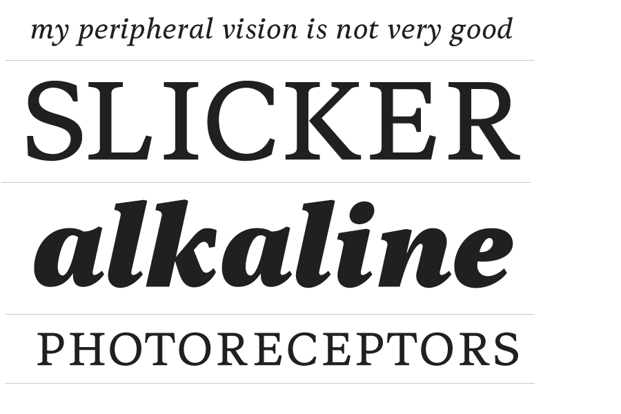
December 20, 2012 at 4:58 am #118230ParticipantQuatro is one of my new favourites, I have a serious thing for Slab Serif fonts as a whole. Museo Slab is also pretty boss.
December 25, 2012 at 8:22 pm #118995ParticipantHooray – and it’s live – http://unleash-it.co.uk
I incorporated a lot of the feedback you guys offered, so let me know what you think.
@joshuanhibbert – I took the advice you gave on the buttons, definitely a good move.Also do you feel certain pages need images too? I feel like the content on some pages could do with breaking up a bit.
For example: [what we do](http://unleash-it.co.uk/what-we-do) vs [how we do it](http://unleash-it.co.uk/how-we-do-it)
I tried it here on the [responsive web design](http://unleash-it.co.uk/responsive-webdesign) page but I’m not sure.
December 26, 2012 at 11:50 am #119031snillor
MemberI’m late to the party, but want to say:
1) Lovely design; I especially like the colors scheme. And a really nice touch with the two-color main nav items that become one color when hovered.
2) Very slow loading in Firefox (17.0.1)
3) In Safari (5.1.4), page initially displayed alternating horizontal black and white bands. And I’ve waited over 3 minutes and the page still hasn’t fully loaded. [After nearly 5 minutes the “banding disappeared, but it’s still trying to load the last of 33 items.] **[This may have been an anomaly, because when I restarted Safari and cleared history/cache, it loaded very quickly.]**
3) Loads properly (no alternating B&W bands) and faster in Chrome (17.0.something).
4) Loads properly (no alternating B&W bands) and faster in IE9.
December 26, 2012 at 12:10 pm #119033MemberJust noticed what might be a typo in the first paragraph of What We Do. It reads:
“What that means for you is that with one all encompassing website, provided by us, you can reach your customers “**on**” whether they’re on a mobile, a tablet, their trusty desktop, fancy laptop or maybe even on a coconut phone if it has a screen!”
Looks like an extraneous “on” to me.
December 26, 2012 at 12:51 pm #119036ParticipantI would completely remove the text-shadow on hover for the buttons. One thing that really bugs me is that random content on the page seems slightly transparent. It throws me off a bit.
December 26, 2012 at 12:57 pm #119037Participant@snillor – thanks for the spot on the typo, fixed it.
Regarding that background black problem – I have noticed it previously when viewing on Safari iphone during the load – it’s definitely a weird one. I’ve tried setting a background colour on HTML/Body so will see whether that cures it (background is just a repeating pattern image).
-
AuthorPosts
- The forum ‘CSS’ is closed to new topics and replies.