- This topic is empty.
-
AuthorPosts
-
April 5, 2011 at 6:06 pm #32242
enfotoad
MemberHey Everyone,
I am trying to make a logo for my web design company. We do web design, web marketing, development, and online consulting.
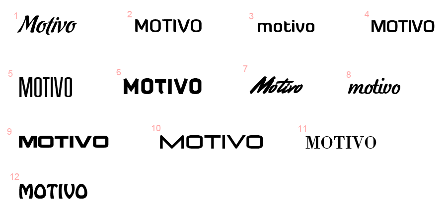
Here are different font types with my company’s name: http://localhostr.com/files/NW6kc12/motivo-types.png
I am trying to resemble professionalism and creativity through the font type.
I would greatly appreciate input on any of the types or if you have one in mind that might good look with my company’s name.
Thanks!
April 5, 2011 at 6:56 pm #52249MemberThanks Josh! Are there any that you know of that I haven’t listed that you think might look nice with the name?
I have looked through so many fonts, but it’s hard to find one that looks good with the name.
April 5, 2011 at 7:42 pm #52242Simon Woodard
MemberI think number 2 or 3 look good
April 5, 2011 at 11:16 pm #52238Historical Forums User
ParticipantHello enfotoad! Given the nature of branding, it’s really difficult to say which typeface is best without knowing more about your company. Different typefaces come in an assortment of styles which evoke a variety of feelings.
Think of it this way; Someone may say that a hammer is just a hammer. But in reality, there are many different types of hammers – each purposefully fitted to solve a particular problem. Type is exactly like this – and the differences can be even more subtle.
If you’re super-concerned with branding and identity specifics – you may want to seek advice from a site which has forums more geared in that direction. I’m not sure how many valuable forums there are on the web for this topic, but you may want to start at logopond.com.
3 seems like your best bet – though I wouldn’t say its great. The ‘v’ has a few problems, the stem needs some work on the ‘t’, and I’m not feeling the terminal on the ‘t’. Here are my thoughts on the rest;
1. No
2. Same typeface as 3? If so, caps don’t work well here.
4.
5. If you like this, go with Trade Gothic Bold Condensed No. 2, League Gothic, or Steelfish (if you want a nice @font-face typeface to match)
6. No
7. Kerning is waaay too tight. If you want a nice script, you’ll need to do it yourself – which is difficult. I’ve seen Reagan Ray do a nice job of this; http://reaganray.com/#591977/4-Logos
8. No – and notes from 7
9. Nope, perhaps a construction company.
10.
11. No, unless you want to channel Tiffany and Co, Ralph Lauren, Giorgio Armani, or other high-end fashion brands.
12. Lol…… don’t even think about it.April 5, 2011 at 11:27 pm #52201Member@Aaron
WOW!!! Thanks for taking the time to share your input. Greatly appreciate it.
I am honestly not to satisfied with any of the fonts I had. I have spent about 2 hours looking at different fonts at fonts.com and myfonts.com and designs at logopond.com.
I guess the main issue is finding a font that will look good with MOTIVO in either all caps or all lower case.
Are there any fonts that you know of that would look nice with this name? Or is there a certain design you see I could make with the letters? I’ve been stuck on this for a while now!!! For some reason those letters in that order are not fitting to well with fonts and my creativity.
Side Note: I have some knowledge in Adobe Illustrator to edit a font or make graphics.
Also, Motivo means reason, cause, and impulse… don’t know if that would help spur up some ideas.
April 5, 2011 at 11:46 pm #52196ParticipantWhy are you set on all lowercase, or all caps? I, first hand, know how difficult it can be ‘branding’ yourself. Remember, you can always change and update it! Don’t wait until it’s perfect – because it you’re as hard of a critic as I am, you’ll never be happy. You can push it out the door when you are 60-70% happy and work hard on the things that actually make your brand successful.
Or, you can pay someone else to make it for you. Matthew Smith (of Squared Eye) did exactly this – and for good reason. You can learn a little about it from reading his ‘deep thoughts’ page; http://squaredeye.com/notebook/deep-thoughts/
I also think you’re searching in the wrong places. Fonts.com and myfonts.com have long been known to host some garbage. Personally, I primarily use typefaces from Hoefler & Frere-Jones (www.typography.com), but they are pricey. Another option is The League of Moveable Type (www.theleagueofmoveabletype.com). All open source – all free (and super quality). I’ll go ahead and recommend Chunk to you;
(http://www.theleagueofmoveabletype.com/fonts/4-chunk)
Most of the time, if you get stuck in a design or project, you just need a bit of inspiration and a swift kick in the rear. Works most of the time! Now get out there and kick that project’s ASS!!!!
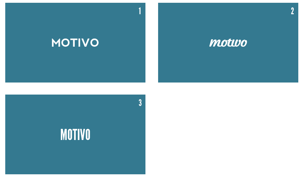
April 6, 2011 at 10:57 am #52021MemberThank you guys so much for the continued support… so I narrowed things down to 3 options here: http://localhostr.com/files/JMCtGyx/possible-logos.png
I really like the first two choices. For #1 I could reduce the letter spacing and it would look better.
Which one do you guys like?
Also, I plan on messing around with the type to sort of add my own style to it…. not messing to much with it, but making it so that its basically somewhat “custom.”
April 6, 2011 at 11:15 am #52014TheDoc
Member#2 looks a little bit too much like “motwo” – I’d adjust the kerning or scrap the font.
I really like #1, but not much can really be taken away from it. In that I mean it could be a company that quite literally does anything. I’m not sure if that’s the best type of representation for you.
April 6, 2011 at 11:35 am #52008Member@TheDoc Agreed.
I really like how this design does a great job of keeping things simple and unique: http://logopond.com/gallery/detail/126810 … but at the same time it doesn’t really show or provide a visual for what the company does.
I think if I add in some type of visual edit to the type (#1) like a swooping mark through it or something, I should be able to make it custom and unique so that if people do come across it they don’t mistake it for something else.
Do you guys have any idea on what I could do to the first type to add the WOW factor? Or maybe something that will make it look unique compared to the standard font (as displayed). I feel that I should do something with the double “O”.
April 6, 2011 at 11:55 am #51980MemberYou could do something simple like…
Add ‘//’ in front of it, like a PHP comment… or… motivo {}
I don’t know, brainstorming! I feel like doing something like that will at least give people that know what it is an idea of what you do, and for people that don’t know what it is it gives the brand more recognition (easier to remember).
-
AuthorPosts
- The forum ‘Other’ is closed to new topics and replies.
