Just as you can declare the background of an element to be a solid color in CSS, you can also declare that background to be a gradient. Using gradients declared in CSS, rather using an actual image file, is better for control and performance.
Gradients are typically one color that fades into another, but in CSS you can control every aspect of how that happens, from the direction to the colors (as many as you want) to where those color changes happen. Let’s go through it all.
Gradients are background-image
While declaring the a solid color uses background-color property in CSS, gradients use background-image. This comes in useful in a few ways which we’ll get into later. The shorthand background property will know what you mean if you declare one or the other.
.gradient {

  /* can be treated like a fallback */
  background-color: red;

  /* will be "on top", if browser supports it */
  background-image: linear-gradient(red, orange);

  /* these will reset other properties, like background-position, but it does know what you mean */
  background: red;
  background: linear-gradient(red, orange);

}
Linear Gradient
Perhaps the most common and useful type of gradient is the linear-gradient(). The gradients “axis” can go from left-to-right, top-to-bottom, or at any angle you chose.
Not declaring an angle will assume top-to-bottom:
Those comma-separated colors can type of color you normally use: Hex, named colors, rgba, hsla, etc.
To make it left-to-right, you pass an additional parameter at the beginning of the linear-gradient() function starting with the word “to”, indicating the direction, like “to right”:
This “to” syntax works for corners as well. For instance, if you wanted the axis of the gradient to start at the bottom left corner and go to the top right corner, you could say “to top right”:
If that box was square, the angle of that gradient would have been 45°, but since it’s not, it isn’t. If you wanted to make sure it was 45°, you could declare that:
.gradient {
  background-image:
    linear-gradient(
      45deg,
      red, #f06d06
    );
}
You aren’t limited to just two colors either. In fact you can have as many comma-separated colors as you want. Here’s four:
.gradient {
  background-image:
    linear-gradient(
      to right,
      red,
      #f06d06,
      rgb(255, 255, 0),
      green
    );
}You can also declare where you want any particular color to “start”. Those are called “color-stops”. Say you wanted yellow to take up the majority of the space, but red only a little bit in the beginning, you could make the yellow color-stop pretty early:
We tend to think of gradients as fading colors, but if you have two color stops that are the same, you can make a solid color instantly change to another solid color. This can be useful for declaring a full-height background that simulates columns.
Browser Support / Prefixes
So far we’ve only looked at the new syntax, but CSS gradients have been around for quite a while. Browser support is good. Where it gets tricky is syntax and prefixing. There are three different syntaxes that browsers have supported. This isn’t what they are officially called, but you can think of it like:
- Old: original WebKit-only way, with stuff like from() and color-stop()
- Tweener: old angle system, e.g. “left”
- New: new angle system, e.g. “to right”
And then prefixing as well.
Let’s try a chart:
| Chrome | 1-9: Old, prefixed 10-25: Tweener, prefixed 26: New, unprefixed |
|---|---|
| Safari | 3-: No support 4-5.0: Old, prefixed 5.1-6.0: Tweener, prefixed 6.1: New, unprefixed |
| Firefox | 3.5-: No support 3.6-15: Tweener, prefixed 16: New, unprefixed |
| Opera | 11.0-: No support 11.1-11.5: Tweener, prefixed, only linear 11.6-12: Tweener, prefixed, added radial 12.1: Tweener, unprefixed 15: New, unprefixed |
| IE | 8-: No support 9: filters only 10+: New, unprefixed (also supports Tweener w/ prefix) |
| Android | 2.0-: No support 2.1-3.0: Tweener, prefixed 4.0-4.3: New, prefixed 4.4+: New, unprefixed |
| iOS | 3-: No support 3.2-4.3: Tweener, prefixed 5.0-6.1: New, prefixed 7.0: New, unprefixed |
There is some overlap in there. For instance when a browser supports the New syntax they probably also support the older syntaxes as well, including the prefix. Best practice is: if it supports New, use New.
So if you wanted to absolute deepest possible browser support, a linear gradient might look like this:
.gradient {

  /* Fallback (could use .jpg/.png alternatively) */
  background-color: red;

  /* SVG fallback for IE 9 (could be data URI, or could use filter) */
  background-image: url(fallback-gradient.svg);

  /* Safari 4, Chrome 1-9, iOS 3.2-4.3, Android 2.1-3.0 */
  background-image:
    -webkit-gradient(linear, left top, right top, from(red), to(#f06d06));

  /* Safari 5.1, iOS 5.0-6.1, Chrome 10-25, Android 4.0-4.3 */
  background-image:
    -webkit-linear-gradient(left, red, #f06d06);

  /* Firefox 3.6 - 15 */
  background-image:
    -moz-linear-gradient(left, red, #f06d06);

  /* Opera 11.1 - 12 */
  background-image:
    -o-linear-gradient(left, red, #f06d06);

  /* Opera 15+, Chrome 25+, IE 10+, Firefox 16+, Safari 6.1+, iOS 7+, Android 4.4+ */
  background-image:
    linear-gradient(to right, red, #f06d06);

}
That’s an awful lot of code there. Doing it by hand would be error-prone and a lot of work. Autoprefixer does a good job with it, allowing you to trim that amount of code back as you decide what browsers to support.
The Compass mixin can do SVG data URI’s for IE 9 if that’s important to you.
To complicate things just a little more, the way degrees work in the OLD vs NEW syntax is a bit different. The OLD (and TWEENER – usually prefixed) way defines 0deg and left-to-right and proceeds counter-clockwise, while the NEW (usually unprefixed) way defines 0deg as bottom-to-top and proceeds clockwise.
OLD (or TWEENER) = (450 – new) % 360
or even simpler:
NEW = 90 – OLD
OLD = 90 – NEW
like:
OLD linear-gradient(135deg, red, blue)
NEW linear-gradient(315deg, red, blue)
IE filters
Internet Explorer (IE) 6-9, while they don’t support the CSS gradient syntax, do offer a programmatic way to do background gradients
/* "Invalid", but works in 6-8 */
filter: progid:DXImageTransform.Microsoft.gradient(GradientType=0, startColorstr=#1471da, endColorstr=#1C85FB);

/* Valid, works in 8-9 */
-ms-filter: "progid:DXImageTransform.Microsoft.gradient (GradientType=0, startColorstr=#1471da, endColorstr=#1C85FB)";
There are some considerations here on deciding to use this or not:
filteris generally considered a bad practice for performance,background-imageoverrides filter, so if you need to use that for a fallback, filters are out. If a solid color is an acceptable fallback (background-color), filter is a possibility
Even though filters only work with hex values, you can still get alpha transparency by prefacing the hex value with the amount of transparency from 00 (0%) to FF (100%). Example:
rgba(92,47,90,1) == #FF5C2F5A
rgba(92,47,90,0) == #005C2F5A
Radial Gradients
Radial gradient differ from linear in that they start at a single point and emanate outwards. Gradients are often used to simulate a lighting, which as we know isn’t always straight, so they can be useful to make a gradient seem even more natural.
The default is for the first color to start in the (center center) of the element and fade to the end color toward the edge of the element. The fade happens at an equal rate no matter which direction.
You can see how that gradient makes an elliptical shape, since the element is not a square. That is the default (ellipse, as the first parameter), but if we say we want a circle we can force it to be so:
.gradient {
  background-image:
    radial-gradient(
      circle,
      yellow,
      #f06d06
    );
}
Notice the gradient is circular, but only fades all the way to the ending color along the farthest edge. If we needed that circle to be entirely within the element, we could ensure that by specifying we want the fade to end by the “closest-side” as a space-separated value from the shape, like:
The possible values there are: closest-corner, closest-side, farthest-corner, farthest-side. You can think of it like: “I want this radial gradient to fade from the center point to the __________, and everywhere else fills in to accommodate that.”
A radial gradient doesn’t have to start at the default center either, you can specify a certain point by using “at ______” as part of the first parameter, like:
I’ll make it more obvious here by making the example a square and adjusting a color-stop:
Browser support for radial gradients is largely the same as linear-gradient(), except a very old version of Opera, right when they started supporting gradients, only did linear and not radial.
But similar to linear, radial-gradient() has gone through some syntax changes. There is, again: “Old”, “Tweener”, and “New”.
/* Example of Old */
background-image:
  -webkit-gradient(radial, center center, 0, center center, 141, from(black), to(white), color-stop(25%, blue), color-stop(40%, green), color-stop(60%, red), color-stop(80%, purple));

/* Example of Tweener */
background-image:
  -webkit-radial-gradient(45px 45px, farthest-corner, #F00 0%, #00F 100%) repeat scroll 0% 0% rgba(0, 0, 0, 0);

/* Example of New */
background-image:
  radial-gradient(circle farthest-side at right, #00F, #FFF);
The hallmarks being:
- Old: Prefixed with
-webkit-, stuff likefrom()andcolor-stop() - Tweener: First param was location of center. That will completely break now in browsers that support new syntax unprefixed, so make sure any tweener syntax is prefixed.
- New: Verbose first param, like “circle closest-corner at top right”
Again, I’d let Autoprefixer handle this. You write in the newest syntax, it does fallbacks. Radial gradients are more mind-bending than linear, so I’d recommend attempting to just get comfortable with the newest syntax and going with that (and if necessary, forget what you know about older syntaxes).
Conic Gradients
A conic gradient is similar to a radial gradient. Both are circular and use the center of the element as the source point for color stops. However, where the color stops of a radial gradient emerge from the center of the circle, a conic gradient places them around the circle.

They’re called “conic” because they tend to look like the shape of a cone that is being viewed from above. Well, at least when there is a distinct angle provided and the contrast between the color values is great enough to tell a difference.
The conic gradient syntax is easier to understand in plain English:
Make a conic-gradient that is located at [some point] that starts with [one color] at some angle and ends with [another color] at [some angle]
At it’s most basic level, it looks like this:
.conic-gradient {
  background: conic-gradient(#fff, #000);
}
…where it is assumed that the location of the gradient starts at the very center of the element (50% 50%) and is evenly distributed between white and black color values.
We could have written this in several other ways, all of which are valid:
.conic-gradient {
  /* Original example */
  background-image: conic-gradient(#fff, #000);
  /* Explicitly state the location center point */
  background: conic-gradient(at 50% 50%, #fff, #000);
  /* Explicitly state the angle of the start color */
  background: conic-gradient(from 0deg, #fff, #000);
  /* Explicitly state the angle of the start color and center point location */
  background: conic-gradient(from 0deg at center, #fff, #000);
  /* Explicitly state the angles of both colors as percentages instead of degrees */
  background: conic-gradient(#fff 0%, #000 100%);
  /* Explicitly state the angle of the starting color in degrees and the ending color by a full turn of the circle */
  background: conic-gradient(#fff 0deg, #000 1turn);
}
If we do not specify an angle for the colors, then it is assumed that the gradient is evenly divided between the colors, starting at 0deg and ending at 360deg. That kind of creates a hard stop where the colors bump right up to one another at 0deg and 360deg. If our starting color would begin somewhere else on the circle, say one quarter of the way at 90deg, then that creates a smoother gradient and we start to get that cool cone-looking perspective.
.conic-gradient {
  background: conic-gradient(from 90deg, #fff, #000);
}
We can have fun with conic gradients. For exmaple, we can use it to create the same sort of pattern you might see in a color picker or the infamous Mac spinning beach ball indicator:
.conic-gradient {
  background: conic-gradient(red, yellow, lime, aqua, blue, magenta, red);
}
Or, let’s try a simple pie chart by adding hard stops between three color values:
.conic-gradient {
  background: conic-gradient(lime 40%, yellow 0 70%, red 0);
}
Unfortunately, conic-gradient has no browser support at the time of this writing. It’s currently part of the CSS Image and Replaced Content Module Level 4 specification, which is in working draft. In the meantime, Lea Verou (who has contributed to the spec) provides a polyfill that makes them possible.
This browser support data is from Caniuse, which has more detail. A number indicates that browser supports the feature at that version and up.
Desktop
| Chrome | Firefox | IE | Edge | Safari |
|---|---|---|---|---|
| 69 | 83 | No | 79 | 12.1 |
Mobile / Tablet
| Android Chrome | Android Firefox | Android | iOS Safari |
|---|---|---|---|
| 123 | 124 | 123 | 12.2-12.5 |
Repeating Gradients
With ever-so-slightly less browser support are repeating gradients. They come in both linear and radial varieties.
There is a trick, with non-repeating gradients, to create the gradient in such a way that if it was a little tiny rectangle, it would line up with other little tiny rectangle versions of itself to create a repeating pattern. So essentially create that gradient and set the background-size to make that little tiny rectangle. That made it easy to make stripes, which you could then rotate or whatever.
With repeating-linear-gradient(), you don’t have to resort to that trickery. The size of the gradient is determined by the final color stop. If that’s at 20px, the size of the gradient (which then repeats) is a 20px by 20px square.
Same with radial:
Improper Fallback Loading
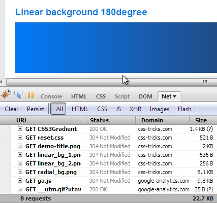
As we’ve covered, some really old browsers don’t support any CSS gradient syntax at all. If you need a fallback that is still a gradient, an image (.jpg / .png) could do the trick. The scary part with that is that some slightly-less-old browsers, that were just starting to support CSS gradients, would load the fallback image. As in, make the HTTP request for the image even though it would render the CSS gradient.
Firefox 3.5.8 did this (see screenshot), as well as Chrome 5- and Safari 5.0.1. See:

The good news is this isn’t really any issue anymore. The only offending browsers were Chrome and Safari and Chrome hasn’t done it since 6 and Safari hasn’t done it as of 5.1, going on three years ago.
Additional Resources
- Snag a block of the CSS covering all prefixes/syntaxes from CSS3 Please!
- Can I Use on gradients
- Mozilla docs for linear gradients, repeating liner gradient, radial gradient, and repeating linear gradient.
- Gradients Gallery (you can do some crazy patterns with gradients)
FYI: Different syntax for different rending engines, “Rendering” is spelled wrong.
:)
Great post! I really wish there were more browsers and users using CSS3.
Yes. It is definitely worth doing now. With server side scripting and a little JavaScript the possibility increases exponentially with CSS3.
Good to know.
Jeffrey Way did a great screencast using these not long ago here http://bit.ly/9zFMQR
Thanks for posting that link. The given information was really useful to me, same counts for the article here itself. I learned a lot
Great article Chris! Would definitely will give them a go!
Can’t we report (or ask?) Mozilla and Webkit to not request the fallback image? Something like a bug/feature request?
Shorter hand for Firefox if you don’t to get to fancy.
Where you can replace top with bottom, left, or right.
Great article! Webkit have a best syntax.
Nice writeup however the demo for the 180deg example is still showing 90deg in Safari 4.0.4. Also, if we don’t invite IE (trident) to this party because there are no performance gains then the same can be said for Safari/Webkit as it too loads the image. Furthermore, and I haven’t tested this yet, would using a conditional comment to target IE with its filter utilizing the !important override force the Trident engine to use the gradient instead of the image?
The problem with Trident is twofold:
• It loads the fallback image anyway
• If a fallback image is declared it uses that instead of the gradient filter
So yes, if you could figure a way to get it to at least use the gradient filter instead of the image, there would be an advantage (programmatic declaration of color) to using it. But as written in this article, there isn’t.
We can target IE (may be conditional comments or underscore hack) and set background to “none” and declare the filter. A bit more work but it means not loading the image which worth it.
Sorry! I didn’t see your last paragraph.
There is actually a proprietary IE filter to get gradients working in IE 5.5+. You just get a start and stop value though, not the fine grained control we have in webkit and mozilla
aaaaanndd i’m assuming that’s what you meant with “filter”.
I like the fallback image solution though, seems the most logical
Like Sean mentioned, there is a small typo in the demo code. It’s the 180-degree code that is wrong though. Webkit-browsers will show 90-degree gradient in both examples with the current code.
I believe the it should be:
background-image: -webkit-gradient(linear, 0% 0%, 100% 0%, from(#1a82f7), to(#2F2727)) !important;
or, in this case, easier to understand:
background-image: -webkit-gradient(linear, left top, right top, from(#1a82f7), to(#2F2727)) !important;
Thanks for a interesting article!
Thanks I fixed that… it was just me messing with it changing stuff around as I was learning how to use it.
I’m gonna leave in the keywords version you suggested so there are examples of both ways.
Really useful to know and definitely worth implementing now.
My problem with progressive enhancement to date has been that it’s only really practical for personal sites and blogs. Try explaining to a client that the beautiful gradients that he/she sees in the mock up will not actually be visible to a large proportion of the sites visitors. Now everybody sees the intended design without resorting to a conditional stylesheet.
CSS gradients are cool and sexy, but I’m not still convinced. If they weren’t declared via vendor specific syntax and their syntax was standarized, I would do the whole enhancement magic (like I do with rgba() and text-shadow). But now for me their code is too messy. Though the whole idea is just awesome.
I could not agree more. It’s weird how all the semantic, clean code aficionados are using these browser specific “css hacks”.
While I think it’s cool to stay progressive and try new things, it’s somewhat contradictory at the same time.
As of Safari 5 and Chrome 10 the syntax is standardised, and since users of these browsers are prompted heavily to update (or in Chrome’s case, updated automatically) it could be argued that we don’t need to provide the older Webkit syntax, just rely on the image fallback for the tiny minority that this would affect.
While I think this is awesome, I am getting a little tired of the fact that all of these things need 3 lines in the stylesheet to get them to work. This vendor specific syntax is annoying. And then to have to work around for IE garbage? Bah!
I’m with Mike above….when you have a client that uses an older browser and either can’t or won’t upgrade, you trying telling them that this looks awesome for others, but just ok for you.
Or, hey Mr. client, this looks great on the browser you are using, but for a lot of your visitors, some things will be missing or will look different.
Clients don’t want to hear that. They want it to be the same across the board. Progressive enhancement doesn’t mean a whole lot to them. To make it worse, the company I work for monitors what browsers our client’s visitors are using….and IE6 is STILL at about 25-30%.
I don’t think it’s useful.
A serious web designer would use sprites anyway, so requests aren’t an issue here (if you have 8 gradients on your page, you’re probably not going to save 8 files if you have any idea what you’re doing) …
Not working on IE is an issue. Not working properly in webkit-based browsers (still making the request) is an issue.
I’ll stick to sprites. And most of my gradients have a lot of effects that I don’t think css can (for now) reproduce easily.
Sorry that I have to correct you Chris, but Firefox 3.6 does support radial gradients.
The syntax is fairly simple, instead of using -moz-linear-gradient you simply use -moz-radial-gradient.
Check out this article with more information: CSS Gradients in Firefox 3.6
You can also have a look at my Beautiful Photoshop-like Buttons with CSS3 Tutorial, which features radial gradients in Firefox.
Nice summary of CSS Gradients in any case, thanks!
Mozilla does support radial gradients, it’s just a different property: -moz-radial-gradient.
Check out the reference page on the Mozilla Developer’s Center
I’ll support CSS gradients when I only need one syntax, and no separate browser-declarations.
Currently you hint in the direction of damn ugly rectangle boxes with a gradient
as soon as the design requires more details this will become tricky
i know that css3 will also have shadow’s and rounded corners and all, but we are still a long way from all these features working great together (with each other and with fallback images / colors)
so my oppinion would be “wait”
since my boss will not agree with a site that does not look like the design (yes, to the pixel, and yes, in all major browsers including my worst enemy IE6).
Sander
I’m finding it pretty amazing how many people are against the idea of progressive enhancement, citing angry bosses and clients.
But remember…
In thise case, this isn’t “how it looks” progressive enhancement, this is “how it works” progressive enhancement. Because we can use fallbacks, the look will be the same here.
It’s little details like this that make modern web design so much fun. Being able to accomplish these things outside of photo shop will completely change how sites are designed>
Chris, I gave gradients a sincere try. Tried and tried, with all my might. I found that, in many cases, specifying for multiple browsers didn’t play nice with each other.
That is to say, specifying for both mozilla and webkit blew off one or the other. And throwing opera into the fray blew them ALL off. And throwing in the proposed W3 spec …well… nada.
I tried the specs in all orders (one first, the other first, etc.) I tried with ONE background statement, then with one each. No luck. So, I gave up and retreated to an image.
I’m a gradient fiend. I’d LOVE to use them via spec. Mebbe I’m doing something terribly wrong. But no luck yet.
Since CSS 3 support is still not that good, I would suggest different approach – using SVG for backgrounds with little Javascript (to support all mayor browsers).
Take a look at this article at AListApart.com:
http://www.alistapart.com/articles/using-svg-for-flexible-scalable-and-fun-backgrounds-part-i/.
Nice idea! I wouldn’t thought of that, beacuse I’m not used to working with svg. But I’ll give this approach a chance.
So, the question that remains is:
Why bother with fallbacks anyways?
If certain browsers do not support all aspects of CSS2 and are not beginning to support CSS3, then why should we cater to their users?
“But then things won’t look the same!”
I say, so what?
As designers and developers, I feel it is high time we abandoned trying to make everything look the same in every browser. As long as standards compliance and graceful degradation are taken into account, this should not be a problem. If certain elements do not display on certain browsers then those users do not get as rich of a user experience as others. As long as the site still works correctly, this does not matter.
Bravo…NOT. Why should you cater to their users? Because they’re the ones the website is for!
I love Progressive Enhancement (not Graceful Degredation) and really want/try to use CSS3 as much as possible but I will never make (for example) an IE7 user suffer a worse experience than a Chrome user for the sake of being cutting edge.
If one of my designers has created a great design then as far as I’m concerned as many people as possible deserve to have the opportunity to experience it.
And quite often the ‘gracefully degraded’ version looks shocking – take the rounded corners, gradient and shadow off a button and all you get is a box.
So now that little rant is over, thanks very much Chris! A very informative post!
I stand somewhere in the middle. Graceful degradation should be considered professionally. One should look at their target market/user base/budget and evaluate how much time should be spent making improvements for older browsers.
@Matt – believe me, you will hear about it from clients if you build a site that looks the way it’s supposed to in your browser and not theirs.
@Jonathan – I wouldn’t go so far as to say a use “suffers” from lack of design. I do agree sites should still be semi-attractive in older browsers, however, it’s perfectly acceptable with a limited budget to tell users with older browsers that if they upgrade they will be able to enjoy the “full” experience.
Good post Chris.
Great article Chris! I’m going to have to give this a go.
I’m sure most here have seen modernizr which detects what browsers support which html5 and css3 properties. This solves the problem of the fallback image, but introduces a 3.9 kb js file with the http request and client-side processing. I’m curious how others here feel about modernizr and if it is worth the request, size, and processing.
One of the things we want for modernizr 2.0 is a build system so you can only include the tests you want.
Until then i think it’s totally fine to use the detection technique that we use internally on your own.
And then again, 3.9k aint too huge. :)
Very exciting to hear about version 2.0! 3.9k is tiny IMO and I have been using it on all of my new sites. Was trying to find out what others thought that have used it or thought about using it.
Most likely if you are using CSS3 gradients then you are using other css3 features like border-radius, box-shadow, etc. which I would think more than justifies the js file. i am not an optimization expert yet, though.
I need to get off my ass and start using modernizr… I like everything about it.
When it comes to using some of these cooler CSS3 technologies in their early stages the other question you may want to ask is how well and fast does the browser render the CSS3.
If the CSS3 short cut takes longer than the actual image retrieval then we might as well grab the image.
As for the browser specific declarations something like http://lesscss.org/ would be ideal.
great thank you, I will definately start using CS3, does CSS3 have cross browser issues,
Found a nice interactive gradient generator here: http://gradients.glrzad.com/
I prefer
http://westciv.com/tools/gradients/index.html
I really benefited from the list.
Thanks for your sharing!
I recently used gradients for a site because of the advantage it creates visually since the gradient can stretch to match the height on say a background. Here’s the site:
http://www.bronzetouchwf.com/
Compare a short page to a long one or use control+mousewheel (works in Chrome on Windows) to zoom out (Document > Zoom to fix that).
It’s subtle but nice…compare to IE or another browser without gradients and you can see the difference.
Already using it. Spread the word!
I second the already using it
Chris good stuff as always thanks so much
I can get pretty lazy when it comes to having to load up PS even to create a simple image. CSS gradients are so much easier and I’m fine backing that up with a solid color for folks that can see the gradient.
Also, I wrote a little utility to display various web stats and I hate seeing image resources top the list of most http requests. I’m going through now and trimming image resources where I can. This certainly helps do that.
Just an odd note, but does the footer of this site look off in IE7 to anyone else?
nm….it is when you bring the window size in. Footer doesn’t move.
I just started to use the css gradients last month, after I saw a few Nettut articles about them.
So far, I’ve only used them for drop shadows on divs to add a bit of depth for people with Firefox, Chrome and Safari. I stay away from using them for elements that depend on them, though.
The question I ask myself: “Would the art suffer without it?” If the answer is ‘Yes,’ I use older, more reliable methods at the cost of page load speed.
Nice! Been holding off using CSS gradients with a fallback as most browsers I’d tested in downloaded the image anyway.
It’s only one browser and it’s only one http request, but it doesn’t take a lot of effort & will give performance increases
Very nice article. Definitely going to try this out.
i use right now js gradients, it works in all browsers with the same sintax, and is easy to me to make all lighter to load, using svg is agreat deal too, but don’t work on ie without a adobe plugin
Another way to look at them is that if you use subtle gradients in your site, the fallback can be no gradient at all, just a solid color. So the site won’t look good in IE8 and prior, FF3.5 and prior,Opera 9 and prior,etc. Any non-CSS3 (even partial) browser that doesn’t support the gradient rule will see a solid color. But very soon, IE9 will be out, and within perhaps a year and a half, this subtle gradient fallback of simply a solid color might be acceptable.
Great article chris. I’m going to work some css3 gradients into my next project
-Anthony
Great article! I spent much time on this a little while ago, wish I found your article earlier – it would have save me a lot of time.
For those who don’t want to spend to much time building their CSS gradients (like me), I created a little tool:
http://www.display-inline.fr/projects/css-gradient/
There’s also support for Opera gradients, using SVG background.
Hey Chris, nice write-up!
I’ll just add a new twist to it: What about embedding your gradient as data-URI right into your background-property? That would also save you bandwidth and works in all modern browsers (apart from…, IE of course).
In addition you could then apply IE’s filter, as IE won’t get the message with that “strange” background-property.
PS: Yes, IE knows the proprietary data-URI-equivalent of MHTML, but that’s buggy under IE7 on >=Vista…
thx for this article and especially the demo. whenever I have to make a gradient I go to your demo and copy the code. thats very useful!
It seems this fallback works not only with gradients, but with RGBA backgrounds too.
E.g. when you want a semi-transparent background, you can use
Firefox 3.6 won’t download the background image.
Thanks for the great post.
FYI, I’ve seen a small typo on the “view demo” link on top, /examples/CSS3Gradient/ at that page you have same webkit properties for two gradients even though the gradients differ.
Great post! I learned a little more about CSS 3 gradients.
If you use
-webkit-gradient(linear, 0 0, 0 100, from(#0f82f7), to(#072727));instead of
-webkit-gradient(linear, 0% 0%, 0% 100%, from(#0f82f7), to(#072727));gradient will not stretch.
You can use SVG for fallback as following:
background-image:url('data:image/svg+xml,');I.e. write usual SVG as data:url, you only need to replace „#“ with „%23“. Pros: you can modify gradients right in CSS. Cons: very large syntax.
Wrong code, the right one:
background-image:url(‘data:image/svg+xml,<svg xmlns=”http://www.w3.org/2000/svg”><defs><linearGradient id=”g” x2=”0″ y2=”100%”><stop offset=”0″ stop-color=”%232F2727″/><stop offset=”100%” stop-color=”%231a82f7″/></linearGradient></defs><rect width=”100%” height=”100%” style=”fill:url(%23g)”/></svg>’);
I don’t get it. If an image isn’t supported, why would you add another image?
Thank you! You just saved me about thirteen months of trying to figure this out on my own!
CSS gradients are finally supported pretty well, thanks for the heads up.
Just one thing, Mozilla is not a rendering engine, it’s called Gecko.
Well then, to add to Sunny Singh’s comment, Opera is not a rendering engine, it’s called Presto (layout engine). =)
I’m using CSS3 Gradients, Opera, Safari and Mozilla supports them great..
I use a gradient generator, that generates moz and webkit gradient, and a filter for IE.. but still I delete the filter for IE, and go for images..
Yes, the CSS will get huge when I need to specify 3-4 backgrounds each time for same element.. But it’s not the same size as what the background image would be, and I write my code nice, so easy to update, I save the requests on the browsers that support it, and some traffic.. So why not use them, I’m just thinking..
If possible, I’ll never open photoshop when creating sites.. because I can code the graphics I need, and for fixing Chrome, and IE etc.. I take a lovely screenie on the site.. Starting slicing the graphics out in Preview in mac.. works great.. and then I optimize the images after so it works perfect :)
It’s my way to create websites.. and they’re kinda fast :)
If you include fallback images as data uri, all browsers will load it and skip css gradients. Adding !important to gradient declarations forces browsers to use it. In addition, in IE9 if you use IE filters and rounded corners it just doesnt work. IE9 wont clip background to the border.
A simple workaround is to declare gradients for supported browsers and fallback image in IE condidional stylesheet. IE performance will suffer, but that’s just the price for using poor browser.
Another great tricks here.. the demo is good, hope to download the source code so I could test it right away.
I’ve recently started using CSS gradients and aside from the browser specific syntax (http://www.colorzilla.com/gradient-editor/ helps a lot) they work great.
The biggest advantage over sprites is that they’re vertically scalable. Even IE6 works just fine with linear gradients, which is probably the most common use for them.
I’m using gradients on the menu for our website. I wanted to cut down image use to as little as possible using CSS3 techniques (many learned from you). The result for me is actually a website far more visually stimulating, satisfying and successful in its objectives then when I had the full blown power of Photoshop available to me. Not using images at all is arguably more restricting but then its implementation has almost forced me to create a more clean and functional design that isn’t overly cluttered with visual goodies.
Fallback wise, I’m sticking to solid color however.
Where did you find Opera 11.10?
Link in the footer of Opera.com
Here’s an interesting article I found on using SVG to get gradients to work in IE9 in a non ms-filter way
http://css3wizardry.com/2010/10/29/css-gradients-for-ie9/
Haven’t tried it yet, don’t know how it affects HTTP requests, and may just add an unnecessary layer of complexity, but may be worth investigating?
I’m glad to see you didn’t use the IE9 SVG fix for using gradients. I believe an anternative (old-school) background image will do just fine.
Thats the right solution, thx and i also works for my new sites. I alway searched for and there was no solution in pagespeed.
i have been trying to make a gradient background work for a site i’ve been drafting… but i haven’t found much in the way of cross-browser support.
http://www.denisebeaudet.com/new-index.html
for example: this works fine in FF4 on a mac and is *non-existent* for FF4 for Windows. annoying.
the other thing that is quite bothersome is the buggy aspect where if your browser window is set at something less than full-screen, and you then scroll to see what is “below the fold” (i.e. below the viewport bottom-margin), it reverts to the startcolor. very annoying and visually interruptive.
ideas? please?
thanks!
using the correct code would probably help. you left out the new syntax for Chrome, you don’t really need the old syntax for Chrome(IMHO) because Chrome auto updates. you’re also using svg for opera, why? gradients are supported in opera.
Go back through this article and re-read everything, you’ll see your problems pretty quickly.
Well it will certainly speed up one’s site. But what about the compatibility issues. For IE we need to use the js code for getting the bg gradient.
Thank you for this article.
I am using some gradients on my latest site.
It works great.
Sadly there are still people browsing with IE6 on my sites.
But with only 3% I am one of the lucky guys.
Awesome!!! Thanks for the breakdown!
Really cool trick here I didn’t know how to do. I’m think I’m going to go ahead and give it a go on one of my sites.
Just a note: although you have dismissed IE, I can’t since 95% of our visitors use IE7-9. I have found that simple linear gradients ca be used as follows:
filter: progid:DXImageTransform.Microsoft.gradient(startColorstr=’#FFFAE5′, endColorstr=’#FFDB95′);
Hope this helps some users who must live in the real world.
Dick
The web just got a whole lot more colorful. I have a tool that will generate the css for any linear gradient – and create the gradient even on IE6 using a simple behavior file i wrote for IE.
Enjoy (see the link in my contact info)!
Ron
Great resource and tips for gradients. Although, I’ve been working on adding noise to a CSS gradient and didn’t find much help online so I wanted to share my solution.
Wow! CSS3 is like magic! Thanks for this tutorial!
You can cover nearly 100% of gradient-supporting browsers with just two lines:
The first line is realistically only needed for iOS 6-, Safari 6.1-, and Android 4.3-.
As you pointed out,
filterfor IE is gross (btw it’s not just about performance — it also turns off ClearType) so you need fallback images if your gradients are critical and not strictly decorational.Those fallback images will also cover the extremely tiny percentage of browsers that still need prefixes, such as old versions of desktop Opera (
-o-), Konquerer (-khtml-), and people who are not getting auto-updates for Chrome and Firefox (hardly anyone, according to StatCounter).There’s no help for Opera Mini (where we’d want to avoid the HTTP request for the image) since it doesn’t support
linear-gradientwith or without a prefix.A lot of sites include the
-ms-variation but that was only necessary for one developer preview of IE 10, not any public release.Tiny clarification points:
Remember to be very careful about the tweener syntax. For your top-to-bottom example, that will be fine, but I wouldn’t want people to think, oh I’ll just handle the prefixing myself with the syntax I already know… and do this:
Because that isn’t going to work. The unprefixed version there is using the tweener syntax and breaking it. You’ll need to do:
which I personally found hard to remember at easy to screw up.
Also, I’m not sure there was ever a public browser that needed -khtml- for gradients, was there?
Great new tools: Gradient Generator
Please don’t take it personally. I still prefer the background image version for now. Anyway, I can still set the image size to 1 pixel width, and turn it into
base64version.Better for control, but maybe not for performance. Using CSS gradients (especially multiple CSS gradient) makes the web pages heavy scrolled.
CSS gradients probably only suitable if used for scallable gradient on the container size that is not fixed. In fact, I more often make gradations for a fixed size, or specific height then leaving the rest as plain color without gradations.
I would have to see some real tests that prove that image gradients are better for scrolling performance. Do you have one available? I’m sure it’s possible but I don’t like throwing statements like that around.
Sorry. Different operating systems might yield in different results. At least that’s what I feel (slow). By searching for keyword CSS3+gradient+slow+scroll on Google, I get some of this link:
http://stackoverflow.com/a/4023133/1163000
https://bugzilla.mozilla.org/show_bug.cgi?id=657603
http://yannesposito.com/Scratch/en/blog/2010-07-07-CSS-rendering-problems-by-navigator
http://www.tricedesigns.com/2013/03/11/performance-ux-considerations-for-successful-phonegap-apps (see on Keep Graphics Simple)
As a live example, you can try to visit http://lea.verou.me/css3patterns with quite small screen then scroll down and feel.
Then click on Carbon or Carbon Fibre pattern then scroll again and feel.
Example image patterns site with better scroll performance: http://subtlepatterns.com
CodePen example: Background Image vs. CSS3 Gradient
I’m surprised no-one’s mentioned CSS3Pie yet which does a pretty good job of bringing CSS3 gradients to older IE browsers.
CSS3 pie uses IE filers as well to accomplish the gradients in old IE, but we can write them ourself (if we really, really have to).
I have had issues with color fallback support using
backgroundorbackground-imagespecifically with IE7 and IE8. Thus, I write my code starting like this:http://codepen.io/anon/pen/cuCql
Instead of two background properties for fallback and svg, put them on one line. This works flawlessly for oldIE and svg works for IE9.
I usually don’t come here to comment, but this article is so complete and thoughtful, that I had to say thank you: thank you man!
Its awesome. But it doesn’t work on ie9. Do you have any rule for ie9?
Great update on the new way for CSS Gradients Chris.. you did a really a great and thorough job, keep up the great work!
Here’s something I always use to generate them for me: http://colorzilla.com/gradient-editor/.
It will generate the CSS for you with optional IE9 support.
I think using image instead of css properties has their cons and pros. First, using css for making gradient makes it harder to get it works in old browsers and computers. I normally tend to use photoshop instead of css properties for gradient. Using css is fast without need to use a third party software like photoshop or other graphics programs.
this is what i use (with LESS):
And then just call this wherever I need the gradient as background:
There is a mistake in the article. Since version 11.60 Opera is supporting the new “to” syntax for gradients. And since 12.10 gradient properties are unprefixed. They wouldn’t be unprefixed if they had deprecated, different from standardized, syntax.
The latest Presto based Opera has support for every gradient related function (linear and radial, optionally repeating) and is compatible with W3C standards in that regard.
So the proper list would be:
11.00-: No support
11.10-11.50: Tweener, prefixed, only linear
11.60-12.00: New and legacy tweener, prefixed, added radial
12.10-12.16, 15+: New, unprefixed
Version 12.16 is still being used, so it is relevant.
(Also a small typo: “repeating liner gradients”)
Whoa! This is the first time I’m hearing about RADIAL gradient. That’s pretty awesome stuff. I’m definitely going to try it out. To be honest I once remembered how to write a pretty much completely cross browser friendly gradient. But now I just use an online tool to generate the whole thing for me.
Yeah agreed. Pretty cool that you can create something like that and get rid of all those images.
It’s also great to see that a lot of the browsers do not require vendor prefixes anymore. Certainly reduces file sizes.
Great Demo, I was looking for a comprehensive script to implement on our new design for a blue sky gradient. I hope there wont be limitations on some browsers.
Don’t like to think about requirements like possible fallbacks. Hopefully i can forget about less and stuff like these one day and be more modern and intuitive. We are on the right way. Anyway “repeating-radial-gradient” was new for me.
Awesome that you can specify degrees and do radial gradients too.