Susy provides you with the tools to build your own grid layouts that match the needs of your website. It gives you the freedom and flexibility to build any design that you can imagine. It doesn’t matter if your design has 5, 14 or 48 columns. Unequal width columns? Susy’s got you covered.
Why would you pick Susy over the million other frameworks out there on the internet? You may never even heard of it before. What if it’s beauty is only skin deep?
Susy is one of the best things that happened to me in terms of my front-end development workflow over the past few months. It has helped me out so much that I decided to write a book about it to share it’s merits with the world. It’s an in-depth guide on Susy and how you can use it to easily create any website design you want.
Still not convinced? Well then, all I ask is you give me the opportunity to try and change your mind through this article. We’ll see why Susy is so special, and how it can help you out.
As they say, there’s no substitute for experience, so I’m going to walk you through the Susy experience of creating a layout. And you can compare it with the experience of creating the same layout by hand (which involves calculating pixels…by yourself).
We’ll start off simple, and progress on to more fancy layouts once you’ve gotten to know Susy a bit better.
Before we start, there are some things you must know about our friend, Susy. You MUST use the Sass preprocessor language for it, which means you have to at least know how to convert Sass into CSS. And no, you can’t use LESS. Sorry, LESS folks!
Creating a Very Simple Layout
CSS-Tricks has a pretty straightforward layout, so let’s use that for our first example.
Have a look at the blog and you’ll find that CSS-Tricks is made up of two content areas: the main content and the sidebar area.
We’ll assume CSS-Tricks uses a 12-column layout for the whole site, and it’s content area takes up 8 of 12 columns while the sidebar takes up 4 of 12 columns. Quite standard stuff if you’ve worked with grids before.

If you have used Bootstrap or Foundation before, the markup for this site layout would be:
<div class="wrap">
  <div class="content col-md-8"></div>
  <div class="content col-md-4"></div>
</div>
Simple, yes. But Bootstrap and Foundation also come with a lot of baggage, that a lot of the time, we just don’t want to deal with. If you don’t need most of the other stuff that comes with Bootstrap and Foundation, Susy would be a much better fit for you.
A stoic developer who hand-codes all his sites from scratch, no frameworks or frills, would probably write his mark-up like so:
<div class="wrap">
  <div class="content">Content</div>
  <div class="sidebar">Sidebar</div>
</div>
To create an 8-column content and 4-column sidebar, you’ll have to measure widths of the content, the gutter and the sidebar. One rule of responsive web development is to output these widths in percentages, so you’ll have to convert them accordingly.

So the corresponding CSS would probably look something like this:
/* I tend to use border-box sizing for all my web layouts. */
*, *:before, *:after {
  -moz-box-sizing: border-box;
  -webkit-box-sizing: border-box;
  box-sizing: border-box;
}

.wrap {
  max-width: 1120px;
}

/* Clearfix for floated children */
.wrap:after {
  content: " ";
  clear: both;
  display: block;
}

.content {
  float: left;
  width: 66.071429%; /* 740px / 1120px */
  margin-right: 1.6964286%; /* 19px/1120px */
}

.sidebar {
  float: right;
  width: 32.2321429%; /* 361px / 1120px */
}
A quick note before we continue further: I love to set the box-sizing property to border-box for all of my web elements, and I highly recommend you do the same as well. Chris has written extensively about box-sizing here.
Anyway, the hand-coding from scratch method can start to get tedious if you have multiple layouts to work with. Imagine calculating all those percentages every single time!
That’s precisely what Susy helps you with. She does the math for you.
Creating the Simple Layout With Susy
When using Susy to create any layout, you’ll first have to let it know what settings you want it to use. There are a whole bunch of default settings that Susy uses to kickstart every project.
I’m assuming this is your first experience with Susy, so we’ll stick with most of the defaults for now. You do need to change three properties though, and you change them by declaring them on the $susy map.
At the same time, let’s also apply the border-box property like we have done above.
@import "susy"

/* Changing Susy default global settings */
$susy: (
  /* Tells Susy to use 12 columns */
  columns: 12,
  /* Tells Susy that the container has a max-width of 1120px */
  container: 1120px,
  /* Tells Susy to use border-box */
  global-box-sizing: border-box
  );

/* Makes border-box properties */
@include border-box-sizing;
It is recommended that you use the container mixin to create the container for the website whenever you use Susy. In our case, this container is .wrap
.wrap {
  @include container;
}
This time round, instead of manually calculating the exact pixels and percentages for the layout, we’re going to tell Susy to do it for us. To do this, you’ll just have to tell Susy that content is 8 columns and sidebar is 4 columns.
We do have to let Susy know that sidebar is the last item on the row so it can make the necessary adjustments.
/* Tells Susy there's 8 columns in the content */
.content {
  @include span(8);
}

/* Tells Susy there's 4 columns in the sidebar, and its the last item on the row. */
.sidebar {
  @include span(4 last);
}
This compiles into:
*, *:before, *:after {
  -moz-box-sizing: border-box;
  -webkit-box-sizing: border-box;
  box-sizing: border-box;
}

.wrap {
  max-width: 1120px;
  margin-left: auto;
  margin-right: auto;
}
.wrap:after {
  content: " ";
  display: block;
  clear: both;
}

.content {
  width: 66.10169%;
  float: left;
  margin-right: 1.69492%;
}

.sidebar {
  width: 32.20339%;
  float: right;
  margin-right: 0;
}
Did you notice that the CSS output is exactly what we needed to create? Susy sure saved us a lot of time.
We’re not done with the CSS-Tricks layout yet though. If you scroll down to the bottom of the site, you’ll find the social media area, and you can also see that there are 10 social media items within this area:

If you use a traditional grid framework in your design, you’re pretty much in trouble. As far as I know, there’s really no simple way to quickly manipulate the number of columns from 12 to 10 using frameworks like Bootstrap or Foundation without affecting the rest of the layout.
Susy doesn’t bind you with such rules. You are free to create your own rules. After all, it’s your grid.
Your Grid, Your Rules
Anything is possible when you’re making your own grids. Before we move on to the CSS, let’s first get the mark-up correct. It should look something like this:
<div class="wrap">
  <div class="content"></div>
  <div class="sidebar"></div>
  <div class="social">
    <ul>
      <li class="social__list-item"></li> <!-- repeat 10x -->
    </ul>
  </div>
</div>
Now we can begin work on the CSS. Using the hand-coding approach, you may have realised you’ll have to calculate the width of each item and gutter again.

.social {
  padding: 1.6964286% /* 19px / 1120px */
}

/* Adds clearfix to social to prevent the float collapse  */
.social:after {
  content: " ";
  clear: both;
  display: block;
}

.social__list-item {
  float: left;
  width: 9.1497227; /* 99px / 1082px */
  margin-right: 1.0166359; /* 11px / 1082px */
}

/* And the last item cannot have any right margins */
/* It is also good to float it right to mitigate subpixel rounding errors */

.social__list-item:last-child {
  float: right;
  margin-right: 0;
}
It feels like quite a tedious job, if you ask me.
It’s so much simpler if we get Susy to do it for us. You’ll just have to tell Susy that there are 10 columns in all (instead of 12), and each social item takes up one column.
.social {
  /* Adds a padding of 19px to each side of the .social container */
  padding: gutter();
  /* Adding a clearfix because all children elements are floated */
  @include clearfix;

  .social__list-item {
    /* Telling Susy that there are 10 items, and each takes up 1 row */
    @include span(1 of 10);
    /* Another way to tell Susy that this is the last item in the row */
    &:last-child {
      @include last;
    }
  }
}
And Susy produces the same exact CSS properties that we need for the grid!
.social {
  padding: 1.69492%;
}

.social:after {
  content: "";
  display: table;
  clear: both;
}

.social .social__list-item {
  width: 8.16327%;
  float: left;
  margin-right: 2.04082%;
}

.social .social__list-item:last-child {
  float: right;
  margin-right: 0;
}
This is how simple it can be to use Susy. Math skills not required. As long as you know how to make a grid with vanilla CSS, you will know how to use Susy.
One thing about working with percentages is the inevitable fact that your output will contain subpixels, like 10.4px. This has been a major problem with layouts for a very long time because different browsers treat these subpixels differently.
For instance, webkit browsers round these pixels down, and 10.4px will be rounded down to 10px. The larger the number of items in your layout, the larger the occurrence of each rounding error. So our 10-item error is clearly showing up in webkit browsers.

Such errors are unbecoming and we simply cannot have that.
Dealing With Subpixel Rounding Errors
One method is make sure the percentages don’t generate subpixels at all. But
that’s not a good idea because you’re going to be stuck with either a non-responsive website, or one that snaps to different grid widths.
There’s another method, which I call the Isolate Technique.
This method is slightly more advanced and requires you to know more about laying out elements with the isolate technique that was developed by Jamie Hill. This technique has been used in the battle-tested zen grids for a long time. If you’re familiar with Zen grids, you’ll know what I’m talking about here.
If not, let’s examine how to use this technique.
The Isolate Technique
The premise of the isolate technique is to reduce the compounding effects of rounding errors by positioning them right where they should be with specific margins.
The requirements of using this technique are:
- Each element must have a
margin-leftproperty to position itself in the correct position. - Each element must have a
margin-rightproperty of -100% to pull the next item to the extreme left edge of the container.
This technique can be quite confusing if you’re not familiar with negative margins. Let’s go through a full step-by-step explanation on how it works.
Say you need to create a 3-column layout:

We’ll go through the positioning of each item one-by-one. Item 1 is quite straightforward.
- It has a
margin leftof 0, so it sits on the start line. - Then it pulls the next item (Item 2) back to the start line with a
margin-rightof -100%.

Item 2 has been pulled to the start line by Item 1 before it’s own CSS properties kick in.

Item 2 then positions itself with a margin-left property that is the percentage value of up 2 columns and 2 gutters, positioning it exactly on the third column.

Item 2 also has a margin-right property, which pulls the next item (Item 3) to the start line.

Item 3, gets pulled to the start line by Item 2 before its own CSS properties kick in.

It is then positioned on the 5th column by its margin-left property that is a percentage value of 4 columns and 4 gutters.

And it pulls the next item to the start line and the pattern repeats itself for the number of items in total.
If any item needs to start on a new line, it has to clear the float from its previous item with the clear: left property.
And to align it to with the first column (positioned on the start line), it has to change its margin-left property back to 0 to place itself there.

That’s how the Isolate Technique work. Now that you understand it, we can use it to deal with the subpixel rounding issue.
Solving Subpixel Rounding Errors
We have to position each item manually with the isolate technique, and Susy can help us with that.
Susy has a convenience function that helps you skip ALL the manual stuff. It’s called the gallery mixin.
.social__list-item {
  @include gallery(1 of 10);
}
And the CSS it outputs uses the isolate technique mentioned above.
.social__list-item:nth-child(10n + 1) {
  margin-left: 0;
  margin-right: -100%;
  clear: both;
  margin-left: 0;
}
.social__list-item:nth-child(10n + 2) {
  margin-left: 10.20408%;
  margin-right: -100%;
  clear: none;
}
.social__list-item:nth-child(10n + 3) {
  margin-left: 20.40816%;
  margin-right: -100%;
  clear: none;
}
.social__list-item:nth-child(10n + 4) {
  margin-left: 30.61224%;
  margin-right: -100%;
  clear: none;
}
.social__list-item:nth-child(10n + 5) {
  margin-left: 40.81633%;
  margin-right: -100%;
  clear: none;
}
.social__list-item:nth-child(10n + 6) {
  margin-left: 51.02041%;
  margin-right: -100%;
  clear: none;
}
.social__list-item:nth-child(10n + 7) {
  margin-left: 61.22449%;
  margin-right: -100%;
  clear: none;
}
.social__list-item:nth-child(10n + 8) {
  margin-left: 71.42857%;
  margin-right: -100%;
  clear: none;
}
.social__list-item:nth-child(10n + 9) {
  margin-left: 81.63265%;
  margin-right: -100%;
  clear: none;
}
.social__list-item:nth-child(10n + 10) {
  margin-left: 91.83673%;
  margin-right: -100%;
  clear: none;
}
And the social media area is back to normal!

Now that we’ve built up some momentum, let’s take it up a notch and make the layout responsive.
Making the Layout Responsive
Responsive websites have became increasingly important and I’ll be selling you short if I didn’t talk about how to make responsive layouts with Susy.
The very first step to creating responsive layouts is to make sure that you’re familiar with how media queries work. Pay special attention to the Mobile-First media queries in that article as we’re going to be using them.
For simplicity’s sake, let’s only create a layout with two breakpoints – one for the mobile view that begins at 0px and ends at 700px; and another for the desktop view that begins at 700px.
In the mobile view, both the .content and .sidebar sections take up a full 100% of the viewport. After 700px, .content and .sidebar will be split into 8 columns and 4 columns respectively.
If you hand code it, this is what it might look like (using Sass):
.content {
  /* Styles for mobile view go here */

  /* Styles for desktop view go here */
  @media (min-width: 700px) {
    width: 66.10169%;
    float: left;
    margin-right: 1.69492%;
  }
}

.sidebar {
  /* Styles for mobile view go here */

  /* Styles for desktop view go here */
  @media (min-width: 700px) {
    width: 32.20339%;
    float: right;
    margin-right: 0;
  }
}
You don’t need to create any styles for the mobile view because <div> blocks takes up 100% width by default. What you need, however, is to make sure the desktop layout kicks in once the viewport hits 700px.
Coding a responsive layout by hand is the same as coding a responsive layout with Susy, only Susy makes things faster. You use the exact the same technique and media queries.
.content {
  /* Styles for mobile view go here */

  /* Styles for desktop view go here */
  @media (min-width: 700px) {
    @include span(8);
  }
}

.sidebar {
  /* Styles for mobile view go here */

  /* Styles for desktop view go here */
  @media (min-width: 700px) {
    @include span(4 last);
  }
}
So that’s it for .content and .sidebar.
The next bit is the social media section. This is how it looks like in the mobile view.

Instead of having each item take up 1 of 10 columns, each item now takes up 2 of 10 columns on the mobile view, and you can do this by using span(2 of 10).
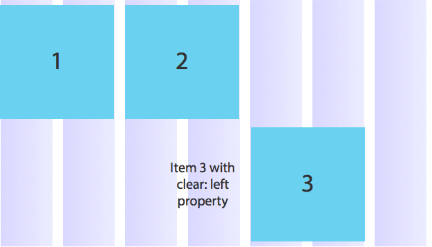
Note: You might be wondering why not use 1 of 5 columns instead. There are slight nuances between span(1 of 5) and span(2 of 10), and a picture best explains it:

These are fundamentally different layouts because of the number of gutters involved. You can always use the 1 of 5 option but I’ll stick with 10 because the size of the gutters are then much closer to 12.
We’ll call the gallery mixin again, and add one gutter below each item to provide some separation between the rows.
.social {
  /* ... Same styles as above */

  .social__list-item {
    @include gallery(2 of 10);
    margin-bottom: gutter(10);
  }

  @media (min-width: 700px) {
    @include gallery(1 of 10);
    margin-bottom: 0;
  }
}
Here’s an example of what we have done so far:
See the Pen eidcj by Zell Liew (@zellwk) on CodePen.
Working with Susy is just like working with vanilla CSS. The key difference is that Susy is a math-whiz.
Susy is so good at math that it can allow you to create wacky asymmetric grids that have columns of different sizes.
Let’s try creating the layout for CSS-Tricks using an asymmetric grid.
Making The Layout With Asymmetric Grids
Declaring columns is a tiny bit different when working with asymmetric grids. You tell Susy the number of columns and the ratio of their sizes with a Sass list. Since CSS-Tricks has content that is twice the width of the sidebar, the columns can be represented by a 2 1 list. This means that there are two columns, one of them is twice the width of the other.
You’ll also have to set the output mode to isolate on Susy’s global settings:
$susy : (
  columns: 2 1,
  output: isolate,
)
Instead of saying content has 8 columns now, we say that content has 1 column. Susy is smart enough to know the size of the column if you tell her its location. In this case, content is the first item.
.content {
  @include span(1 first);
}
Likewise, you’ll have to let Susy know how many columns sidebar takes up and where it is located. In this case, sidebar takes up the second column, which coincidentally is also the last item on the row.
.sidebar {
  @include span(1 last);
}
This is how it will look:

There is a lot more to asymmetric grids and it would take a whole new article to show you how to build them with Susy. I’ve have created a simple design that explains the concepts of asymmetric grids on my blog that uses the following as an example.

In addition, I wrote about creating an asymmetric layout comprehensively in Learning Susy with a more realistic example that was based on Nathan Ford’s design. You may want to grab the book if you want to find out more about it.

Conclusion
Well, we’ve reached the end of this introduction to Susy, as well as some peripheral (but important) matters like subpixel rounding errors. I hope you are at least a little bit convinced to give Susy a try.
In fact, there is so much more to Susy than what I could cover here. So I’m going to refer you to 5 sample chapters of my book on Learning Susy. Have a read through and you’ll learn how you can use Susy to do so much more. Also, if you have any questions about Susy, or just front-end development in general, feel free to contact me.

Really loving Susy.
Not loving the incompatibility with libsass.
Seems to be compiling awfully slow. I wrote a pretty straightforward grid system that takes about 10 seconds to compile all the way through.
Hopefully libsass will support native maps soon, because Susy is definitely in the list of tools I want to be using.
Yeah its gonna be even more awesome when Libsass comes into the picture. Still waiting for it as well. Compile times are pretty quick for me with Susy though.
This would have seemed awesome to me until I started using flexbox which just makes all of these problems go away, including the need for the isolate technique. Am I missing something?
Depends on your compatibility needs.
http://caniuse.com/#search=flexbox
Short answer, poor IE support and dodgy in other places. If you don’t care about these things, though, then flexbox is pretty awesome.
Susy is more about traditional web design processes, where the designer uses real columns and ratios (rather than the slightly more fluid approach of flexbox).
Flexbox is great if you can get away with the limited support. Until I can get by without supporting IE9 flexbox is off the table.
Flexbox is great, though theres one issue that I remembered I read, but can’t seem to find the link.
I read that flex box displays the content first before flexing it down, so in the case of a website that loads slightly slower, the layout can be messed up initially, then suddenly snaps back when its done running.
Not sure whether it only happens with the old flex box though, a further research is probably needed for that. Otherwise, flex box is great as well.
And I completely agree with Jonathan, with Flexbox, its difficult to do the column, and gutter ratio thing, which is part and parcel of traditional web design processes, and that makes it difficult for me to use it
Can Suzy handle a layout of columns that are changing in number depending on browser width fluidly? For example, in the social icons, imagine there were a gallery of 100 of those, and they started 10 per row, and steadily dropped down to 9, 8, 7 … all the way down to four towards at the low end resolutions?
Would you manually have to do a media query breakpoint for each time the number of columns per row changed?
For this, you could just set static widths for the column in Susy. I think that would be something along the lines of span(200px) or whatever per column.
Yup, you can set the widths of the social icons to a fixed width like 200px as Jonathan mentioned. In that case, you might also want to use the normal float instead of the isolate technique.
Interesting.
I usually just containers at a set pixel or percentage width with percentages for the grid, whether that’s bootstrap or another grid system.
The grid sits in its own CSS file. Then custom elements that differ from the grid are hand coded. In general I don’t find this to be too tedious. In most cases, I don’t have to stray from the grid.
If that works for you its cool :)
I prefer to code the grids out because it brings much more flexibility to the development process.
I see a lot of last-child and nth-child selectors in the output which aren’t supported by IE8. So what do regular Susy users use in that scenario?
I use justified inline-blocks, and the Susy span() function to control the widths.
eg: width: span(3) as opposed to @include span(3).
There are two ways of going about it.
Option 1:
You can switch the gutter-position setting to either
before,insideorsplit.If you switched to
before, you’ll have to use:first-childinstead.If you switched to
splitorinside, you won’t have to use either:nth-childor:last-childYou can find out more about gutter positions here: http://www.zell-weekeat.com/susy-gutter-positions/
Option 2:
The second option is to use a polyfill for IE8. You need to add media query polyfills if you work on a responsive website anyway. Its just a matter of adding the Selectivizr polyfill to it as well.
And you can read more about there here: http://www.zell-weekeat.com/support-for-older-browsers/
I haven’t used Susy much so it looks like I need to look into gutter positions a bit more, although Mitch’s idea sounds interesting.
FWIW, you don’t necessarily need to polyfill mediaquery support for old IE: http://jakearchibald.github.io/sass-ie/ (this is the approach I use).
Ah, I meant you’ll need to polyfill if you want IE8 to be responsive as well, but thats another good method to deal with IE8! :)
Yeah I use the span() function quite a lot when using Susy as well, and that helps when you want to make some unique layouts that aren’t so great with the default outputs from @include span().
Usually though, I just use the span() function to get a column width to do margin / padding push and pull.
I think there’s a typo on “Solving Subpixel Rounding Errors” section. Isn’t is supposed to be
Yep you’re right. Thanks for spotting this!
All the dimensions for the margins in the Isolate Technique images are -100 instead of -100%.
Great article! Susy seems to be very nice indeed. Do you have something to say about it compared to Bourbon’s Neat?
What do you mean by “All the dimensions for the margins in the Isolate Technique images are -100 instead of -100%.” ?
I haven’t came up with a complete discussion on Neat vs Susy yet, I’m going to work on that in a couple of weeks.
I always use Bourbon with Neat. Neat is very well documented and easily customisable.
How does that work in a responsive environment, you have to work out which item will be the last at every breakpoint?
Also just curious, are there any reasons why you choose float over inline-block?
Nice write up though!
Thanks Brendan! :)
There are a couple of ways to work with Susy. In the method I chose above, you’ll have to work out which item is the very last at every breakpoint. In other methods, like with a gutter-position of
insideorsplit, that’s not necessary.Check this page out for an introduction to other gutter positions: http://www.zell-weekeat.com/susy-gutter-positions/
I chose to use float because its just easier. Inline-block introduces these weird little spaces on the side and bottom of the content and its pretty difficult (imo) to make it perfect without hacks like
margin-right: -3px. I personally would prefer no hacks on my CSS :)Great presentation of Susy!
I need to check it in my own workflow.
PS. Please change the link in last paragraph – Learning Susy :)
Gotcha, I’ll let Chris know :)
How’s your workflow?
Just pointing out that this output CSS can still be improved immensely by grouping the common properties in the
.social__list-itemclass, like so:Only the
margin-leftchanges.Other than that, very interesting article.
The code is slightly off. You have to
clear:nonefor any items that are not on the extreme left.This reduces the output code and works great if you only need to worry about one layout. If your layout changes at different breakpoints, you’ll want to make sure the
clear: noneis able to override theclear:bothat each of these breakpoints.This can be difficult to do because :nth-child adds specificity to the CSS. And it takes a lot more effort to make sure the code is correct.
It’ll be great if you have any good solutions to that :)
Thanks a lot. nice article.
This is really awesome, but foundation 5 does have some of the same functionality in the guise of block grid.
Foundation 5 has somewhat of the same functionality that helps with creating galleries. The whole grid system however, is very very different.
Foundation relies a lot on HTML when adding breakpoints while on Susy, you can really do it either way. The choice is open to you.
If you use the SASS version you can use the grid-row and grid-column mixins combined with media queries to really fine tune a lot of stuff and not have to rely on the html.
But the grids in Susy appear to be definitely more powerful, especially the gutter positions. You can collapse a gutter in foundation, removing the margins and padding, but then you can run into other issues. Looks like Susy handles this a lot better, among other things.
Fantastic article on Suzy… definitely need to dig into it more.
Good article. I used Susy already and really like it so far. The only thing I don’t like is, that the code which Susy outputs is far away from DRY. Every time you use the span() mixin (or any other mixin of course) the same code is produced (of course). It would really be great if Susy would “know” that and use extends instead as often as possible.
While I’m really no fan of frameworks, I think it’s handled better by them because simple classes are used, which keeps things much DRYer. But the downside of course is that you can’t change an element with “grid_4” to “grid_2” in a responsive website. That’s a huge downside I think.
What do you think about that?
Sorry I took so long to reply to this!
Yeah I agree that Susy could potentially be much DRYer, and there’s probably lots of ways to do so. Maybe we should dig into the code and submit an improvement :)
Its really kinda hard to think of all the possible @extend scenarios though.
The downside is a deal breaker to me. Just having to imagine putting all these classes in HTML and changing them afterwards makes me dread! To top it off, I find that it’s quite likely that the layout will change considerably while prototyping, and Susy just makes things easier.
There’s one real downside to Susy I think. It’s that you’ll really have to know CSS to be able to use it well. And that’s going to be a deal breaker for many other people out there.
What do you think?
To be DRY or not, is more a matter of preference and how you do your own work. So if you have a basic layout that doesn’t have lots of different layouts, then you’ll be fairly DRY anyway, but more importantly you won’t have style sheets littered with unused rules.
Frameworks, by their very nature have a huge amount of (in general, Bootstrap and Foundation) unused grid classes.
As for not changing an element on a responsive site, you’re slightly off. Bootstrap for example uses 4 possible combinations of screensize/layout on a block. col-lg-*, col-md-* and so on, allowing you to go from x cols to whatever you want at whatever breakpoint you want.
I’ll definitely be giving Susy a run though. I much prefer coding an .blog-article opposed to .col-lg* blah blah. It makes your sass so much clearer to use and give you absolute control, as opposed to someone else’s perception.
Is it possible to mix susy and boostrap 3 in sass? Does it create any problems?
Yes Paul,
it is possible to use Susy and Bootstrap together. I haven’t done a deep dive into using the two of them together, but there shouldn’t be much problems as far as I know off.
Interesting stuff indeed, but like Christian Krammer said, it’s not very DRY. Then again, when you come to think of the a system, how much declarations do we really need? From what I see, you can simply create couple of classes for articles, galleries, header, footer, global layout etc., and then (re)use it in your whole project.
Frankly, when it comes to DRY vs possibility to change a crucial part of the design while in development, I always go with the latter. It’s like the problem I am facing in my day job now – we had a field with six blocks, but now the designer deciced, that we need seven blocks. And, since we use bootstrap, we have a problem. Looking at Susy, this would be a question of changing one line.
Hahah I feel you totally!
I don’t mind Susy not being super DRY. The number of lines of code Susy creates for possibly all your layouts will likely pale in comparison to the number of lines of codes for the rest of the CSS anyway.
thanks a lot for this post! looking out at your blog for more on Susy!
in my last apps i used a tecnique based on
(http://http://webdesign.tutsplus.com/tutorials/a-simple-mixin-alternative-to-standard-css-grids–webdesign-16958 “less mixins”)
as already stated, if you have a single page like your example DRY approach is very good, but in a site with many pages with different layout in term of number of columns, you can:
#define many classes in a single file;
or you can one style file or each page
what do you think about?
regards
I believe you should restrict the number of different layouts to a minimum no matter what site you’re trying to create. The larger the amount of different layout patterns, the larger the chance of your website design being incongruent. If you use the same layouts, then there really isn’t a problem at all.
I’d definitely go one style file for everything.
Hi,
Don’t bother to publish this comment; i just think you forgot some percentage signs in the code you published, on this selector : .social__list-item
Nice article anyway
Thanks for this. At the very beginning stages of learning web development… I’ve got lots to learn. Is there code for automatically resizing all images to a max height/width in Squarespace blog posts?
I’ve never used Squarespace, but I believe you’re looking for something like this:
img {
max-width: 100%;
height: auto;
}
Try it out and let me see if it works
I think there is a typo right above section ‘Here’s an example of what we have done so far’. The curly brace of .social__list-item is closed too early. In the final code it is correct though.
I think there are way to many variations and technologies out there and its to the point now where it is just making the water muddy … not actually improving anything … and since nobody can actually know all of them … we will soon run into a re-run scenario … where people were just doing their own thing because they didnt know any better … but this time around we will have seen the past and refused to learn from it and this time we will have hundreds of different ways to produce a site(app) and a designer who was handed the code and ORDERED to FIX THIS or IMPROVE THAT … and the only thing they will be doing is scratching their head simply because they are human …
Susy, Neat and Singularity (which was far more better, before Susy 2 came out) are pretty similar in their approach to handle fexibility for grids.
I now thought about switching to susy but still are very happy with Singularity (coupled with Breakpoint). I think it’s even DRYer in it’s output than Susy.
Anyway: Great insights about Susy, thanks!
I never know about Susy and never used it. but i think it easy to you used compare to another. thanks to share it.
I like this article you writing ! Thank you.
I can’t use susy on window 8. I installed Ruby and susy, but it’s not working? Anyone know why? how to fix it?
my Error:
“Error: File to import not found or unreadable: susy.
Load paths:
..”
Have you had a look to Scout? it is a tool just like winLess but for SCSS: you launch it and it monitors all SCCS files on a selected folder, compiling them when saved, so no Ruby, gem and so on.
or you can use the Bracket editor, where you can install a plugin to compile LESS and/or SCSS files
regards
What are your opinions on profound grid compared to susy. This was a very interesting article and still can’t decide whether to use susy or profound.
http://www.profoundgrid.com/
Profound grid looks interesting! Haven’t had a very deep look into it, so my arguments could be a little biased.
I think Susy is more flexible and can be used in more situations. Of course, its also slightly more complex if you wanted to learn everything :)
.wrap {
max-width: 1120px;
margin-left: auto;
margin-right: auto;
}
.wrap:after {
content: " ";
display: block;
clear: both;
}
Any help appreciated.
Whoa just realized I forgot to add the
container()mixin into the post.You’ll have to write this additional line:
Hi Zell,
I also got an error message about a missing mixin @cf
occurred because of the line
/* Adding a clearfix because all children elements are floated */
@include cf;
I’ve added the following to my code (but I know there are different clearfix methods) – is this appropriate?
@mixin cf {
&:after {
content: “”;
display: table;
clear: both;
}
}
Oh Shoot I can’t believe I’m so careless with this.
Yes you are completely right. Its a standard clearfix mixin. Thanks for spotting that!
Thanks Zell!