In case you haven’t noticed, I’ve done a bit of a design overhaul around here. I thought I’d take the opportunity to go over some points and features of the new design.
Why?
Because it was fun. Because I’m a designer and we never stay satisfied. Because I think websites should always get a little design refresh at least every year or so.
Is there anything new?
Nope, not really. Just a new face. On the back-end, I’m slowly moving some stuff into WordPress that lived outside of it before. Like all the video pages. Most of them are on static pages I built one-by-one as I need them. I don’t even remember why. But now I have a special WordPress page template for them, where I insert the stuff into Custom Fields, which will work out great I think. This will allow for commenting on the video pages themselves, which is nice. This will also make future design tweaking a hell of a lot easier.
Connection to old design
I’ve said many times in the past that I like evolutionary design more than revolutionary design. Essentially, tweaking and improving rather than starting from scratch. While this design feels quite a bit different, I still feel it’s evolutionary. The underlying code hardly changed at all. The background texture, while lighter, is the same. The tag is still here! The sidebar is still on the right and has the exact same stuff in the exact same places. The footer is still humongous =)
jQuery
I like jQuery, you like jQuery, WordPress likes jQuery. I was using it a little bit in the last design, but I figure if I’m going to load the library I might as well make more use of it. Things jQuery does in the new design:
- Does the color-fading in the main menu. Tutorial on that coming soon.
- Powers the tabbed slider in the sidebar.
- Pulls my recent Tweet in the footer.
- Animates the links in the footer.
Changes to Page Titles
The old design appended ” – CSS-Tricks” to the end of almost every page. I don’t even remember why, I think it was either some early effort at SEO, or just came in as a part of a template I started from. I never liked it. Now I’m using a much smarter technique for properly naming pages in WordPress. The homepage is just the name of the blog. Posts are just the name of the post.
Here is the clever bit of PHP (specific to WordPress) that handles page titles:
<title>
	<?php if (is_home()) { echo bloginfo('name');
	} elseif (is_404()) {
	echo '404 Error - Page Not Found';
	} elseif (is_category()) {
	echo 'Category:'; wp_title('');
	} elseif (is_search()) {
	echo 'Search Results';
	} elseif ( is_day() || is_month() || is_year() ) {
	echo 'Archives:'; wp_title('');
	} else {
	echo wp_title('');
	}
	?>
</title>
@font-face
As a nod to CSS3, I am using @font-face for some of the text in the footer. You’ll only be able to see it (at the time of this writing) in Firefox 3.1 beta and the latest versions of Safari. I am using the free and very nice Fontin font from Jos Buivenga.

If you are interested in using @font-face, want to learn more, and want to learn how you can make it work in IE, check out Jon Tan’s article.
Coding the new theme
I decided that it would make things easier to work in the exact same environment that CSS-Tricks currently lives. So I registered a top level domain name and put it on the same server. That way when it was done an complete, I could literally just move a few folders and files and that was it. All the relative file paths would be exactly the same, which I wouldn’t be able to do if I was working from a subdirectory of the original site. Maybe overkill, maybe better ways to do it. Whatever, it worked great for me.
One problem I ran into was the fact that I wanted to copy all the posts and comments over to the test site from the main site. I should have been able to just export from the main site and import at the test site. Tried that, but the file was 10MB which was too big (even after some fancy hacking tricks) for WordPress to import. I could have moved the database, but I just got lazy and didn’t do it.
So… When the design was getting close to done and needed some real live testing on the real live site, I found an awesome WordPress plugin that did the trick. It’s called Theme Switcher, and it allows you to show a different theme to people who are logged in (and at a high enough access level). So I was able to active my new theme and literally see it in action when I was logged in, while everyone else was still seeing the old design. Extremely helpful.
It’s not centered
Just a design decision. In order to center this design I’d have to come up with some kind of way to resolve the left side so that it could use the same repeating graphic as the right does. That would take up a decent chunk of horizontal space and I just don’t think it’s necessary. I don’t mind it left aligned anyway.
Things you just have to live with
At this point I have way too many articles to ever (ever) revisit one-by-one and make changes to. There are some consistencies in the articles that dictate certain design aspects of the site. For example:
- Images in all posts are 570px at a maximum. So the main content area of the site always needs to be at least that wide.
- Images in all posts were meant to be shown on white. When I first started this new design I had a little texture in the main content area I liked, but then I went back an looked at some old posts with lots of images that were meant to be shown on white and it looked awful. From now on, my main content area will always need to have a white background.
- All code snippets in my archives are wrapped in both <pre> and <code> tags, with a class name indicating the code type. All HTML code in unescaped. I use a plugin to allow me to do that, and another plugin to do the highlighting. I like the system OK, but I am absolute trapped into it now. Different code highlighters have different requirements for how you handle your code, and I have far too many snippets to ever go change them all.
Hope you like it!
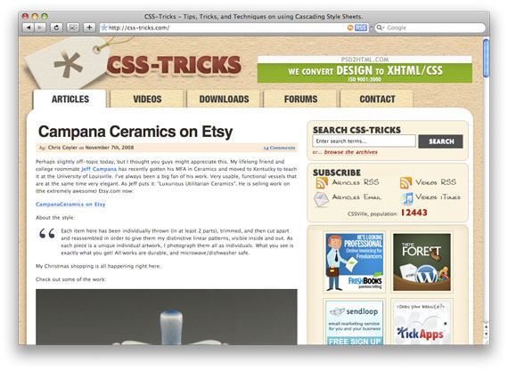
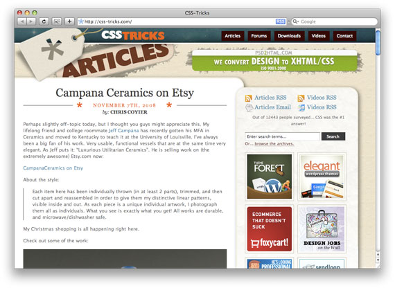
So there ya have it! I hope you like it, feel free to let me know (either way). For posterity, here are some screencaps.
Old Design
New Design

Hey Chris,
sorry to say, but I liked the old one way more than the new one.
It’s really not bad at all, but in my opinion the “paper texture” does not fit with the spacy things in the footer.
And the Header/Navi-Section is overloaded with stuff. The logo, the navi, the badge, the ad and the site-information… And all that widthin like 250px of height.
Maybe you could give that section a little more white-space.
What I like better in the new design is the content-area.
The Main-Content and the sidebar work nice next to eachother!
So long,
all the best from bonn, germany,
Oliver
Well done Chris, a lot less clogged, easier and clearer navigation in the header, so definitely an improvement.
And if the articles stay at the same level, I’ll keep reading!
I haven’t experienced the old design being new here but this is a great design. love the footer btw.
“…I like evolutionary design more than revolutionary design.”
I usually can’t make up my mind and I usually do “revolutionary” designs that’s why I don’t have a portfolio now.
Great work keep on growing
i second everything Oliver said. I couldn’t have said it better myself.
Old one was great & so is the new one.
The important thing for me is, they are both clear.
1 thing that I can miss is the old large-yet-not-disturbing navigation.
Anyway, great re-design.
I love it so much better. I really cannot wait for that jQuery tutorial!
Loved it :) Really nice. Congrats ;)
Really like the new design. Especially footer area. Great!
The only thing I consider not very nice is so vivid gradient from yellow pattern to white. Anyhow that’s my weird taste. In any other sence the site is pretty and very comfortable for reading.
Great job.
I’m steady follower of your blog which I find a great resource for css and js techics. I hope I will not offend you by saying that graphically, your site is a mess. I would advise you to consider the help of a good designer. I really believe you could do with some good taste lessons.
^^ Ouch. Screw them. It’s your site.
Looks great, but you didn’t set a background color on the bottom part. It’s funny that you redesigned and had this happen on the same week that Zeldman brought attention to it: http://www.zeldman.com/2008/11/07/is-your-websites-underwear-showing/
I like it !
Whatever some says, some change is always welcomed.
Very nice re-design, but dude, no validation? :)
Hello, my browser has just crashed so my whole comment essey is lost. :) I’ll just make it short:
Would you please fine-tune your print styles? There are unnecessary things and the font is too big – I always have to download your page and cut out the site navigation, comments, forms and sidebar as I don’t want to print those. Take a look at alistapart.com for more info and how they managed their print styles (I found them most satisfying so far).
Why bother? :) Because there might be plenty of us who don’t have internet access at home and like to read in the train. And of course because you have a lot of good articles in here!
PS: I like this design more than the previous one. :) See ya, Ollie
“Vote” on the right column is off in IE7.
I like the new design, the only thing that I find ‘off’ is the primary menu, and the ‘floating’ comment bubbles are a little bit odd ;)
Its not for me.
Drop the paper, bring back the centre alignment.
I really like this new one. It seems a lot more “professional” and modern. The old one was good, but seemed to simple for the stuff you output. I like it. Add a point in the keep it column. I am sure most people read by RSS so they doesn’t even visit the site.
I must say, i love it. It just rocks! The jquery put into it, makes it even better.
Chris, I think the design worked out well and, like you said, is evolutionary. I really like the new post headers, but the one thing that seems off is the menu. Its off in its own corner, very separated from the site and very easy to miss. This is a revolutionary change from your previous design where the navigation was huge and very indicative of where you were. Somehow they need to be reconnected to the design.
I like this design better than the previous. My only recommendations would be using “cursor:pointer;” on labels and buttons and a little work on the print stylesheet. Other than that, it looks very good.
The new design is definitely an improvement, but the top still feels a bit cramped – otherwise good work!
@mouras, Bit of a hypocrite, no? (I took the time to look at your cough well designed website)
Chris, the new design is fantastic, the header is a little tight but I still like it. I think the way your title’ing posts is really cool. Anyway, it’s all about the content, so keep it coming! :)
I really welcome the new look. And am excited to see that you are planning a tutorial on the fading navigation. I know that myself and others really appreciate your effort to teach us all how to make the web a better place. Keep it up.
I like the old one better, but change is good adn sometimes takes a little to get used to. Frankly I come here for the great stuff you write and not for what the site looks like. So if YOU like it and it makes you feel like writing some of your great articles, then I think it is great :-)
Keep it up.
@mouras Different strokes for different folks. This site has a visual identity that is memorable, yours looks like every other wordpress theme. Unless you’re trolling the internet to drive traffic.
I like it, roll with it. My only beef is with the horizontal ad at the top, but let’s be honest – you probably make a lot more money a month off of these ads than you do at your 9 to 5, so it’s not like it’s going to go anywhere.
We too often wrap ourselves around the design of a site when it really comes down to the content. More often then not we try to add more and more design elements that distract from the content. I think if you look at it from the end user point of view, you’ll see everything is fine.
I prefer the centered design better, if this were centered I’d like it just fine.
Just a note about comments, if I didn’t know to click the title to get to the single post page, I wouldn’t have known you still had comments enabled. I didn’t see it anywhere on the main blog page within the posts.
oh, agreed – i like the small design changes all the time – just showing that everything goes on :)
I like it the header however, interesting at least :)
I love the new design.
Now that it’s gone, I can say I never really liked the old design/style (I think it was mainly the textured background on the entire page). But a good design lets you make relatively minor adjustments and come out with something refreshing like this.
Keep up the good work and great content.
Seriously, center align!
Well I love the redesign. I like the smaller and sleeker header with a bit of grunge underlying pieces. I think the tag could be smaller, it seems to overpower “CSS TRICKS” and although everyone has already said it.. I don’t like the left alignment :) Although sites don’t always need to feel balanced and be symmetrical, I think it helps the intangibles of the site, you feel more at peace with a centered design. I also think it would help the design itself, it just looks like it’s put to the left for no reason, seems like you could have finished off the left side easy enough. But I do love the design and the space elements, well done!
Ryan Faubion, It’s called being new and innovative – you don’t like it because you’re used to center aligned sites.
@Chris, I forgot to mention, I LIKE the fact that you don’t show a comment count on the front page, it shows you’re more committed to quality of posts than quantity of comments, I’m a bit tired of all those speech bubble comment counts to be honest.
I saw your twitter about how nobody was explaining why they like the centered version of the site better than the left-aligned version. Personally I almost always hate hard left-aligned sites; it generally looks outdated and off-balance. In your case your design is really strong, so theoretically it should hold its own against the blank rest of the page. But in reality, here’s what i saw when I clicked on your site this morning: miles and miles of blank space. Achieving balance in compositions is Design 101, and while the site looks balanced on your screenshot, it doesn’t look balanced on my monitor.
That being said, I love the rest of the redesign–especially the footer, which is amazing.
I like you redsign very much. You did a very good job.
i like it. it’s got the same feel but more ‘punch’. the footer is fantastic! i like it left aligned, but when i get towards the bottom of the page (where white overtakes the bkgd texture, and there is a lot of white to the right of the screen, it looks like something was left off. maybe that’s why ppl don’t prefer the centered look.
nicely done.
Some comments:
To me it seems as if there were three different pages. First part with the background, second one in white, and the third one, the footer. They are too different.
Why spots on the back of the headlines, if the rest is so clean? And why the space theme at the bottom if anything looks similar?
I mean, you can do whatever you want, of course, it is YOUR page, but to me it is a bit unconsistent
I think change is good, and I really like the new layout. I didn’t think that anything was wrong with the old design, but I really like the new one! Great work Chris, and keep the good content coming!
Hey Chris,
Love the new site,
specially the navigation (:D hahaa, sorry had to say it :P)
but yeah, I really like it.
I think you have a nice effect with the footer links too.
I also think the left aligned style works well.
Well excited about Wednesday :D!
–Liam
[email protected]
The main content area looks great. The rest of it could use some work though.
What is with the ugly background texture all of a sudden fading to white?
I think the fading to white is a little too sudden, the sidebar background texture should at least run to the end of the sidebar widgets.
Also, when you tab out of the comment box, expecting to go to the Name field, it sends you up to the search field.
— Bryce
I must be the only person that doesn’t browse with their browser super maximized so it takes up their entire screen. I use a large screen so I can have multiple things open, not to see the page background.
@Ollie – Print stylesheet is looking pretty solid to me, let me know if you see any details you’d like changed.
@Don – Good catch! I was actually planning on linking to that article tommorrow =)
@James – I kinda agree with you, but I think the # of comments thing might be making a comeback. I like how that invites people to comment and it provides an another obvious path to the “single” page. I’ll try to make it non-annoying.
@Jason – I’m with you man. I have a big monitor, but I don’t browse full screen almost ever. How many sites are optimized for 1920 px widths? None.
Congratulations! The new site design looks fantastic, a great improvement!!!
I still find the footer section is awesome!
And congrats on passing 10,000 :)
Found your twitter comment about center aligned and thought I’d share my opinion on the design as well.
Left vs Center
I think its fine that you have left aligned the site. The comments about the site being off balance only points out that some of your readers maximize their browser window when they are surfing. That is their choice, but I don’t see why they bother to surf like that. The majority of websites are still designed so that the fit within the 1024 x 768 resolution.
Consistency and design
@tonicastro has a valid point about the inconsistent parts of the site design, but I would go further and say that there are more than three different designs here. The header starts off with some nice graphics, and the footer picks that up again at the bottom of the page. After the header some of the old design ideas with “papyrus” or “sandy paper” is mixed in. This doesn’t work to good in my opinion.
The main-content ads another design with a hint of “ilovetypography.com” and “designworkplan.com”. I think those designs are strong and beautiful and understand if they inspired you. The sidebar ads yet another feel to the design, with rounded corner (also on the main-content) and a wrinkled paper background that doesn’t mix well with the “papyrus” or the clean main-content.
The organizing of the sidebar is good. The RSS feeds, email subscription and search area is clearly defined. The block with tabs is also ok organized, but the background graphics seems buggy or wrong.
There are to many different fonts on the site. One font for the logo (that doesn’t really count), one for the navigation and article body. Another font for the headlines and the subscriptions in the sidebar. On the tabs you have chosen a different font for the first tab and yet another font for the rest of the tabs and the Vote block headline. By choosing a different font for the first tab you indicate that this tab is active. But the real (your choice) indicator is the color black. The vote block just needs a little tweaking to get better. Not indenting the second line of the labels and separating the choices more clearly (different space between choices and the line-height of each label.).
The buttons are nice, clear and big, but I’m not sure what style they are grouped with. Should the “Vote” and “View Results” both look like buttons?
The comments have a completely different style from the rest of the site. I would have organized them differently to make it more clear who each comment belongs too. It is quite difficult to make the comments area look good on almost any website, but I am confident that you can do better than what you have here right now.
The comments form is clean but the organizing seems odd. If the name and e-mail fields are required (and they are), I would let the reader focus on getting that out of the way first. Maybe I would put the website field under the textarea but that would also be unconventional.
The footer looks pretty nice but I am not sure if I like “Chris Coyier” as a ghost floating in outer space ;)
In general there’s a lot of heavy shadows going on. There are bright colors, creamy colors and some pastel colors. I count 4 or 5 fonts at the most. The total size of the site in KB is almost 1000, with 24 JavaScript files, 21 CSS images and 4 Stylesheets files (YSlow plugin for Firefox/Firebug).
The content of your site is excellent and I admire the work you put into all the articles and podcasts/screencasts. I will continue to visit the site regularly. Good luck with some more tweaking of the redesign.
@macbruker
Just a few things i noticed in the sidebar for some reason if the ads are not there the sliding box moves up and as that has a white background it looks odd and the sliding box also you can see the text come on before the edge of the image. and on he comment preview if you comment is large the button hits the box.
Chris I love the new design and colors. It’s completely different from your older version. So this is good in my book!
I think the center content is much more clear on this re-design. Really pops out and its much more inviting to read.
I like your re-design better, great job~!
PS the 428X60 banner up at top (psd2html.com banner – https://css-tricks.com/images/ad.jpg), instead of it being a one piece banner, shouldn’t you have the grunge effect as a background image hover effect and the 468 banner by itself? I would assume it may be tedious to continue to add in the background effect each time you get a new 468 banner up there~ Im sure you’ve covered this already, but just in case :-)
If I’m honest — I hated your old design, it looked pretty bad for a CSS centric site. But I absolutely love the new design! The only quibble I have is the comment icon for people without a Gravatar, it just doesn’t seem to fit in with the rest of the design.
Well done! ;)
i want to be honest :) i’ve never like the theme before u use, but i like this one. It’s great Chris :) Congratulations!
Great work Chris! I really like the new design, it’s much better than the old one.
I love it. Great article. Looking forward to the upcoming tutorial on the color fade in jQuery.
Great job on the refresh – it’s nice and compact, and the footer’s got charm. I’d agree with others about extending the textured background all the way down, if possible.
Chris, I like the site. Yes, the non-centered page is a little different. Over all it still looks good. I would comment that there is no way to see the number of comments and/or a quick link to the comments. I think a lot of people would prefer that. Just a suggestion!
Well, I love the new design! I also love left aligned (for some reason I don’t know yet, I mostly work left aligned.
Just one thing bout he print styles: the “save to …” (Delicious), etc. are quite useless in my opinion ^-^ and it would maybe an idea to float the comments beside the pics and / or take the pics out, because that just takes ink and kills trees (for the space it uses).
(Checked it with Safari 3.1.2 on OS X 10.4.11)
I think it’s great, but I only don’t like the new search bar. The previous one was much better. The black button just doesn’t feel right to me. If you want to keep it as it is, i was thinking it would’ve been better placed above the rss feeds.
gr8 site and gr8 articles, keep em coming.
PS: looking forward to the jquery tut.
So I had an idea while reading through all these comments. What if you positioned some odd nuggets of random tips, images, quotes, whatever out into that empty space. You know give those people with 30″ monitors and no idea how to resize their window… something to look at. :)
Hi Cris, the design is neat and functional; I slightly preferred the old version because of the centered position. Great example of hi-tech footer. Anyway Kepp on sharing great contents!
Bye Fede
I like the new design specially your footer; I wonder if my blog footer works according the whole site; your comment about it will be appreciated for me.
Why so many people waits you always make a centred site ?
On 1280×1024, there’s more than half a page whitespace. That sucks, as for me.
The footer is cool though.
Hey Chris,
Nice redesign. I like the fact that you recognize where you are though the design is new. As you said it “I like evolutionary design more than revolutionary design”. It’s a good face lift.
I have a question, you have a new style for your site, can you provide the old theme for download? It was very beautiful, that would be very nice. :)
Keep it up and best wishes
Dominik
Very nice… cool details and effects…
To everyone who has a problem with the new design, I have a simple fix for you:
Subscribe to the RSS feed.
Ok this is gonna sound weird, but I can see the text slide over outside of the background. Maybe you meant to do it, I don’t know, but other than that I REALLY like the new design! Fantastic work as usual.
I like this design much better. I could never put my finger on it, but there was something i didn’t like about the old, and it’s gone. (not to say it was bad at all, it was just something.) way to go.
A tutorial for the animate link in the footer?
i’m interesting of this code.
hummm, to be honest i liked the old design better. Don’t get me wrong this one looks fresh, and beautiful… but the navigation on the old design and the “centerdness” of it made it more appealing to me… oh well some cool jquerry on the new one i might add.
Hey Chris! The new design is looking great! Also great to see IntenseDebate installed already, I'm looking forward to testing it out more myself
The top navigation is now lost in the heading and I didn't notice it being above the main title to the right-hand side.
I found out that Google Chrome supports @font-face as well!